

Step 1: Don‘t Rush to Turn On Your Computer! First Answer These 3 Specific Questions
Many people jump straight to finding templates and searching for data, only to end up with a pile of useless slides. Please first spend 10 minutes answering these three questions clearly on paper:
“What exact problem am I trying to solve?“ (Clarify the Purpose)
l Vague purpose: “Learn about the competitors.”
l Specific purpose A: “For our App homepage revision next quarter, we need to reference competitors’ layout and core function entrances to persuade the design team to adopt our proposal.”
l Specific purpose B: “To set the price for our new smart water bottle product, we need to figure out the main functions and user complaints of competing products in the ¥99–¥399 price range, so as to provide pricing recommendations to the boss.”
“Which ‘competitors‘ should I focus on?“ (Select Competitors)
Don’t make a long list. Based on your “specific purpose”, focus on the 3 most critical ones.
l Direct competitors: Products with almost identical functions and target users as yours (e.g., if your project is “online collaborative documents”, direct competitors are Feishu Docs and Tencent Docs).
l Indirect competitors: Products that solve the same user needs but in different ways (e.g., if users need to “record ideas” and your product is a “note–taking app”, indirect competitors might be “voice memos” or “whiteboard tools”).
l Industry benchmarks: That “other company’s product” that always gets mentioned in your meetings.
“From which ‘angles‘ should I conduct the analysis?“ (Determine Analysis Dimensions)
Don’t copy fancy jargon from textbooks. Customize 3–4 most relevant dimensions based on your purpose. For example, if your goal is “homepage revision”, the core dimensions are: information architecture, visual design, and core function paths. If your goal is “new product pricing”, the core dimensions are: price and configuration matrix, user review pain points, and channel policies.
Step 2: Gather Data Using These 3 Methods
Data doesn’t need to be “high–end”, but it must be “accurate”. Stop talking vaguely about “user experience”—let’s get practical.
Feature Comparison: Create a “Spot the Difference“ Table
Open an Excel or Tencent Docs spreadsheet. List 15–20 core feature points in the leftmost column.
List your product and 3 competitors in the horizontal rows. Instead of just ticking or crossing boxes in each cell, use a three–level marking system:
l Available: Basic functionality is present.
l Excellent: Not only available, but also delivers a superior user experience (e.g., faster loading speed, more attractive interface).
l Unavailable: The feature is not offered.
Once this table is completed, strengths and weaknesses will be immediately clear—it will serve as the core comparison chart in your subsequent PPT.
User Experience Walkthrough: Be a “Critical User“
Pick up your phone or open your computer to complete a key task on each competing product. For example, when analyzing an e–commerce App, the key task is “search for a product on the homepage and successfully place an order and make payment”.
Take screenshots continuously while operating, focusing on the following points:
l Where is the first step? Is the search box easy to find on the homepage?
l How many clicks does each step require? How many page jumps are needed from the product page to payment?
l Are there any confusing parts? Is the button copy unclear? Are there too many options to choose from?
Organize your feedback and corresponding screenshots—this will be the most vivid evidence of “user experience differences”.
Mine User Reviews: Pan for Gold in the Comment Sections
Go to the product detail pages of competitors on platforms like App Store, Huawei AppGallery, and Xiaomi App Store.
Focus on latest reviews and 3–star reviews. Latest reviews reflect issues with the current version, while 3–star reviews are often the most rational and point out specific flaws.
Prepare a notebook to manually record frequently mentioned “complaint keywords”. For example, after reading 100 reviews, you find that the terms “app crash”, “unresponsive customer service”, and “more laggy after update” appear 30 times. These three are the current core user pain points of that competitor. These keywords are more straightforward than any research report.
Step 3: Create the PPT—Don‘t Work Hard Alone! Let AI Be Your Intern
Once you have clear conclusions and a pile of screenshots, tables, and keywords, the most frustrating part is often: how to quickly turn these scattered pieces of information into a well–formatted, logically coherent PPT? This is the key leap to creating an outstanding competitor comparison slides presentation. Manually adjusting the layout and style of each slide can be extremely time–consuming.
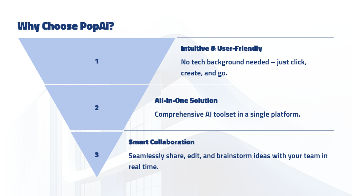
At this point, you can leverage AI presentation tools like PopAI, which can act as an efficient intern to handle the tedious work of turning drafts into polished presentations. Here’s how to use it in detail:
Feed It the “Raw Materials“ to Generate a First Draft with One Click
You don’t need to design the PPT from scratch. PopAI supports importing content from files and webpage links. You can directly upload the Word analysis document, Excel comparison table sorted out in Step 2, or links to articles on competitors’ official websites to PopAI.
Its “Auto–convert to Presentation” feature will instantly generate a PPT draft with clear structure, appropriate titles, and content sections based on your materials. This instantly solves the blank page phobia of “what to write on the first page”.
Use AI to “Polish“ Content and Visuals, Not Rewrite Them
On the basis of the generated first draft, you can use AI to enhance content for individual slides. For example, if you have a slide titled “User Review Keyword Analysis” with only the keywords “app crash, lag, poor customer service”, you can let PopAI’s AI expand these keywords into a concise summary, or suggest a more suitable chart type (such as a word cloud), making the page more informative and visually professional.
PopAI has a rich built–in library of themes and layouts. You can quickly switch the overall style according to your company’s brand colors or presentation scenario, ensuring the visual consistency and professionalism of the competitor comparison slides presentation.
Adjust the Structure Easily Like Building with Blocks
The logic of a good report needs to be refined repeatedly. PopAI’s seamless editing feature allows you to easily adjust the order of slides by dragging and dropping them like cards. If you think the “feature comparison” section should come before “market performance”, just drag it— the system will automatically maintain the consistency of all formats.
Its editing interface is intuitive: you can modify the text in any text box or replace images at any time. The entire process is smooth, allowing you to focus on sorting out the logic rather than struggling with software operations.
Remember: Tools Serve Your “Story“
PopAI’s “audience–centric design” concept reminds you: who is the final audience of your presentation? If it’s for the technical team, you need to include more details about function implementation and architecture diagrams; if it’s for the boss or marketing department, market data, user pain points, and conclusion recommendations are the absolute core. You can use PopAI to quickly copy, delete, or reorganize slides to customize different versions of the competitor comparison slides presentation for different audiences, maximizing communication efficiency.
Simply put, the core value of tools like PopAI is to free you from the complicated layout operations of PPT software, allowing you to focus more on the analysis itself and narrative logic, thus efficiently producing professional–grade presentations.
Step 4: Apply This “Golden 8–Slide“ PPT Structure
Whether you use tools or not, the structure of the final report slides must be clear. Remember: a PPT is an outline for storytelling, not a full copy of a paper. It’s recommended to keep it within 10–15 slides, which is the ideal length to maintain the audience’s attention.
1. Cover Slide (1 page): Write the core conclusion in a large title, e.g., “Three Breakthrough Opportunities for Us in the XX Market”. Include the presenter’s name and date in smaller font.
2. Table of Contents/Agenda (1 page): Clearly list your analysis roadmap: Why analyze → Who to analyze → What we found → What we should do.
3. Analysis Background and Objectives (1 page): Directly write down the “specific purpose” you clarified in Step 1. Ensure everyone reaches a consensus at the very beginning: “The purpose of this meeting is to solve the XX problem”.
4. Competitor Selection (1 page): Use a chart or table to show the 3 key competitors you focused on, and explain why you chose each in one sentence (e.g., “A: Direct competitor with the highest market share; B: Highly innovative and popular among young people; C: Price disruptor shaking up the market”).
5. Core Findings (4–6 pages, the main body):
l Feature slide: Directly insert the three–level marking comparison table you created in Step 2, and interpret the most important findings in 1–2 sentences (e.g., “We lead in core collaboration functions, but are significantly behind A in template ecosystem”).
l Experience slide: Use the “key task path map” with your screenshots, mark the differences in competitors’ processes with arrows and numbers, highlighting our advantages or areas for improvement.
l User Voice slide: Display the word cloud or list of “frequently mentioned complaint keywords” mined from comment sections, and summarize: “Price–sensitive users complain the most about the quality of Product B, while high–end users are dissatisfied with the service of Product A—this is our opportunity”.
l Market Data slide: Use bar charts to show download/sales trends, and a table to compare prices and promotional activities.
6. Summary and Opportunities (1–2 pages):
l Draw a simple SWOT matrix (Strengths, Weaknesses, Opportunities, Threats) to summarize the findings above.
l The most important slide: Put forward specific, actionable recommendations. Each recommendation must correspond to the previous findings. For example: “Recommendation 1 (addressing the template ecosystem weakness): Launch the template library project in Q3, prioritizing the development of high–frequency templates for finance and education in the first batch. Recommendation 2 (capitalizing on the user service opportunity): Launch ‘24/7 online customer service’ as the core selling point of the new product, and highlight it on the product detail page.”
7. Q&A (Last page): A concise “Thank you for listening, Q&A” slide.