Creating a presentation that truly resonates with an audience requires more than just dumping data onto a screen. For marketing managers, startup founders, and educators, the biggest challenge is often "noise"—too much information competing for attention at once. When everything is emphasized, nothing is emphasized. This is where mastering visual hierarchy in slides becomes a game-changer.
Visual hierarchy is the arrangement of elements in a way that implies importance. By strategically using size and spacing rules, you can guide your audience's eyes through your narrative, ensuring they absorb your key message before getting distracted by supporting details. In this guide, we will break down the fundamental rules of size and spacing to help you build slides that look professional and communicate with precision.
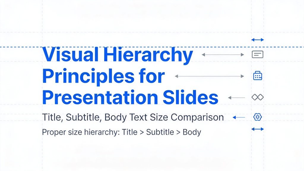
Understanding the Core Principles of Visual Hierarchy in Slides
At its heart, visual hierarchy is about control. You are the director of your audience's attention. Without a clear hierarchy, the human brain struggles to process information, leading to "cognitive load"—the feeling of being overwhelmed by too much data. To avoid this, you must prioritize your content into three levels: the Hook (Primary), the Context (Secondary), and the Details (Tertiary).
- Primary: The main takeaway or headline.
- Secondary: Sub-headlines or key supporting points.
- Tertiary: Fine print, citations, or minor details.
By establishing these levels early in your design process, you can apply size and spacing rules consistently across your entire deck, creating a cohesive and professional look that builds trust with your viewers.
Pro Tip: Struggling to organize your thoughts? Use an AI presentation maker to automatically structure your content into logical hierarchies before you start designing.
The Power of Size: Directing Attention to What Matters Most
Size is the most intuitive tool in the designer's kit. Naturally, the human eye is drawn to the largest element on a page first. When discussing visual hierarchy in slides, size doesn't just apply to text; it applies to icons, images, and charts as well.
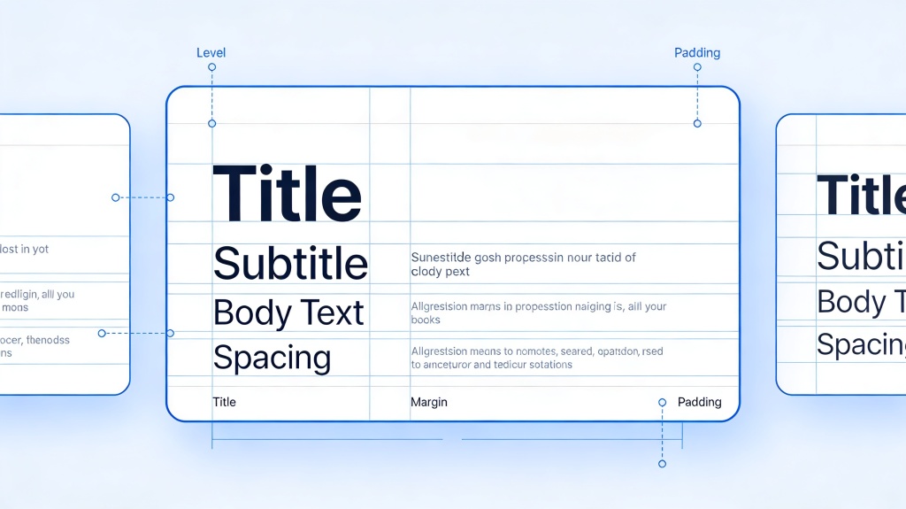
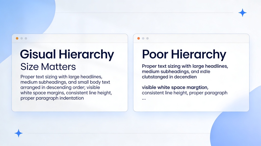
For text, a common rule of thumb is the 3:1 ratio. Your main headline should be approximately three times the size of your body text. For example, if your body text is 18pt, your headline should be 54pt. This creates an undeniable contrast that tells the audience, "Read this first."
When it comes to images, don't be afraid of scale. A single, large, high-quality image often carries more emotional weight than four small thumbnails. Use size to create a "hero" element that anchors the slide, then use smaller text elements to provide the necessary context.
Mastering White Space and Spacing Rules for Clarity
Spacing, often referred to as "white space" or negative space, is the "breathing room" between elements. Many presenters feel the urge to fill every square inch of a slide, fearing that empty space looks unfinished. In reality, white space is a powerful active element that defines the visual hierarchy in slides.
There are two types of spacing to consider: Macro Spacing (the margins around the edge of the slide) and Micro Spacing (the gaps between lines of text or between an image and its caption). Proper macro spacing prevents your content from feeling "squished" against the edges, which looks amateurish. A good rule is to keep a "safe zone" of at least 5-10% of the slide's width as a margin on all sides.
Micro spacing helps with legibility. Increasing line spacing (leading) in your paragraphs can make dense information much easier to scan. When elements are spaced too closely, the brain perceives them as a single, complex object rather than distinct, manageable pieces of information.
Using Alignment and Proximity to Group Related Ideas
According to the Gestalt Principle of Proximity, elements that are close together are perceived as related. This is a critical spacing rule for effective slides. If you have a list of features, keep the feature title and its description close to each other, but leave a larger gap before the next feature begins. This creates "visual chunks" that are easier to digest.
Alignment works alongside proximity to create a sense of order. Whether you choose left-aligned (standard for readability) or center-aligned (good for minimal, punchy slides), consistency is key. Misaligned elements create "visual friction," which distracts the audience from your message as their brain tries to "fix" the perceived messiness.
Common Pitfalls in Slide Layout and How to Avoid Them
Even with the best intentions, it's easy to fall into design traps. Here are the most common mistakes that ruin visual hierarchy in slides:
- The "Everything is Bold" Trap: If you bold every second sentence, nothing stands out. Use bolding sparingly for maximum impact.
- Tiny Text on Busy Backgrounds: If your audience has to squint, you've already lost them. Ensure high contrast and a minimum font size of 18pt for body text.
- Conflicting Focal Points: Having a giant red button and a giant bright yellow chart on the same slide creates a "visual tug-of-war." Choose one primary focal point.
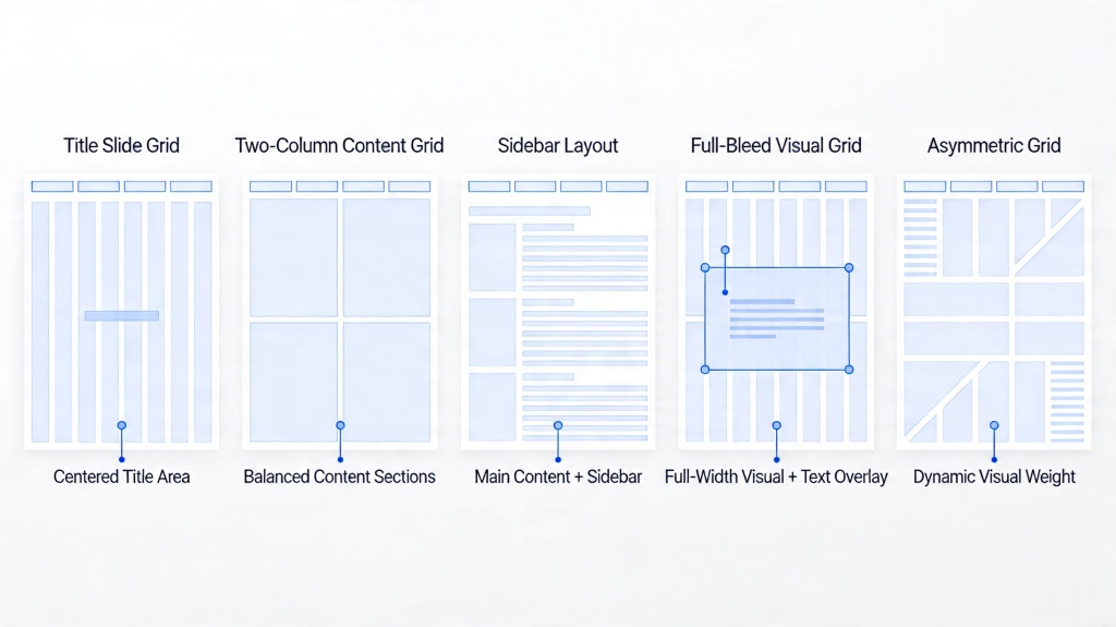
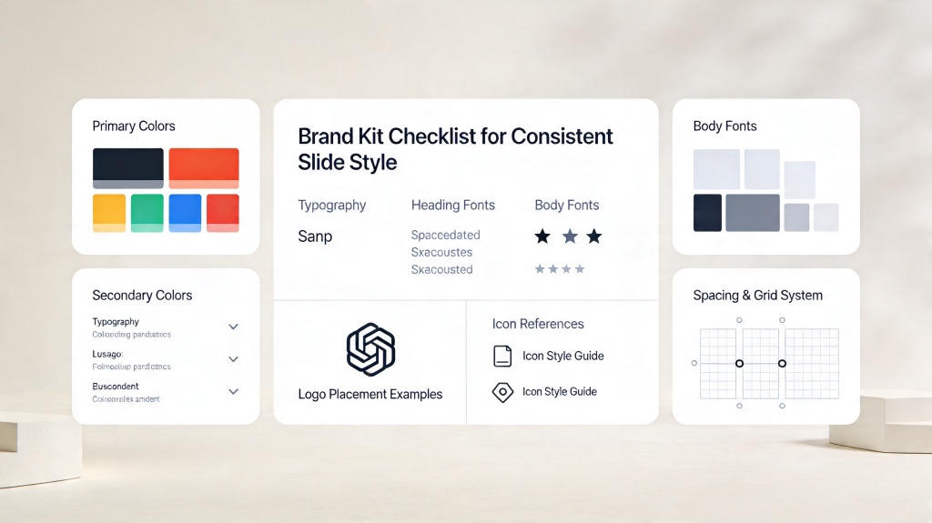
- Inconsistent Margins: Jumping between different margin sizes on every slide makes the deck feel disjointed. Use a grid system to maintain consistency.
Practical Steps to Audit Your Current Slide Deck
Ready to improve your slides? Follow this quick audit to ensure your visual hierarchy is on point:
- The Squint Test: Squint at your slide until the details blur. What is the one thing that still stands out? If it's not your main message, resize your elements.
- The 5-Second Rule: Show your slide to someone for 5 seconds. Ask them what the main point was. If they can't tell, you need more white space.
- Check Your Ratios: Ensure your headline is at least twice as large as your subheaders, and your subheaders are larger than your body text.
- Clean the Edges: Move all content away from the very edges of the slide to give it room to breathe.
FAQ: Solving Common Visual Hierarchy Challenges
What is the most important rule for visual hierarchy in slides?
The most important rule is to have a single, clear focal point. Use size and contrast to ensure the audience knows exactly where to look first. If you have multiple important points, consider splitting them into multiple slides.
How much whitespace should I leave on a slide?
Aim for at least 20-30% whitespace. This prevents cognitive overload and makes your content feel more professional and breathable. Whitespace isn't "wasted" space; it's a tool for focus.
Should I use different fonts for hierarchy?
It is generally better to use different weights (Bold, Regular, Light) of the same font family rather than mixing many different fonts. Mixing more than two font families often leads to a messy and inconsistent appearance.
Create your presentation with one click now
Don't spend hours wrestling with margins and font sizes. Let our AI handle the visual hierarchy for you, so you can focus on your story.
Try PopAi for Free