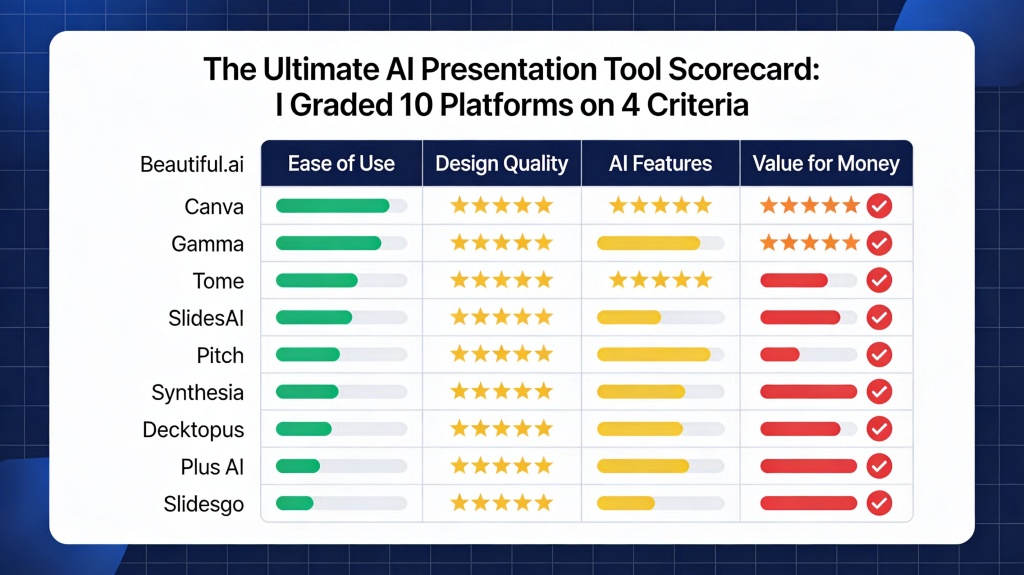
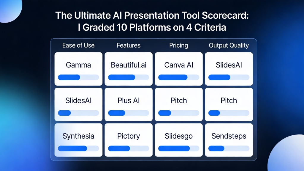
The Ultimate AI Presentation Tool Scorecard: I Graded 10 Platforms on 4 Criteria
Published on April 29, 2026 • By Sarah Jenkins
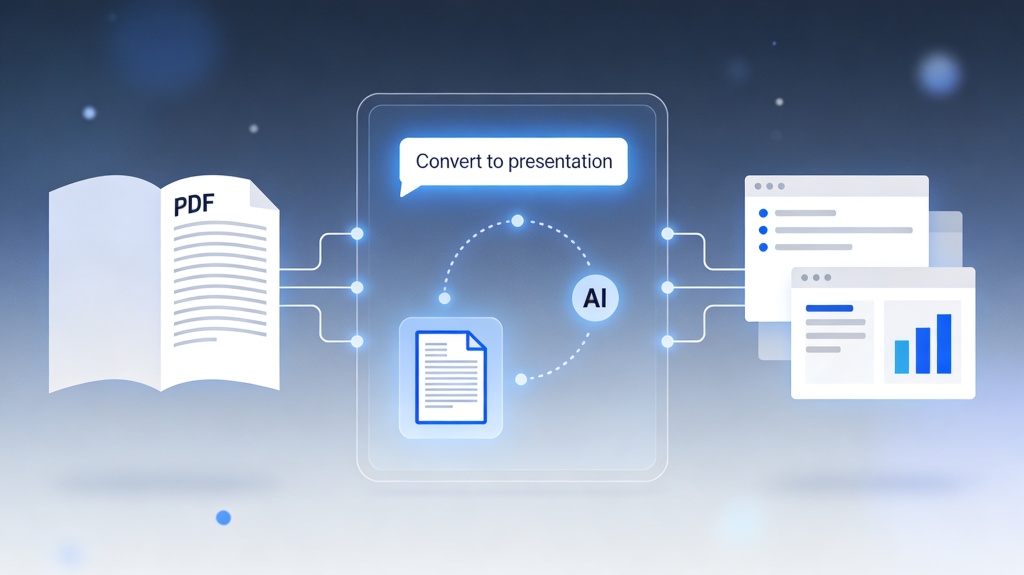
If you are a startup founder pitching to investors, a marketing manager presenting quarterly results, or an educator building a curriculum, you’ve likely felt the overwhelming "choice paralysis" of the modern software market. Every week, a new "game-changing" tool enters the fray, promising to turn a single prompt into a masterpiece. But do they actually deliver? Or do they just create more work for you to fix later?
To cut through the noise, I developed a rigorous AI presentation tool scorecard. I spent over 40 hours testing 10 of the most popular platforms—ranging from legacy giants adding AI features to nimble, AI-native startups. My goal was simple: identify which tools actually save time and which ones are just expensive digital toys. This scorecard isn't just about flashy features; it's about the practical reality of getting work done under a deadline.
The 4 Critical Criteria for Grading AI Presentation Software
To ensure a fair and objective evaluation, I graded each platform on a scale of 1 to 10 across four specific pillars. These criteria reflect the real-world pain points of presentation creation: the need for speed, the requirement for professional aesthetics, the demand for accurate content, and the necessity of flexible editing.
- Design Aesthetics (30%): Does the AI produce slides that look like they were made by a human designer? I looked for modern typography, balanced white space, and smart color palettes.
- Content Intelligence (30%): How well does the AI understand the prompt? Can it build a logical narrative arc, or does it just spit out generic bullet points?
- User Experience & Flexibility (25%): Is the interface intuitive? More importantly, how easy is it to change a layout or swap an image after the AI is done?
- Integration & Portability (15%): Can I export to PowerPoint? Does it work with Google Slides? Can I present live with interactive elements?
Pro Tip: When using an AI presentation tool, the quality of your output is 50% tool capability and 50% prompt engineering. To get the best results, always provide context about your audience and the specific goal of your deck. Try PopAi's prompt optimizer here.
Round 1: Design Aesthetics and Template Variety
In the first round of our AI presentation tool scorecard, I looked at visual impact. Many tools suffer from "template fatigue," where every presentation ends up looking like a generic SaaS landing page from 2018. The top scorers in this category were those that utilized dynamic layouts rather than static templates.
Platforms like Gamma and Beautiful.ai scored highly here because their AI understands visual hierarchy. They don't just place text on a slide; they arrange it in a way that guides the viewer's eye. However, some tools struggled with image selection, often choosing stock photos that felt disconnected from the content. The winners were those that allowed for easy style-switching—the ability to change the entire "vibe" of a 20-slide deck with one click without breaking the layout.
Round 2: Content Intelligence and Outline Generation
This is where the "AI" part of the AI presentation tool scorecard is truly tested. I provided each tool with the same complex prompt: "Create a 10-slide pitch deck for a sustainable lithium-ion battery recycling startup targeting Series A investors."
The results were polarized. Lower-tier tools provided a basic "Introduction, Problem, Solution" structure but filled the slides with "Lorem Ipsum" style fluff. The high-performers, including PopAi and Tome, actually researched the market (or simulated high-level market knowledge) to include specific industry trends and logical growth projections. A key differentiator was the ability to "rewrite" specific sections. If a slide was too wordy, could the AI condense it while keeping the professional tone? The best tools could.
Round 3: User Experience and Editing Flexibility
The most common frustration with AI tools is the "Black Box" effect—the AI makes something, and you can't change it. For this part of the scorecard, I graded how much control the user retains. If the AI places an image on the left, can I move it to the right without the whole slide breaking?
Canva's Magic Design scored well here because it leverages an existing, world-class editor. However, some AI-first tools felt clunky once you moved past the initial generation. The "Sweet Spot" is a tool that offers a "Co-pilot" experience rather than an "Auto-pilot" experience. You want an AI that suggests layouts while you maintain the final say on every pixel. Tools that enforced strict, unchangeable grids received the lowest scores in this round.
Round 4: Integration and Export Options
A beautiful presentation is useless if you can't show it to anyone. In the final round of the AI presentation tool scorecard, I tested export capabilities. Many modern tools prefer you to stay within their ecosystem, sharing a "live link." While great for tracking analytics, corporate environments often demand a .pptx or .pdf file.
I found that while almost all tools offer PDF export, only a few handle the transition to PowerPoint gracefully. Often, fonts are replaced, and layouts shift. Platforms that prioritize "clean" exports—where text remains editable in PowerPoint—earned bonus points. Additionally, integrations with data sources like Excel or Google Sheets are becoming the new frontier for AI tools, allowing for real-time chart updates.
The Final Verdict: Which Platform Wins the Scorecard?
After tallying the points across all 10 platforms, a few clear leaders emerged. For those who prioritize speed and "one-click" magic, PopAi and Gamma are the current gold standards. They balance content intelligence with stunning, modern design better than anyone else in the market.
If you are looking for a tool that fits into a legacy workflow, Canva and Beautiful.ai offer the most stability. However, the overall winner of our 2026 scorecard is the platform that treats AI as a collaborator. The future of presentations isn't about replacing the human presenter; it's about removing the friction between an idea and its visual representation. Whichever tool you choose, ensure it ranks high on "Flexibility"—because your unique voice is the only thing the AI can't replicate.
FAQ: Choosing the Right AI Tool for Your Needs
What is the most important factor in an AI presentation tool scorecard?
While design is subjective, the most critical factor is "Editing Flexibility." An AI that generates a great deck but makes it impossible to change a single icon or font is ultimately useless for professional workflows. You need to be able to refine the AI's work to match your specific brand voice.
Can AI tools replace professional presentation designers?
AI tools are exceptional for speed and structure, but professional designers are still needed for high-stakes brand consistency and complex storytelling. However, for 90% of business and educational needs, AI tools provide sufficient quality and save hours of manual labor.
Is there a free AI presentation maker that ranks well on the scorecard?
Yes, many platforms like PopAi offer robust free tiers that allow you to test the content intelligence and design output before committing to a premium plan. This is the best way to see if the tool's "logic" matches your industry's needs.
Create your presentation with one click now
Stop struggling with blank slides. Use PopAi to transform your ideas into professional, high-impact presentations in seconds.
Get Started for Free