Slide Design Mistakes to Avoid Before You Present
July 2, 2026
The fastest way to improve a deck before presenting is to fix the problems that block understanding: crowded text, unclear headlines, weak contrast, inconsistent fonts, messy alignment, cluttered charts, poor images, and unnecessary animation. You do not need to redesign every slide from scratch. Start by making the main message obvious, then clean the layout, then polish the visual style.
Most slide design mistakes happen when the presenter tries to put everything on the slide at once. The audience reads paragraphs instead of listening, important numbers disappear, and random colors or images make the deck feel less credible. A practical review checklist helps you decide what to fix first when time is short.
Good slide design is not just talent. It is a set of repeatable decisions: one point per slide, clear hierarchy, readable contrast, consistent spacing, useful visuals, and restrained motion. AI presentation tools can speed up rewriting, outlining, and draft creation, but the final judgment still belongs to you.
When you are ready to turn the workflow into slides, PopAi AI Presentation can help transform rough notes, documents, or prompts into an editable deck structure.
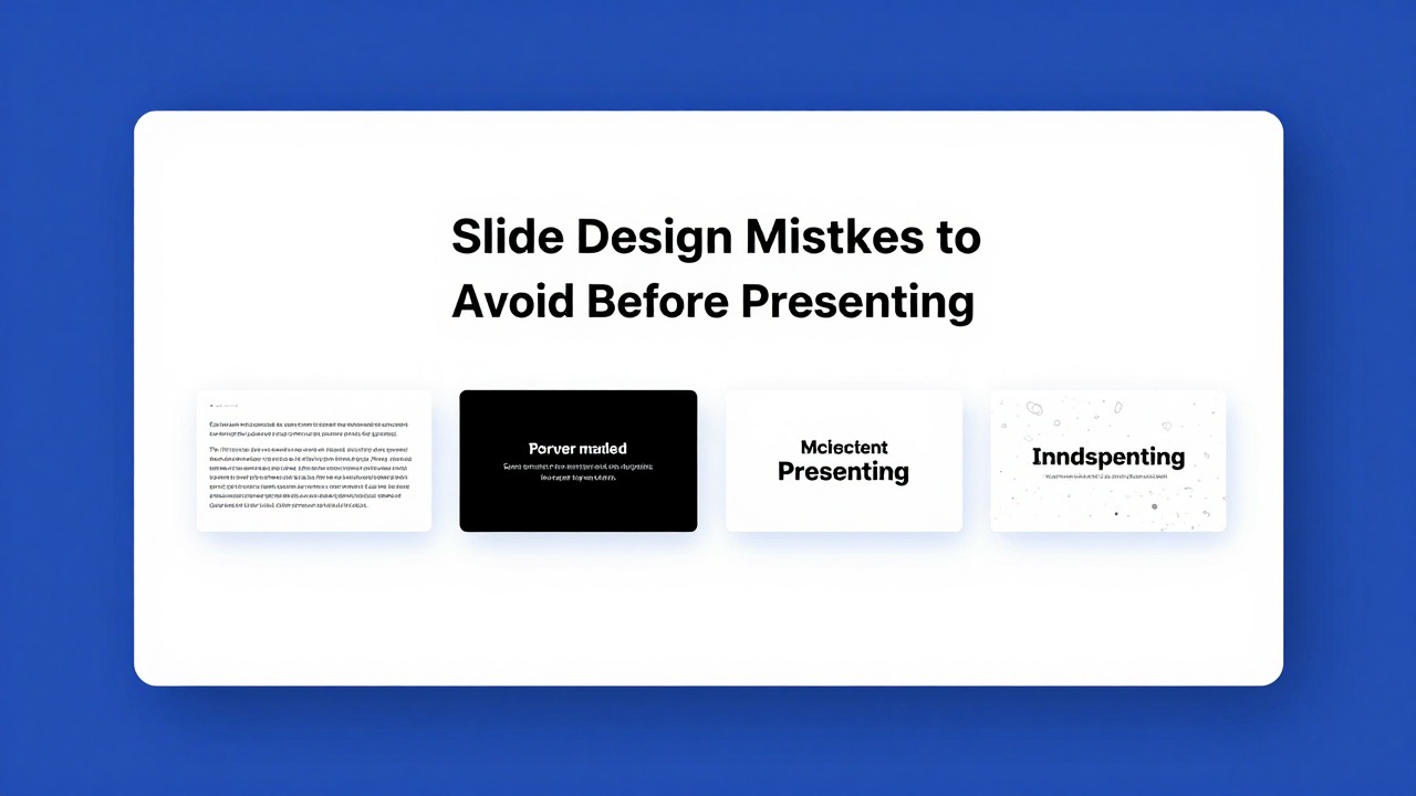
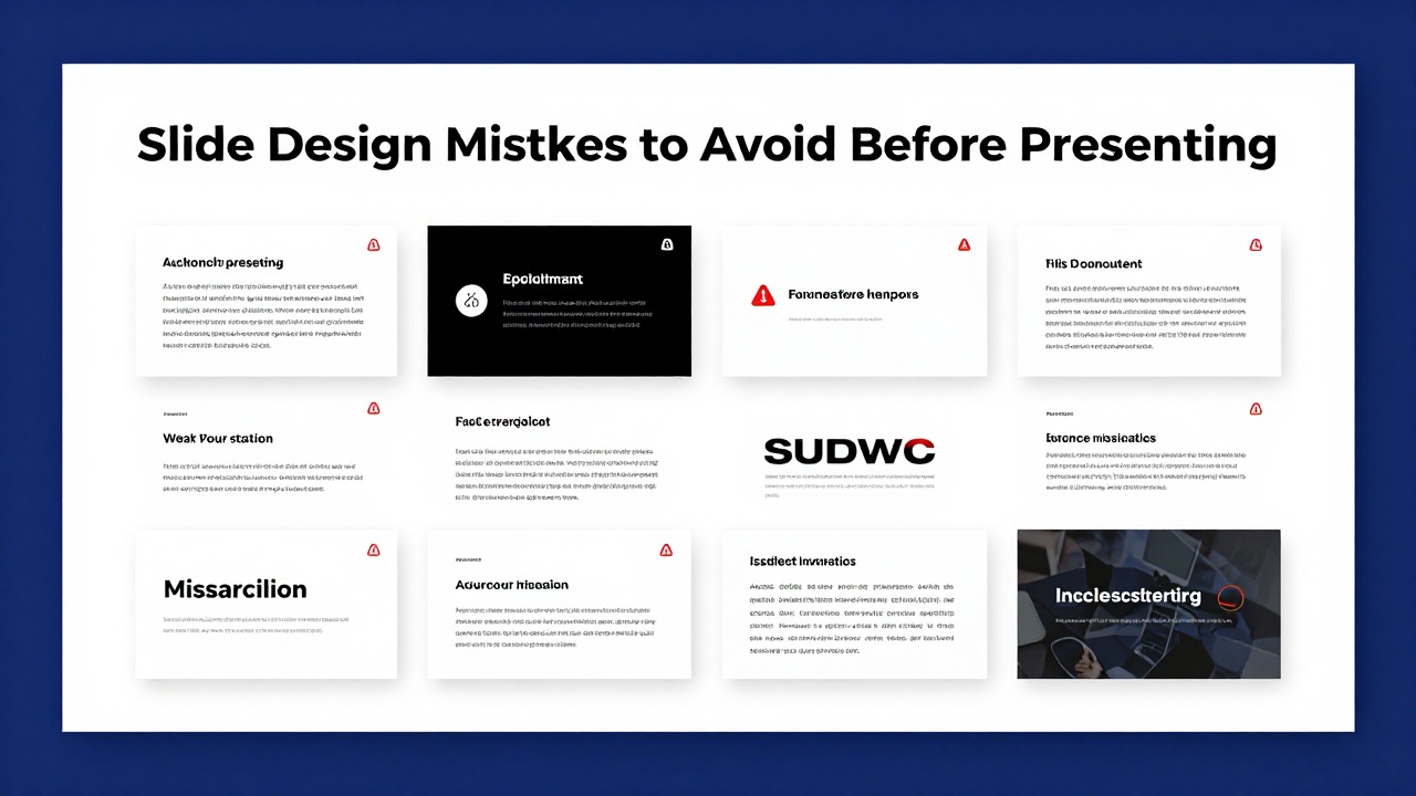
The 10 slide design mistakes to fix first
This section gives you a prioritized repair order for the most visible problems in a deck.
A familiar ugly PPT usually has the same symptoms: crowded paragraphs, three or four font styles, colors that fight the background, random stock photos, floating text boxes, and no obvious takeaway. The presenter may know the material well, but the slide makes the audience work too hard to find the point.
The best repair sequence is message first, layout second, polish third. If the main point is unclear, a better icon set will not save the slide. If the objects are scattered, a nicer color palette will still feel messy. If the text is overloaded, no template can make the content easy to absorb.
- Too much text: paragraphs, long bullets, repeated phrases, and slide titles that describe the topic instead of stating the takeaway.
- No clear hierarchy: every item has the same size, color, and weight, so the audience cannot tell what to read first.
- Poor contrast: light gray text on white, dark text on a dark image, or key numbers that blend into the background.
- Inconsistent fonts: different typefaces, random font sizes, mixed capitalization, and inconsistent bullet styling.
- Misaligned elements: text boxes, charts, icons, and images placed by eye instead of aligned to a common edge or grid.
- Weak spacing: cramped content, uneven gaps, tiny margins, or objects placed randomly to fill empty space.
- Messy charts: too many data series, unreadable labels, unnecessary gridlines, and no visible insight.
- Low-quality visuals: stretched images, pixelated screenshots, decorative stock photos, or visuals that do not support the message.
- Overused animation: spinning objects, excessive transitions, inconsistent timing, or effects that slow down the story.
- Inconsistent slide style: each slide looks like it came from a different deck, with changing colors, layouts, icon styles, and title positions.
- Read the slide title only and ask, “Do I know the point?” If not, rewrite the title as a conclusion.
- Look at the slide from arm’s length or zoom out to slide sorter view. If everything looks equally important, fix hierarchy.
- Turn on guides or use alignment tools. If objects do not share edges, clean the layout before changing colors.
- Check the deck as a sequence. If the title position, fonts, or color treatment changes without purpose, standardize it.
A polished slide is not the one with the most decoration; it is the one where the audience understands the point fastest.
Fix unclear slide messages before changing the visuals
Message clarity comes before decoration because layout and style should support one clear idea.
The one-message-per-slide rule means each slide should make one main point obvious. A slide can include supporting evidence, a chart, a short example, or a visual, but all of those elements should reinforce the same conclusion. If a slide tries to explain market growth, product roadmap, pricing, and customer feedback at the same time, it is probably four slides hiding inside one.
A common before-and-after example is a quarterly performance slide. Before, the slide title says “Q3 Performance Review,” followed by a long paragraph about sales, churn, new accounts, regional differences, and next steps. The audience has to read while the presenter talks. After, the title says “Q3 growth was strong, but retention needs attention.” Under it are three short bullets: “Revenue up in enterprise accounts,” “Churn increased in SMB segment,” and “Renewal outreach starts next week.” One simple bar or line chart supports the point.
- Rewrite topic titles as takeaway titles. Change “Marketing Campaign Results” to “Email drove the most qualified leads in April.”
- Cut repeated phrases. If three bullets begin with “The team needs to,” keep the action and remove the repetition.
- Move details to speaker notes. The slide should guide the audience; your notes can hold context, caveats, and full explanations.
- Group related points. Put customer, product, and financial points into separate slides or clear clusters.
- Bold only the words that matter. Use emphasis for one key number, term, or decision, not for entire sentences.
- Replace dense prose with a headline, three bullets, and one visual when the audience needs to understand quickly.
Hierarchy is how you tell the eye what matters. On a text-heavy slide, increase the title size, shorten the subtitle, keep bullet indentation consistent, and use stronger contrast for the key number or term. For example, if the slide’s point is that “support tickets fell 18% after onboarding changes,” make that phrase the headline or the most visually prominent element. Do not hide it in the third bullet.
If you have a document, meeting notes, or a rough outline, AI presentation software can help convert the material into an editable deck structure with concise titles and slide-ready bullets. A practical workflow is to upload or paste your source content, ask for a presentation outline for your specific audience, review the generated slide titles, then edit each title into a direct takeaway. This is useful when your current deck feels like a document pasted into PowerPoint.
- For each slide, write the sentence you want the audience to remember.
- Turn that sentence into the slide headline.
- Keep only the evidence that proves or explains the headline.
- Remove side points, background details, and duplicate wording.
- Add speaker notes for the details you still need to say aloud.
Use alignment, spacing, and consistency to make slides look professional
Clean layout principles can make an ordinary slide look more deliberate within minutes.
Alignment means objects share a clear visual edge or center line. Proximity means related items sit close together while unrelated items have more space between them. Repetition means the deck uses recurring placements, colors, type sizes, and visual patterns. White space means empty space is used intentionally to create focus, not treated as a gap that must be filled.
- Align text boxes to the same left edge instead of placing each one by eye.
- Group related objects, such as an icon, label, and short explanation, so they read as one unit.
- Repeat title placement across slides so the audience does not have to reorient each time.
- Keep margins consistent, especially on slides with charts, images, or multiple content blocks.
- Increase space around the most important element to make it feel intentional and easier to read.
- Use empty space to direct attention. A slide does not need to be filled from corner to corner.
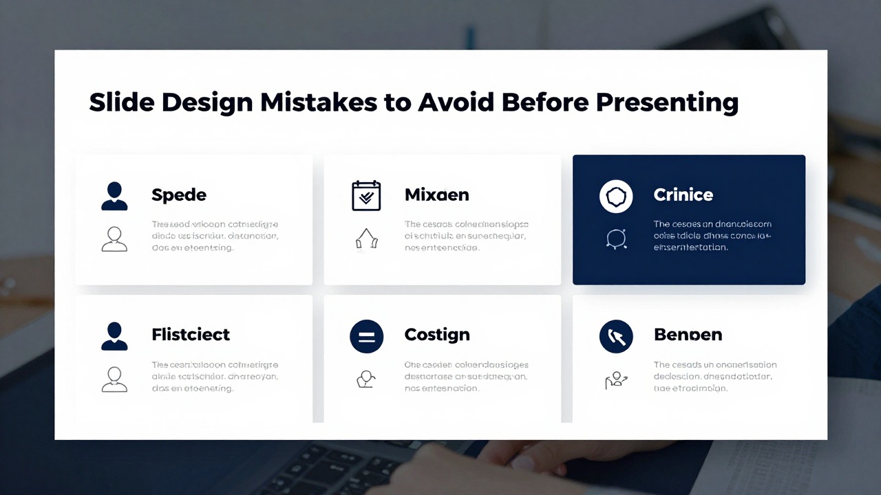
A simple grid helps when a slide has multiple elements. Use a two-column layout when you need text plus an image, a three-card layout when comparing options, and a horizontal timeline when showing process steps or milestones. The grid does not need to be visible to the audience; it simply gives your objects a structure.
- Cover slide: place the title, subtitle, date, and presenter name in a clear block. Avoid crowding the corners with logos, labels, and decorative shapes.
- Agenda slide: keep sections parallel in length and style. If one agenda item is a sentence and the others are short phrases, rewrite for consistency.
- Body slide: choose one layout pattern per purpose, such as headline plus three supporting cards, text plus visual, or chart plus interpretation.
- Timeline slide: use consistent spacing between milestones when the timing is equal; vary spacing only if the actual time intervals matter.
- Summary slide: highlight the decision, recommendation, or next steps instead of repeating every detail from the deck.
Random placement is one of the quickest ways to make a slide feel amateur. Many non-designers move elements around until the slide “looks full,” but fullness is not the goal. Balance is the goal. A large image on the right can be balanced by a concise headline and two bullets on the left. A single number can sit in open space if that number is the main message.
Before changing your template, turn on guides or use your presentation app’s align and distribute tools. Many slides improve immediately when objects share a clean edge and equal spacing.
White space is not wasted space. It is the breathing room that makes important content easier to notice.
AI-assisted layout suggestions and smart templates can speed up consistency, especially when you are starting from rough content. AI presentation tools, Gamma, Beautiful.ai, and other AI presentation platforms may help create a more coherent starting structure. Still, review each slide for balance, readability, and audience context. A generated layout can be attractive but still wrong for your message if it emphasizes the wrong element.
Correct color, font, image, and icon mistakes that distract your audience
Visual style should make your message easier to understand, not compete with it.
Color mistakes often come from using decoration as the main goal. Low contrast makes text hard to read. Too many colors make the slide look noisy. Clashing backgrounds weaken credibility. Decorative colors that do not communicate meaning can confuse the audience, especially when one slide uses red for warning and another uses red only because it looked interesting.
- Use one main color for the deck, one supporting color for secondary elements, and one accent color for emphasis.
- Use the 60-30-10 balance when appropriate: roughly 60% neutral or background, 30% supporting color, and 10% accent.
- Check contrast on projectors and shared screens. If the text is barely readable on your laptop, it will be worse in the room.
- Use bright accent colors sparingly for the most important number, label, or action.
- Avoid placing text directly on busy images unless you add a dark overlay, light panel, or clear text area.
Typography problems are usually consistency problems. A professional deck does not need fancy fonts. It needs readable fonts used predictably. Limit the deck to one or two font families. Use size, weight, and color to create hierarchy. For example, a slide might use a bold 34-point title, a 20-point subtitle, and 16- to 18-point body text. The exact sizes depend on the room, screen, and deck format, but the relationship should be clear.
- Use font weight for emphasis before adding extra colors or underlines.
- Avoid mixing multiple decorative fonts, especially in business, research, or classroom presentations.
- Keep body text readable from the back of the room; avoid tiny footnotes unless they are truly necessary.
- Use consistent bullet indentation and line spacing so each slide feels part of the same system.
- Do not capitalize entire paragraphs. All caps can work for short labels but becomes tiring for long text.
Images should clarify the point, create context, or provide evidence. A stretched photo, pixelated screenshot, or vague stock image can make the slide look less trustworthy. If the image does not add meaning, remove it and give the content more space.
- Use clear, relevant, high-quality images that match the topic and tone.
- Crop images intentionally instead of stretching them to fit a box.
- Keep image treatment consistent, such as all full-bleed photos, all rounded cards, or all screenshots in the same frame style.
- Avoid decorative stock photos that only repeat the obvious, such as a handshake image on a partnership slide with no specific insight.
- Use screenshots only when the audience needs to see the interface, evidence, or workflow.
Icons are useful when they label categories, steps, features, or actions. They become distracting when the deck mixes filled icons, outline icons, 3D icons, emojis, and clip art without a reason. Pick one icon style and use it consistently. If an icon does not make the label clearer, the label may be enough.
When you use AI presentation software to generate a deck from a prompt or source document, treat the output as an editable draft. Review the suggested structure, then standardize font sizes, title placement, colors, image choices, and icon style before presenting. This workflow is helpful for class decks, sales overviews, research summaries, and pitch outlines where you need a coherent first version quickly.
Clean up charts, data slides, and animations before presenting
Information-heavy slides need stronger editing because the audience must see the point immediately.
Chart slides fail when the audience cannot immediately answer, “What am I supposed to notice?” A chart is not just a data container. It is visual evidence for a point. If the presenter has to explain every axis, label, series, and exception before the audience sees the insight, the chart is too hard to read.
- Use a line chart for trends over time, such as monthly revenue, attendance, or adoption.
- Use a bar chart for comparisons, such as region performance, survey responses, or product categories.
- Use a pie chart only when the parts of a whole are simple, limited, and easy to compare.
- Avoid 3D charts because they can distort perception and make values harder to compare.
- Remove unnecessary gridlines, borders, shadows, and decorative effects.
- Label important values directly when possible instead of forcing the audience to decode a legend.
- Use color to highlight the main comparison, not to decorate every bar or line.
A dense data slide can often become a headline plus one visual plus one interpretation. For example, replace a spreadsheet screenshot with the headline “Renewals are strongest in accounts onboarded within 30 days.” Then show a simplified bar chart comparing renewal rates by onboarding speed. Add one short interpretation under the chart: “Faster onboarding appears linked to stronger retention, so the next test should focus on early customer activation.”
- Write the insight before choosing the chart.
- Choose the simplest chart type that proves the insight.
- Remove any series, label, or note that does not support the point.
- Highlight the most important value or comparison with one accent color.
- Add a short interpretation so the audience knows why the chart matters.
Animations and transitions should guide attention, not announce themselves. Common animation mistakes include too many transition types, dramatic effects on ordinary content, inconsistent timing, and sequences that force the presenter to click through every minor object. Motion becomes especially risky in remote presentations, where lag or screen sharing can make effects feel awkward.
- Use animation to reveal steps in a process when showing everything at once would be confusing.
- Use a simple fade or appear effect to guide attention to one point at a time.
- Keep timing consistent across similar slides.
- Remove spinning, bouncing, zooming, and other effects unless there is a deliberate reason.
- Test animations in presentation mode before the meeting, especially if you will share your screen.
If animation makes the audience notice the effect more than the idea, remove the effect.
Run this presentation design checklist before you present
Use this practical review workflow to catch design problems under time pressure.
A pre-presentation checklist keeps you from polishing the wrong thing. Do not spend 20 minutes choosing a new background if the slide title is vague or the chart is unreadable. Work from comprehension to consistency: message, structure, hierarchy, layout, visuals, motion, and proofreading.
- Message clarity: Every slide should have one main point. Rewrite vague titles as takeaway headlines.
- Deck structure: Check that the story flows logically from problem to evidence to recommendation or from concept to example to action.
- Hierarchy: Make the title, key number, or decision visually stronger than supporting details.
- Contrast: Confirm that text, chart labels, and important numbers are readable against the background.
- Alignment: Align objects to common edges and remove floating elements that appear accidental.
- Spacing: Add breathing room around key content and keep margins consistent.
- Font consistency: Limit font families, standardize title and body sizes, and remove random styling.
- Color consistency: Use a controlled palette and reserve accent color for meaning or emphasis.
- Image quality: Replace stretched, pixelated, irrelevant, or mismatched images.
- Chart clarity: Simplify data, label the important values, and highlight the main comparison.
- Animation: Remove effects that slow the story or distract from the message.
- Proofreading: Check spelling, names, dates, numbers, source labels, and final slide order.
If you have only 10 minutes, focus on the fixes the audience will feel immediately. Shorten text. Align objects. Increase contrast. Remove weak visuals. Check the first and last slides. The opening slide sets credibility, and the final slide often carries the action you want the audience to remember.
- 10-minute fix: delete extra words from the most crowded slides.
- 10-minute fix: align titles and body content across the deck.
- 10-minute fix: increase contrast for titles, labels, and key numbers.
- 10-minute fix: remove any image, icon, or animation that does not support the message.
- 10-minute fix: review the cover slide and closing slide for professionalism and clarity.
If you have 30 to 60 minutes, do a deeper repair. Review the deck flow in slide sorter view. Standardize layouts by slide type. Improve visuals that look mismatched. Simplify the densest charts. Rehearse slide transitions so you know where the story may feel abrupt. This level of review is especially useful before pitches, executive updates, lectures, webinars, and client presentations.
- 30- to 60-minute fix: review whether each slide earns its place in the story.
- 30- to 60-minute fix: standardize cover, agenda, section divider, body, chart, and summary layouts.
- 30- to 60-minute fix: replace generic visuals with evidence, diagrams, screenshots, or cleaner supporting images.
- 30- to 60-minute fix: simplify charts so each one supports a specific takeaway.
- 30- to 60-minute fix: rehearse transitions between slides and add speaker notes where the logic needs support.
Use AI presentation software when the issue is not just visual polish but structure. For example, a consultant can paste rough client discovery notes into AI presentation software and ask for a problem-solution-recommendation deck outline, then refine the generated slides for accuracy and tone. A student can upload research notes and create an editable presentation draft, then shorten text, check citations, and adjust visuals for class delivery. In both cases, AI speeds up the first structure and rewriting pass, while the presenter still reviews brand fit, accuracy, and audience needs.
The goal is not decoration. The goal is making the message easy to understand before the audience loses attention.
FAQ
What are the biggest slide design mistakes to avoid?
The biggest mistakes are too much text, weak visual hierarchy, poor contrast, inconsistent fonts, bad alignment, cramped spacing, cluttered charts, low-quality images, and unnecessary animation. Fix message clarity first, then layout, then visual polish.
How do I know if my slide has too much text?
If the audience must read paragraphs while listening to you, the slide is overloaded. Use one main idea, a takeaway headline, short supporting bullets, and speaker notes for details that do not need to appear on screen.
What should be included in a presentation design checklist?
A useful checklist should cover message clarity, deck structure, hierarchy, contrast, alignment, spacing, font consistency, color consistency, image quality, chart clarity, animation, slide flow, and proofreading.
How can I fix a messy PowerPoint quickly?
Start by clarifying the main message of each slide. Delete extra text, align objects, increase contrast, standardize fonts and colors, simplify charts, remove weak visuals, and check that the opening and closing slides look polished.
Can AI help fix slide design mistakes?
Yes. AI tools can help outline a deck, summarize documents, rewrite crowded text, suggest clearer slide titles, and create editable presentation drafts. You should still review accuracy, audience fit, brand style, readability, and final visual judgment.
Build slides faster from your source material
Turn notes, prompts, documents, or rough outlines into a clearer presentation draft, then edit the story, facts, and visual details before presenting.
Try PopAi AI Presentation