For many professionals, slide animations feel like a double-edged sword. On one hand, they can make a presentation feel dynamic and high-end; on the other, they often become a distracting mess of flying text and spinning shapes that scream "amateur." If you've ever sat through a deck where every sentence "bounced" into view, you know exactly why slide animation best practices focus so heavily on restraint.
The goal of a minimal, clean presentation isn't to eliminate motion entirely, but to use it as a functional tool. In this guide, we will explore how to implement motion that enhances your narrative, maintains professional polish, and ensures your audience stays focused on your message rather than your transitions.
The Psychology of Minimalist Animation
In cognitive psychology, the "Saliency Map" refers to how our brains prioritize visual information. Movement is one of the strongest cues for attention. When you animate an object, you are effectively telling the audience, "Look here right now."
Minimalist animation respects the audience's limited cognitive load. By using subtle transitions, you guide the eye from a finished thought to a new one. If the animation is too fast, it creates a "startle" response. If it is too slow, it creates impatience. The "clean" approach ensures that the motion is felt rather than consciously observed.
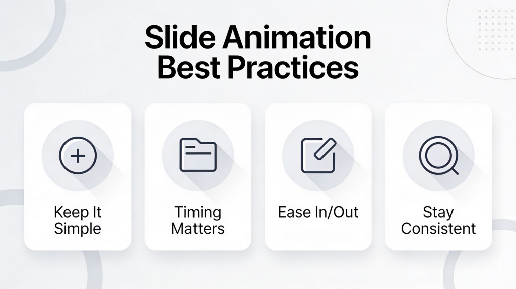
Core Principles of Clean Motion Design
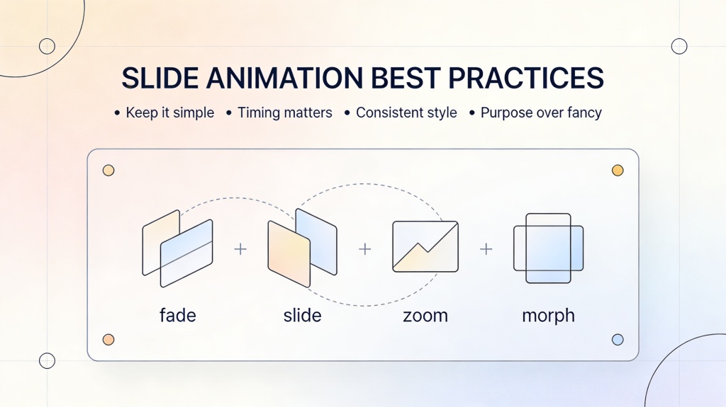
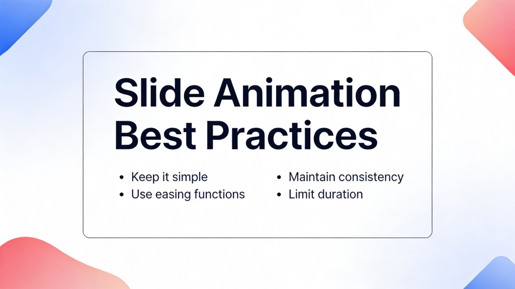
Before applying any effects, keep these three principles in mind to ensure your slide animation best practices remain consistent:
- Purpose: Never animate just because you can. Every motion should serve a function—like introducing a new concept or showing a relationship between two data points.
- Consistency: Use the same transition and entrance effects throughout the entire deck. Switching between "Wipe" and "Float In" creates visual noise.
- Hierarchy: Animate primary elements (headings) slightly differently or before secondary elements (body text) to establish a clear reading order.
Pro Tip: Most professional decks rely on just two types of animations: Fade and Push. These provide the smoothest experience for corporate environments. Learn more about professional design at PopAi Presentation Maker.
Essential Animation Types for Professional Decks
To maintain a "minimal clean" aesthetic, you should stick to a curated list of effects. Avoid anything labeled "Exciting" or "Dynamic" in traditional software menus.
1. The Subtle Fade
The Fade is the ultimate minimalist tool. It allows elements to appear smoothly without any directional movement. It is perfect for bullet points or revealing a chart after you've set the context.
2. The Clean Push
The Push transition mimics the natural movement of a camera or a physical page. When moving between slides that share a narrative thread, a Push from right-to-left creates a sense of progression. A Push from bottom-to-top is excellent for "leveling up" or moving to a summary slide.
Timing and Duration: The Secret to Smoothness
The difference between a "laggy" presentation and a "snappy" one is often just 0.2 seconds. For a clean look, timing is everything.
The Golden Rule: 0.3s to 0.5s. Most default software settings set animations to 1.0 second or longer. This is almost always too slow. A 0.5-second duration is long enough to be seen but fast enough to keep the energy high. For internal element entrances (like icons or small text blocks), 0.3 seconds is often sufficient.
Additionally, consider "Easing." Clean design often uses Ease-In-Out, where the motion starts slow, speeds up in the middle, and slows down at the end. This mimics natural physics and feels much more premium than linear, robotic movement.
Common Pitfalls to Avoid in Slide Animation
Even with the best intentions, it’s easy to cross the line into "distracting." Watch out for these common mistakes:
- The "Whole Slide" Animation: Animating every single word or icon separately. If you have 10 icons, animate them as a single group or in three small clusters.
- Directional Conflict: If your slide transition pushes from the right, but your text flies in from the left, you create visual "clashing" that confuses the eye.
- Sound Effects: Never use built-in slide sounds (whooshes, clicks, typewriters). They are the fastest way to lose credibility in a professional setting.
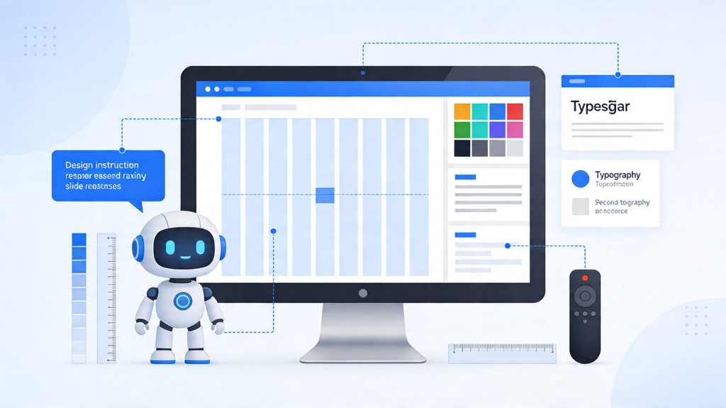
How AI Enhances Minimalist Slide Animation
Manually setting durations and easing for 50 slides is tedious. This is where modern tools like PopAi come into play. By leveraging AI, you can apply slide animation best practices automatically across your entire deck.
AI-driven presentation makers understand the content structure. They can detect where a "reveal" is necessary for a punchline or where a "Push" transition would best represent a chronological sequence. This ensures that your minimalist aesthetic is maintained with mathematical precision, saving you hours of manual tweaking.
Frequently Asked Questions
How long should a standard slide animation last?
+
For a professional, minimal look, animations should last between 0.3 and 0.5 seconds. Anything longer feels sluggish, while anything shorter can feel jarring and "glitchy."
Should I animate every bullet point in my presentation?
+
Only if it serves a purpose. Animating bullet points one by one helps prevent the audience from reading ahead of your speech. However, if the list is short (3 items or fewer), a simple fade-in for the whole block is often cleaner.
What is the best animation for a clean corporate deck?
+
The "Fade" and "Push" transitions are the gold standard for clean design. They provide motion without the distracting "wow" factor of more complex effects like "Honeycomb" or "Gallery."
Create your presentation with one click now
Apply professional, minimal animations and clean design layouts instantly with PopAi's intelligent presentation engine.
Get Started for Free