How to Turn Data into Clear Slides (charts rules)
Published on April 21, 2026
In the modern corporate world, we are drowning in data but starving for clarity. Many professionals—from marketing managers to startup founders—face the same daunting challenge: they have valuable insights hidden in spreadsheets, but their slides look like a "data dump." When your audience is forced to squint at tiny numbers or decipher complex legends, you lose their attention and your persuasive power. Mastering data visualization for presentations isn't just about making things look pretty; it's about making your data speak clearly and convincingly.
The Fundamentals of Data Visualization for Presentations
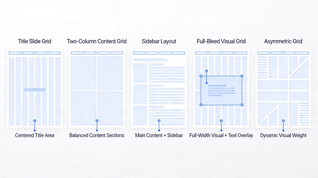
The first rule of turning data into clear slides is understanding that a slide is not a report. A report is meant to be read; a slide is meant to be processed in seconds while the audience listens to you. This distinction is critical. When designing your charts, focus on the "Signal-to-Noise Ratio." The signal is the information you want to convey, and the noise is everything else—gridlines, redundant labels, and excessive colors.
To ensure your audience grasps the point immediately, ask yourself: "What is the one thing I want them to remember from this chart?" If the answer is "revenue grew by 20%," then everything on that slide should serve that specific conclusion. Data visualization for presentations requires a ruthless commitment to simplicity.
Choosing the Right Chart for Your Narrative
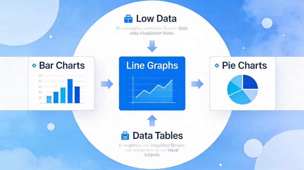
Selecting the wrong chart type is the fastest way to confuse your audience. Each data structure has a "natural" visual counterpart. For instance, if you are showing a trend over time, a line chart is almost always superior to a bar chart because it emphasizes the flow and direction of change.
- Bar Charts: Best for comparing distinct categories (e.g., sales by region).
- Line Charts: Ideal for showing continuous changes over time (e.g., monthly active users).
- Pie Charts: Use sparingly. They are only effective for showing parts of a whole where the differences are dramatic. Never use more than 3-4 slices.
- Scatter Plots: Great for showing relationships between two variables, but use them only with data-literate audiences.
Pro Tip: Don't let your software choose the chart for you. Use PopAi's Presentation Maker to automatically suggest the most impactful layout for your specific dataset.
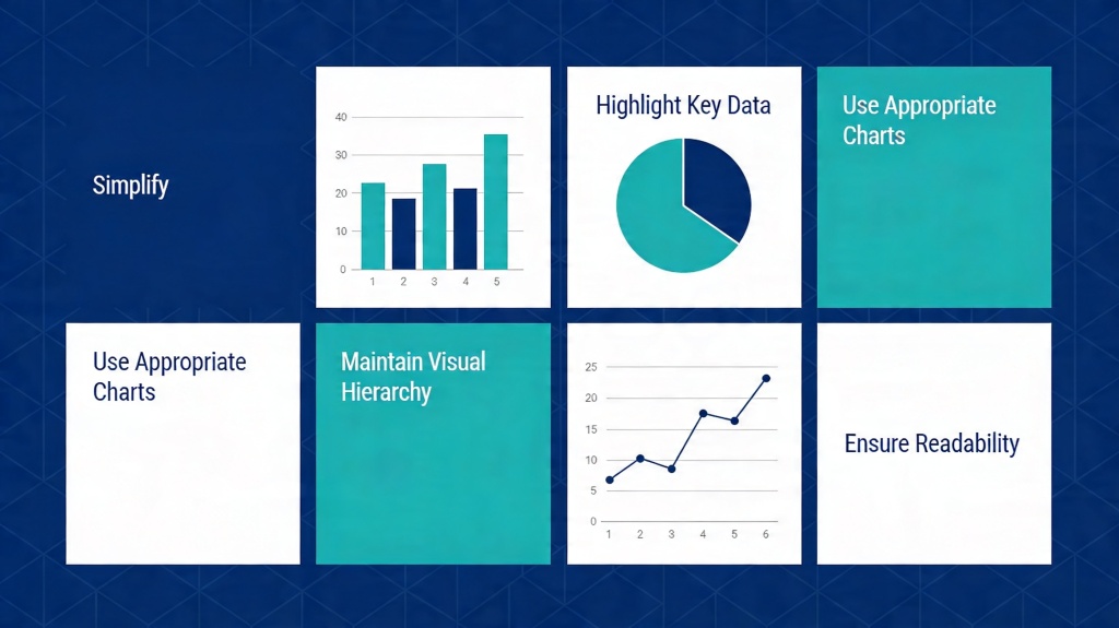
The Golden Rules of Minimalist Chart Design
Once you've chosen the right chart, you must refine its design. Minimalist design isn't just an aesthetic choice; it's a cognitive one. By removing distractions, you reduce the mental load on your audience. Here are the core "charts rules" for professional slides:
- Remove Gridlines and Borders: In most cases, the exact value of a data point is less important than the overall trend. If the specific number matters, label the bar directly.
- Direct Labeling: Avoid legends whenever possible. Place labels directly next to the data lines or bars so the audience doesn't have to look back and forth between a key and the chart.
- Use Color Strategically: Use grey for most of your data and a vibrant color (like blue or orange) to highlight the specific data point you are discussing.
- The 5-Second Rule: If an audience member can't understand the main point of your chart in 5 seconds, it's too complex.
Turning Raw Data into Actionable Insights
Data without context is just noise. To turn data into clear slides, you must provide the "So What?" This is often done through the slide title. Instead of a generic title like "Q3 Revenue," use an assertive title like "Q3 Revenue Grew by 15% Due to New Partnerships." This tells the audience exactly what they should be seeing in the chart below.
Contextualize your numbers. A million dollars might sound like a lot, but is it more or less than last year? Is it above or below the target? Adding a "target line" or a "previous year comparison" bar can instantly make a static number meaningful.

Avoiding Common Data Pitfalls on Slides
Even seasoned professionals fall into traps that undermine their credibility. The most common pitfall is using 3D effects. While they might look modern to some, 3D charts distort the perspective, making it impossible for the eye to accurately judge the height of bars or the size of pie slices. Always stick to 2D.
Another pitfall is the "Dual-Axis Trap." While it's tempting to put two different metrics on one chart (like Revenue and Customer Satisfaction), it often leads to confusion about which line belongs to which axis. It is almost always better to use two separate, small charts side-by-side.
Using AI to Streamline Data-Driven Slide Creation
Creating clear data slides manually can be incredibly time-consuming. Modern tools like PopAi have revolutionized this process. Instead of spending hours formatting charts in Excel and copying them into PowerPoint, you can leverage AI to analyze your data and generate the most effective visual representation automatically.
AI tools can help identify the "outliers" or the most significant trends in your data, suggesting annotations and titles that you might have missed. This allows you to focus on the strategy and delivery of your presentation rather than the pixels of your charts.
Frequently Asked Questions
What is the most common mistake in data visualization for presentations?
The most common mistake is 'data dumping'—including every available data point rather than highlighting the specific insight that supports your narrative. Always filter your data to show only what is necessary for your current argument.
Should I use 3D charts in my professional slides?
Generally, no. 3D effects distort the perception of data values and make it harder for the audience to compare categories accurately. Stick to clean, 2D visuals for maximum clarity.
How many colors should I use in a single chart?
Stick to a primary color for your data and a secondary 'action' color for the point you want to highlight. Avoid using more than 3-4 distinct colors unless you are representing many distinct categories that must be differentiated.
Create your presentation with one click now
Stop struggling with complex data. Let PopAi turn your numbers into stunning, clear slides in seconds.
Get Started for Free