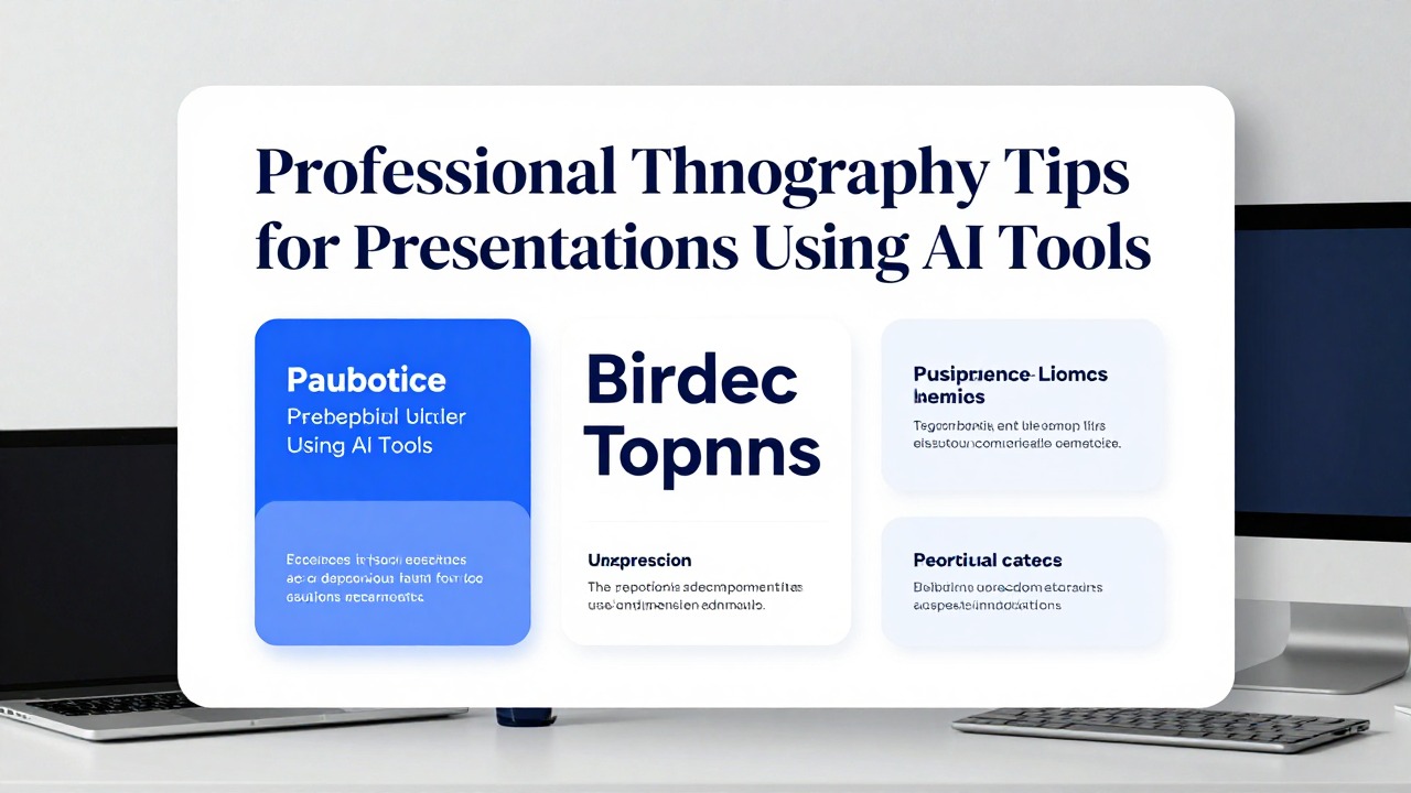
Professional Typography Tips for Presentations with AI
July 2, 2026
Professional typography in presentations means your text is readable, consistent, clearly ranked, and appropriate for the audience. If your slides feel cluttered, the fastest fixes are usually simple: use one or two font families, make titles noticeably larger than body text, create hierarchy with size and weight, align text to a clear edge, maintain strong contrast, and leave enough white space around each message.
Good presentation typography is not about decorative fonts. It is about helping the audience understand what to read first, what to remember, and what details support the point. The typical ugly-slide problem is familiar: cramped paragraphs, mismatched fonts, tiny chart labels, random bolding, low-contrast colors, and bullets that all look equally important.
AI tools can speed up the process, especially when typography problems begin with messy content. AI presentation software can help turn notes, prompts, or documents into structured slide drafts, rewrite dense text into concise slide copy, and give you an editable starting point. You still need to check font readability, hierarchy, spacing, contrast, and brand fit before presenting.
When you are ready to turn the workflow into slides, PopAi AI Presentation can help transform rough notes, documents, or prompts into an editable deck structure.
Quick Answer: What Professional Presentation Typography Looks Like
This section gives you the practical rules to make slide text look clearer and more professional immediately.
Professional presentation typography is readable, consistent, hierarchical, and suited to the setting. Readable means people can understand the slide from the back of a meeting room or through a screen share. Consistent means titles, subtitles, body text, labels, and captions follow a recognizable system across the deck. Hierarchical means the audience can instantly tell what matters most. Appropriate means the style fits the audience, whether you are presenting a quarterly update, a class lecture, a sales proposal, or a creative campaign.
The best professional typography presentations do not ask the audience to work hard. The title states the point. Supporting text is short. Labels are large enough to read. Fonts do not fight each other. Emphasis is used sparingly, so bold text actually means something. The slide feels calm because spacing, alignment, and contrast guide the eye.
- Use one primary font family, or one heading font plus one body font.
- Make the slide title clearly larger than the body text, not just slightly different.
- Use font weight, not multiple colors, as your first method of emphasis.
- Keep dark text on a light background or light text on a dark background for reliable contrast.
- Align titles, text boxes, icons, and charts to shared edges instead of placing them by eye.
- Leave visible white space around text blocks so the slide does not feel compressed.
- Avoid tiny chart labels, low-contrast captions, and dense paragraphs that only work as speaker notes.
A practical way to judge a slide is to look at it for three seconds and ask, “What is the one message I notice first?” If the answer is unclear, the typography is not doing its job. The fix may be as simple as rewriting the title as a takeaway, increasing the title size, reducing five bullets to three, and moving secondary details into a smaller but still readable text style.
Before editing colors or adding graphics, fix the text system: title, subtitle, body, label, caption, and callout. If those roles are clear, the slide will already look more intentional.
Choose Presentation Fonts That Match the Message and Screen
This section helps you choose font categories that fit business, education, pitch, and marketing slides without overcomplicating the deck.
Font choice should start with the audience and viewing environment, not personal taste. Presentation text often appears on projectors, conference screens, laptops, tablets, and video calls. That means clarity at different sizes matters more than subtle typographic personality. A beautiful font that becomes thin, cramped, or blurry on a projector is not a good presentation font.
Sans-serif fonts are usually the safest choice for presentations because their letterforms are clean and easy to scan on screens. They work well for business updates, product decks, training slides, sales presentations, and classroom material. Serif fonts can work when you want a formal, editorial, academic, or premium tone, but they need enough size and contrast. Display fonts should be used only as limited accents, such as a campaign title or section divider, because they often become distracting when used for body text.
- Business decks: choose neutral, readable fonts that do not distract from decisions, numbers, or recommendations.
- Education decks: prioritize clarity at a distance; avoid thin weights and tightly spaced type because students may view slides from the back of a room.
- Pitch decks: use confident, simple typography that makes the problem, solution, traction, and ask easy to scan.
- Marketing decks: allow more personality in headings, but keep body text and data labels controlled and readable.
- Creative decks: use expressive fonts selectively; pair them with a simple body font so the deck still feels professional.
A common mistake is mixing fonts because each individual slide looks interesting. The deck then feels fragmented. A safer system is one font family with several weights, such as regular, medium, semibold, and bold. This gives you enough variation for hierarchy without creating a mismatched look. If you use two font families, assign roles clearly: one for headings and one for body text. Do not switch roles halfway through the deck.
Avoid overly thin font weights for slide text. Thin type may look elegant on a designer’s monitor, but it can disappear in a bright room or on a compressed video call. Avoid script fonts, novelty fonts, and decorative fonts for anything the audience must read quickly. Also be careful with custom fonts if the deck will be opened on another device. If the font is not installed or embedded correctly, PowerPoint-style software may substitute it and break your layout.
If you are designing for a company, client, school, conference, or event, check the official brand guidelines first. Your best font choice may already be defined.
The right presentation font is not the most stylish one. It is the one that carries the message clearly under real viewing conditions.
Build Hierarchy with Size, Weight, Color, and Spacing
This section explains how to make the most important message on each slide obvious at first glance.
Hierarchy is the order in which the audience notices information. On a well-designed slide, people see the key takeaway first, supporting points second, and details third. On a weak slide, everything competes at the same level. When five bullets, a chart title, a footnote, a logo, and three colored callouts all shout at once, the audience has to decide what matters. That slows comprehension.
The simplest hierarchy tool is size. The main takeaway should be the largest meaningful text on the slide. The body text should be smaller but still readable. Captions, labels, and source notes can be smaller again, but not so small that they become decorative noise. Font weight is the next tool. Use semibold or bold to emphasize the important phrase, not every sentence.
- Title: states the point of the slide, not just the topic. Example: “Customer retention improved after onboarding changes” instead of “Retention Analysis.”
- Subtitle: adds context, such as audience, timeframe, segment, or scope.
- Section label: helps navigation, especially in long decks, but should not overpower the slide title.
- Body text: supports the title with short points, not full paragraphs copied from notes.
- Caption: clarifies an image, diagram, or example only when needed.
- Chart label: names values, categories, or highlights so the chart can be understood quickly.
- Callout: draws attention to one important number, risk, recommendation, or decision.
Color can help hierarchy, but it is easy to misuse. If every bullet has a different color, the slide looks busy and the audience loses the signal. A better method is to keep most text in a neutral color and reserve one accent color for the key number, keyword, or callout. If you need more emphasis, first try bold weight, increased size, or more space around the important item.
Spacing is also hierarchy. Related lines should sit close together. Separate ideas need more distance. If a heading sits too close to the previous section and too far from its own paragraph, the slide feels confusing even if the font is attractive. Adjusting spacing often improves a slide more than changing fonts.
Before-and-after example: imagine a slide with the title “Q3 Marketing Results” and five equal bullets: website traffic increased, email signups decreased, paid search spend rose, conversion rate improved, and next quarter needs better audience segmentation. Because all bullets look equal, the audience does not know the message. A stronger version uses one headline: “Higher conversion offset weaker email growth in Q3.” Under it, add three short supporting points: “Conversion rate improved after landing page updates,” “Email signups lagged due to lower campaign volume,” and “Next quarter focus: segment paid traffic by buyer intent.” The typography now supports the thinking.
- Rewrite the slide title as a conclusion or recommendation.
- Reduce the body to three to five short points, ideally one line each.
- Make the title the largest text and use a heavier weight for the key phrase.
- Use one accent color only for the most important number or term.
- Add more space above each group than between lines within the same group.
- Check the slide from zoomed-out view to confirm the reading order is obvious.
False hierarchy happens when the design emphasizes the wrong thing: a large decorative label, a bold but unimportant bullet, or a tiny key message placed in the corner.
Fix Readability with Contrast, Alignment, and White Space
This section shows how contrast, alignment, proximity, and white space make slide text easier to read in real presentation conditions.
Readability depends on more than font choice. A good font can still fail if the contrast is weak, the line length is too long, or the text block is squeezed against other elements. Presentation slides are not documents. People often read them quickly while listening to a speaker. Typography must reduce effort.
Contrast is the visible difference between text and background. In practical terms, dark text on a light background and light text on a dark background are usually safer than medium gray text on a pale image or colored text on a saturated background. Projectors, room lighting, and screen sharing compression can all reduce clarity, so subtle contrast that looks fine on your laptop may fail in the room.
- Use dark navy, charcoal, or black text on a white or very light background for reliable business slides.
- Use white or near-white text on dark backgrounds only when the background is simple and the font weight is strong enough.
- Place a translucent overlay behind text if it must sit on an image, or move the text to a clean side panel.
- Avoid pale gray body text, especially for data labels, footnotes, and captions.
- Do not place small text over busy photos, gradients, or detailed illustrations.
Alignment makes a slide feel orderly. When headings, body text, icons, and chart labels share a left edge or fit into a simple grid, the slide looks intentional. When each object is slightly off, the audience may not consciously notice, but the slide feels messy. For most non-designers, left-aligned text is safer than centered paragraphs because it creates a stable reading edge.
Proximity tells the audience what belongs together. A heading should be closer to the paragraph it introduces than to unrelated content. A chart label should sit close enough to the data point it explains. A caption should be near the image, not floating halfway across the slide. If everything is evenly spaced, relationships become unclear.
White space is not wasted space. It is the breathing room that makes text readable. A slide with fewer words and more space often looks more senior than a slide packed with details. If you need to include dense information, consider splitting the content across two slides: one for the takeaway and one for supporting evidence.
- Increase line spacing when body text feels cramped, especially in multi-line bullets.
- Shorten line length by narrowing the text box or rewriting long sentences.
- Avoid centered paragraphs longer than two lines because the ragged edges slow reading.
- Move text away from slide edges so it does not feel trapped or accidentally cropped.
- Remove decorative shapes, extra dividers, and redundant labels that compete with the message.
- Align text boxes to a shared grid before fine-tuning color or animation.
AI-generated slides can be a useful starting point, but they still need readability review. Check whether any text is too small, whether the contrast holds up in presentation mode, and whether the layout is overcrowded. If the slide contains a paragraph, ask whether the speaker should say that content instead of putting it all on screen.
View the slide at full-screen size, then step back from your monitor or reduce zoom. If chart labels, captions, or secondary bullets disappear, they are too small or too low contrast.
Use AI Presentation Typography Tools Without Losing Control
This section gives you a practical AI-assisted workflow for improving slide text, structure, and typographic consistency.
AI presentation typography works best as a workflow, not as a one-click decision. The sequence is: clarify the message, generate or reorganize the deck structure, shorten the copy, apply a consistent font system, review hierarchy, check contrast, refine spacing, and then export or continue editing. AI can help with the early and repetitive parts, but you remain responsible for audience fit and final readability.
AI presentation tools fit this workflow because many typography problems begin before the design stage. If your source material is a long document, rough notes, or an unstructured idea, the slide text will likely become too dense. AI presentation software can help turn that material into a structured deck draft so each slide has a clearer purpose. Once the content is organized, font choices and hierarchy become much easier.
- Upload or enter your content, such as meeting notes, a report, a lesson topic, or a pitch idea.
- Generate a deck outline so each slide has a specific role and message.
- Rewrite long paragraphs into concise slide bullets or speaker-supported talking points.
- Choose a font system: one family or a heading-body pair, with defined sizes and weights.
- Review hierarchy slide by slide: title first, support second, detail third.
- Check contrast on text, chart labels, captions, and any text placed over images.
- Refine spacing by grouping related items and adding white space between separate ideas.
- Export or edit further in your preferred presentation environment.
Workflow example 1: a consultant has a 12-page client discovery memo and needs an executive update. Instead of copying paragraphs into slides, they use AI presentation software to turn the memo into a structured deck with sections such as current situation, key findings, risks, options, and recommendation. Then they rewrite each title as a takeaway, reduce bullets to the most important evidence, and apply a simple sans-serif font system. The typography improvement comes from fewer words, clearer roles, and consistent title-body formatting.
Workflow example 2: an educator has lecture notes on market segmentation and wants classroom slides. They enter the topic and notes into AI presentation software to create a first draft with an agenda, concept slides, examples, and a recap. Then they enlarge section titles, convert dense explanations into short definitions plus examples, and check that labels on diagrams are readable from the back of the room. The AI helps move from blank page to organized content; the educator’s review ensures the typography works for students.
Other AI design tools may also help with layout suggestions, template recommendations, automatic color pairing, or font pairing. These features can be useful, especially when you need a quick starting point. Still, do not treat any generated slide as finished. A tool does not fully know the room size, projector quality, brand restrictions, audience expertise, or how much you plan to explain verbally.
- Ask AI to shorten slide text before you adjust fonts; dense copy is harder to style well.
- Ask for section headings that sound like audience-facing messages, not internal notes.
- Use AI-generated drafts to identify slide structure, then manually standardize titles, subtitles, and labels.
- Check whether the deck uses too many emphasis styles, such as bold, color, underline, and large type all at once.
- Review brand rules manually before finalizing client, company, or school presentations.
AI can accelerate slide preparation, but typography quality still depends on judgment: what should be read, what should be spoken, and what should be removed.
Use AI presentation software to get from rough content to an editable deck structure faster, then apply your typography checklist before presenting.
Apply Typography Rules to Common Slide Types
This section translates typography rules into slide-by-slide patterns you can use in real decks.
Different slide types need different typographic treatment. A cover slide is not a chart slide. An agenda slide is not a summary slide. The font system should stay consistent, but the scale, spacing, and emphasis should change based on the slide’s job.
- Cover slides: use a large title, a short subtitle, and small but readable presenter or date information. Avoid stacking multiple decorative font styles. The cover should establish tone, not exhaust the design system.
- Agenda slides: use a simple numbered list with consistent spacing. Do not add tiny descriptions under every agenda item unless the audience truly needs them. If descriptions are necessary, keep them short and visually secondary.
- Body slides: use one main message per slide. Make the title a takeaway, not a vague topic label. Keep bullets concise and use bold only for the phrase that deserves emphasis.
- Chart slides: make axis labels, legends, and data labels readable. When possible, use direct labels near the data instead of forcing the audience to decode a legend. Write a headline that states the insight, not just “Revenue Chart.”
- Timeline slides: keep milestone labels short, use consistent date styling, and leave enough space between events. If every milestone has a paragraph, the timeline becomes a document.
- Summary slides: make the key takeaway prominent, group next steps clearly, and use the same emphasis style you used throughout the deck.
On a cover slide, typography sets expectations. A strong cover might use a bold title across two lines, a short subtitle below it, and a small line for presenter name and date. If the title is long, rewrite it instead of shrinking it until it looks weak. For example, “A Practical Plan to Reduce Onboarding Drop-Off” is more useful than “Customer Onboarding Experience Optimization Strategy and Recommendations.”
Agenda slides are often overdesigned. The audience needs orientation, not a complete essay. Use numbers, clear labels, and consistent spacing between agenda items. If your agenda has six items, keep each item to a short phrase. If an item needs explanation, the body slide should handle it.
Body slides benefit from a strong title hierarchy. Instead of a generic title like “Customer Feedback,” use “Customers want faster setup and clearer pricing.” Then use three supporting bullets: “Setup steps feel unclear,” “Pricing page creates comparison questions,” and “Support team repeats the same onboarding explanations.” This typography structure makes the reasoning visible.
Chart typography is often where decks lose professionalism. Designers may enlarge the chart but forget the labels. If axis labels, legends, or category names are too small, the audience cannot verify the insight. Reduce the number of labels, simplify the legend, or directly label the most important series. The chart headline should explain the point the audience should take away.
Timeline slides need restraint. Use short milestone labels, consistent date formatting, and enough horizontal or vertical spacing. If dates appear in different styles, such as “Q1,” “Jan 2025,” and “Spring,” the slide feels less controlled. Choose one format unless the timeline truly requires different levels of detail.
Summary slides should not become a dumping ground. Give the audience a final hierarchy: one bold takeaway, two to four grouped next steps, and any owner or timing details in a smaller but readable style. If everything on the summary is bold, nothing feels final.
If you use AI presentation software to generate a first draft, review each slide type for font size, alignment, and text density before presenting. The draft gives structure; your final pass makes it presentation-ready.
Avoid Typography Mistakes That Make Slides Look Amateur
This section helps you diagnose the most common typography problems and fix them before your deck reaches the audience.
Amateur-looking typography usually comes from inconsistency, overcrowding, or weak readability. The good news is that most problems are fixable without advanced design training. You need a clear font system, fewer words, stronger hierarchy, and a final review under real presentation conditions.
- Too many fonts: the deck feels patched together. Fix it by standardizing one primary family or one heading-body pair.
- Tiny body text: the audience stops reading or strains to follow. Fix it by cutting copy, enlarging key text, and moving details to speaker notes.
- Low contrast: text blends into the background. Fix it with darker text, lighter backgrounds, overlays on images, or simpler color choices.
- Centered long paragraphs: the reading edge changes on every line. Fix it by left-aligning paragraphs and shortening lines.
- Inconsistent capitalization: titles feel random. Fix it by choosing title case or sentence case and applying it consistently.
- Random bold or italic use: emphasis loses meaning. Fix it by bolding only the keyword, number, or phrase that matters.
- Stretched text boxes: letters distort and look unprofessional. Fix it by resizing the box normally and adjusting font size or layout instead.
- Crowded bullets: the slide becomes a script. Fix it by splitting content across slides, grouping ideas, and increasing spacing.
Templates can help, but they do not guarantee good typography. A template cannot know which bullet is the real takeaway, whether your audience will sit far from the screen, or whether a chart label is too small for a webinar recording. AI output has the same limitation. It can give you structure and style suggestions, but final judgment belongs to the presenter.
Before finalizing, review the deck in the format your audience will see. Present in full-screen mode. Check slides on the display or projector if possible. If the presentation will happen over video, test screen sharing because compression can weaken small text and subtle colors. If you will send the deck as a file, make sure custom fonts are available, embedded, or replaced with safer alternatives.
- Scan the deck for font consistency across titles, body text, chart labels, captions, and footnotes.
- Check that each slide has one obvious first-read element.
- Remove or rewrite any paragraph that the speaker can explain verbally.
- Standardize capitalization, punctuation, and bullet structure.
- Increase spacing between unrelated groups and tighten spacing within related groups.
- Verify contrast on every slide, especially text over images or colored shapes.
- Review chart labels at presentation size, not just while editing.
- Apply a final typography checklist before finalizing professional typography presentations.
If a typographic choice does not make the message easier to read, understand, or remember, simplify it.
FAQ
What is the best font for professional presentations?
There is no single best font for every presentation. Choose a readable, widely available, audience-appropriate font and use it consistently. Sans-serif fonts are often safest for screen clarity, while serif fonts can work for formal or editorial decks when they remain readable.
How many fonts should I use in a PowerPoint presentation?
Use one font family if possible, or two complementary font families at most. Create variety through size, weight, spacing, and role definitions rather than adding more fonts.
What font size should I use for presentation slides?
There is no universal size that fits every room and screen, but titles should be clearly larger than body text, body text must be readable from a distance, and chart labels should not be treated as tiny afterthoughts. Always test slides in full-screen presentation mode.
Can AI tools choose fonts for my presentation?
AI tools can suggest layouts, simplify content, create draft slides, and help maintain consistency, but you should still check brand fit, readability, contrast, audience context, and real viewing conditions.
How can I make a text-heavy slide look better?
Start by rewriting the slide around one key message. Cut paragraphs into short points, increase white space, use bold sparingly, align text to a clear edge, and split the content across multiple slides if the audience cannot read it comfortably.
Build slides faster from your source material
Turn notes, prompts, documents, or rough outlines into a clearer presentation draft, then edit the story, facts, and visual details before presenting.
Try PopAi AI Presentation