Visual Hierarchy Slides: Size, Spacing & Contrast Rules
July 2, 2026
Visual hierarchy is the order in which your audience notices and understands the elements on a slide. If every title, bullet, chart label, icon, and number looks equally important, the audience has to work too hard. Strong visual hierarchy solves that by making the main message obvious first, then guiding people to the supporting details.
The fastest fix is simple: decide what the audience should remember from each slide, make that element visually dominant, and reduce everything else. You do this with size, font weight, spacing, contrast, alignment, color, and position. A good slide does not show all information at the same volume; it creates a clear first, second, and third reading path.
This guide translates visual hierarchy into practical slide-editing actions. You will learn what to enlarge, what to reduce, where to add space, how to handle charts and timelines, and how AI presentation tools can help restructure rough content into cleaner, editable slide drafts without replacing your judgment.
When you are ready to turn the workflow into slides, PopAi AI Presentation can help transform rough notes, documents, or prompts into an editable deck structure.
What Visual Hierarchy in Slides Means and Why It Improves Readability
This section defines visual hierarchy in plain language and explains why it is the foundation of readable, persuasive slides.
Most ugly slides have the same underlying problem: they do not tell the audience where to look. The slide may contain six bullets in the same font size, three colors with no clear meaning, a chart with heavy gridlines, a floating logo, and an image that competes with the headline. Nothing is technically missing, but everything is visually shouting.
Visual hierarchy in slides means arranging and styling content so the audience notices the most important message first, the supporting evidence second, and the background details last. It is not decoration. It is a reading path. Your design choices should answer one practical question: what should people see before they read anything else?
One slide should have one primary message. Everything else on the slide should support that message, not compete with it.
Hierarchy is created through size, contrast, spacing, placement, alignment, repetition, and proximity. A large headline at the top has more authority than a small caption near the bottom. A bold number in an accent color attracts more attention than gray body text. A chart placed close to its insight feels connected, while a chart floating far away feels unrelated.
Think of a sales update slide. Before hierarchy, the slide might show a title, eight bullets, four numbers, and a small chart, all in similar sizes. The audience scans randomly and may miss the one important point: retention improved after onboarding changes. After hierarchy, the slide uses a strong headline such as "Retention improved after onboarding changes," one large highlighted metric, a simplified chart, and three short supporting notes. The content may be similar, but the audience now has a clear path.
- Primary level: the one message the audience must remember.
- Secondary level: the key proof, number, chart, image, or comparison that supports the message.
- Tertiary level: explanations, labels, sources, caveats, and details that are useful but not central.
- Background level: decorative elements, brand marks, dividers, and context that should not interrupt reading.
Good hierarchy also reduces cognitive load. When the slide makes priority visible, the presenter does not need to say, "The important part is over here." The design already indicates it. This matters in business reviews, pitch decks, lectures, research presentations, webinars, sales decks, and classroom materials because audiences often decide what matters within seconds.
Show one slide for three seconds, then hide it. If a viewer cannot state the main point, the slide probably needs stronger hierarchy.
The Five Fastest Hierarchy Fixes for a Cluttered Slide
Use these five actions when you need to improve a crowded slide quickly without rebuilding the entire deck.
You do not always have time for a full redesign. When a slide feels cluttered, start by changing priority rather than changing everything. The goal is to make one message dominant, compress secondary information, and create breathing room so the audience can scan the slide in a logical order.
- Identify the one sentence or number the audience must remember. If the slide has three possible main points, choose the one that supports your story at that moment.
- Make that message visually dominant. Increase its size, strengthen its font weight, place it near the top or center, or give it a clearer position than the rest of the content.
- Reduce supporting text. Rewrite long bullets into short phrases, remove repeated wording, and move explanations to speaker notes if they are not needed on screen.
- Add white space. Increase slide margins, line spacing, and the distance between unrelated groups. Move related items closer together so the layout feels intentional.
- Use one highlight color only for the most important element. Avoid highlighting every number, icon, and keyword, because too many highlights cancel each other out.
Imagine a dense sales update slide with this title: "Q3 Sales Performance Update." Below it are eight bullets, a small revenue chart, three regional numbers, and a note about pipeline quality. The hierarchy is weak because the title describes the category, not the insight. The audience still has to figure out what the slide means.
A stronger version might use the headline "Enterprise renewals drove Q3 growth," followed by one large metric, such as "+18% renewal revenue," a simplified chart showing the trend, and three supporting points: "Expansion in healthcare accounts," "Lower churn in top-tier customers," and "Pipeline risk remains in SMB." The slide now has a clear first read, a proof point, and supporting context.
- Weak hierarchy: "Q3 Sales Performance Update" plus many equal bullets.
- Stronger hierarchy: insight headline plus one highlighted metric.
- Weak hierarchy: chart, bullets, and notes all competing for attention.
- Stronger hierarchy: chart supports the headline; notes are smaller and grouped below.
- Weak hierarchy: several accent colors on different numbers.
- Stronger hierarchy: one accent color used only for the key result.
AI presentation software can help at the content-structure stage when your starting point is messy. For example, you can paste rough meeting notes or upload a sales summary document and ask AI presentation software to turn the material into a concise deck outline with one takeaway per slide. That gives you a cleaner foundation before you manually refine size, spacing, contrast, and emphasis.
Do not begin by choosing a prettier template. First decide the message hierarchy. A beautiful template cannot fix a slide where every element has the same priority.
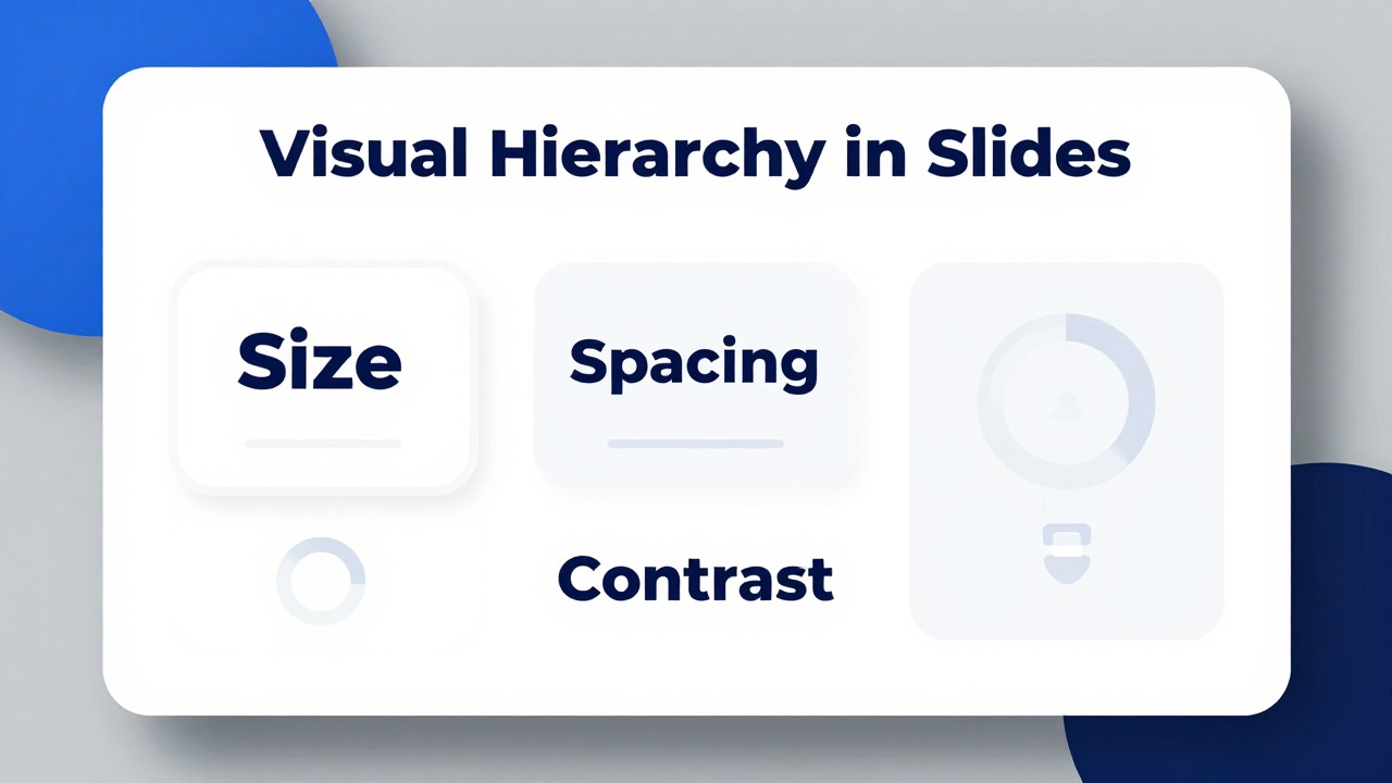
Size, Typography, and Contrast Rules That Guide the Eye
This section explains how text size, font weight, and contrast create visible priority on presentation slides.
Size is the most obvious hierarchy tool. Larger elements usually feel more important. But size only works when it is used deliberately. If the title, subtitle, number, callout, and every bullet are all oversized, the audience cannot tell which item deserves attention first.
Instead of choosing random text sizes slide by slide, create a small set of text levels. The exact sizes depend on screen format, viewing distance, template, and presentation environment, so avoid treating any number as universal. What matters is that each level is visibly different and used consistently.
- Slide title: identifies the topic or, better, states the insight.
- Key message: the main takeaway, often larger or bolder than body text.
- Section label: a small recurring marker that helps the audience know where they are in the deck.
- Body text: supporting points that explain the key message.
- Caption or annotation: short context for images, charts, or examples.
- Source note: smallest readable text, used only when necessary.
A common mistake is using the slide title as a generic label and then burying the real message in the third bullet. For stronger hierarchy, promote the important sentence. Change "Market Research" to "Students prefer short practice modules over long lectures." The new title tells the audience what to understand, not just what category they are viewing.
Font weight is the second tool. Bold type creates emphasis, regular weight supports reading, and lighter or smaller text signals secondary information. Use bold for the few words that carry meaning, not for every bullet. If every sentence is bold, bold no longer means important.
Contrast is about separation. High contrast between text and background makes reading easier. Dark text on a light background and light text on a dark background are usually safer than low-contrast combinations such as light gray on white, pale yellow on white, or saturated red on dark blue. Contrast also applies between content levels: the main number can be dark and bold, while supporting labels can be smaller and muted.
- Start with a readable title and body style that works on the actual display or projector.
- Make the key message clearly larger or heavier than supporting text.
- Reduce captions, sources, and secondary notes so they do not compete with the main content.
- Use bold only for key words, short phrases, or important numbers.
- Check that text remains readable when the slide is viewed at presentation size, not only on your laptop.
Typography should feel consistent across the deck. Limit font families, use the same title style from slide to slide, and keep similar content at similar sizes. If one slide uses a large bold title, another uses a small thin title, and a third uses all caps, the deck feels less professional and the audience has to relearn the hierarchy repeatedly.
Decorative fonts, all caps, and overly thin type can reduce readability. All caps may work for a short label, but it slows reading in long phrases. Thin type can look elegant on a high-resolution screen but disappear on a projector. Decorative fonts can be useful for a themed cover or event title, but they should not carry dense information.
If a styling choice makes the slide more expressive but less readable, use it only for decorative moments, not for the core message.
Spacing, Alignment, and Proximity Rules for Cleaner Slide Layouts
Layout hierarchy often improves a slide even when the content, colors, and fonts stay almost the same.
White space is not wasted space. It is an active design tool that tells the audience what belongs together and what deserves attention. A crowded slide feels difficult because elements touch, overlap, or sit too close to unrelated information. Adding space can make the same content feel clearer without deleting everything.
Proximity means related items should be near each other. Put a chart insight near the chart it explains. Place an icon near the phrase it represents. Keep a number and its label together. When related items are separated, the audience has to connect them mentally. When unrelated items are too close, the audience assumes they are connected.
Alignment is a readability shortcut. Left-aligned text blocks are usually easier to scan than centered paragraphs, especially on business and teaching slides. Align chart edges, image edges, and text boxes so the slide has invisible structure. Floating elements make a slide feel accidental even if the content is strong.
- Use consistent margins so content does not drift from slide to slide.
- Align titles to the same position unless a special slide type requires a different layout.
- Keep related text and visuals in the same visual zone.
- Avoid placing small elements randomly in corners unless they serve a clear purpose.
- Increase distance between unrelated groups and decrease distance within related groups.
A simple grid can help non-designers create order. You do not need a complex design system. Divide the slide into three zones: a title area, a main content area, and a supporting detail area. On a data slide, the title area states the insight, the main area holds the chart, and the supporting area contains short annotations or source notes.
For an agenda slide, hierarchy should show the meeting path, not decorate every item equally. Use a clear title, then list sections with consistent spacing. If one section is the current focus, highlight only that section. Avoid adding icons to every agenda item unless the icons improve recognition and use a consistent style.
For a two-column comparison, align both columns to the same top edge, use parallel labels, and give the more important comparison point extra emphasis. If the slide is about why Option B is recommended, do not make Option A and Option B visually identical. Use a subtle accent, stronger heading, or clearer summary statement to guide the audience.
For an image-plus-text slide, decide which element leads. If the image is emotional proof, let it be large and reduce the text. If the text is the key insight, keep the image supportive and avoid overly busy photos. Place captions close to images and avoid putting text on visually noisy areas unless you add a readable overlay.
For a quote or takeaway slide, keep the message central. Do not crowd it with multiple icons, logos, and decorative shapes. The quote or takeaway should have enough surrounding space to feel important. Attribution can be smaller and placed nearby, but it should not compete with the message.
Review several slides side by side. If title placement, spacing, colors, and section labels change without a reason, the deck will feel less coherent even if each slide looks acceptable on its own.
AI-generated layouts can accelerate slide creation, but they still need review. Check whether the most important element is obvious, whether spacing separates content levels, and whether alignment feels deliberate. Smart layouts are useful starting points; final hierarchy depends on your story and audience.
How to Apply Visual Hierarchy to Charts, Timelines, and Data Slides
Complex slides need hierarchy most because data, labels, and visual elements can easily bury the main insight.
Data slides often fail because they begin with a chart title instead of an insight. "Revenue by Region" tells the audience what the chart contains, but not what it means. "West region growth offset East region decline" gives the audience a conclusion before they inspect the numbers.
The hierarchy of a data slide should usually be: takeaway first, key data point second, supporting context third. This does not mean hiding complexity. It means making the interpretation clear enough that the audience can follow your explanation.
- Write the chart title as an insight, not a label.
- Identify the one bar, line, segment, period, or comparison that proves the insight.
- Use color or weight to highlight that element only.
- Reduce visual noise from gridlines, heavy borders, unnecessary legends, and repeated labels.
- Keep essential context visible so the chart remains accurate and honest.
A bar chart does not need every bar in a different color. If all colors are bright, no bar stands out. Use neutral colors for most bars and one accent color for the key bar. If the main point is a change over time, highlight the relevant period. If the main point is a comparison, use emphasis on the two items being compared.
Legends can also weaken hierarchy when they force the audience to look back and forth. If space allows, label lines or bars directly. Keep labels close to the data they explain. Reduce label size for secondary items and increase emphasis for the data point you are discussing.
Simplification must not become distortion. Do not remove labels that are needed to interpret the chart. Do not crop axes in a way that exaggerates differences. Do not use color emphasis to imply a conclusion that the data does not support. Hierarchy should clarify the truth, not manipulate it.
- Use a line chart when the story is change over time.
- Use a bar chart when the story is comparison between categories.
- Use a stacked bar only when the part-to-whole relationship is important and still readable.
- Use a simple callout when one number matters more than the full chart.
- Use annotations to explain unusual spikes, drops, or turning points.
Timeline slides need the same discipline. Many timelines give equal weight to every event, which makes the slide look like a decorative row of dates. Instead, decide what the timeline is for. Are you showing the current stage, a key milestone, a risk point, or the decision needed today?
To improve a timeline, emphasize the current stage with a stronger color or larger marker. Reduce older or less important events. Group supporting tasks under milestones rather than scattering them across the slide. If the decision point is the main message, make it visually dominant and place it where the audience can see the consequence of previous steps.
AI presentation software can be useful when turning reports, research notes, or project documents into a presentation-ready structure. For example, a product manager could upload a launch plan document and ask AI presentation software to create a milestone deck with one slide for strategy, one for timeline, one for risks, and one for next decisions. The presenter should still verify dates, data, and emphasis before presenting.
Make the insight easier to see, but never use hierarchy to hide uncertainty, exaggerate differences, or remove context the audience needs.
AI-Assisted Workflow: From Rough Content to Readable Slides
AI tools can speed up structure, rewriting, and layout exploration, but your design judgment should still control the final hierarchy.
Many slide hierarchy problems start before design begins. The source material is too dense: a strategy memo, research notes, a transcript, a product brief, or a pile of bullet points. If you paste all of it into PowerPoint, the slide becomes a document. A better workflow is to use AI to structure the content first, then apply hierarchy rules during editing.
- Collect rough notes, documents, links, or bullet points in one place.
- Define the audience and the decision, lesson, or action the presentation must support.
- Identify the main message for each slide before designing individual layouts.
- Generate a draft outline that separates primary ideas from supporting detail.
- Create draft slides with a clear title, one takeaway, and limited supporting points.
- Review each slide manually for hierarchy, accuracy, readability, and story flow.
AI presentation tools fit this workflow when you need to move from rough material to an editable deck foundation quickly. It can help turn prompts, documents, notes, and rough ideas into structured presentation decks faster, which is especially useful when you are starting from a blank page or a long source document.
Workflow example one: a consultant has a 12-page client discovery memo and needs a short executive update. Instead of copying paragraphs into slides, the consultant can ask AI presentation software to summarize the memo into a deck outline with one recommendation per slide. After generating the draft, the consultant reviews each slide and strengthens hierarchy: recommendation headlines become larger, evidence is grouped below, and caveats are moved to smaller notes or backup slides.
Workflow example two: an educator has lecture notes on climate adaptation and wants a 20-minute class presentation. The educator can use AI presentation software to turn notes into sections such as key concept, case example, data slide, discussion prompt, and summary. Then the educator applies hierarchy rules: each slide gets one takeaway, diagrams are placed near explanations, definitions are bolded sparingly, and discussion questions are given more white space so students know when to pause and respond.
- Prompt idea: "Reduce each slide to one takeaway and three supporting points."
- Prompt idea: "Turn this paragraph-heavy content into a title-plus-visual slide structure."
- Prompt idea: "Suggest which points should be main headlines and which should be speaker notes."
- Prompt idea: "Create a presentation outline for a non-technical audience, with one clear message per slide."
- Prompt idea: "Rewrite these bullets into shorter phrases suitable for a slide."
Other AI design assistance can also be useful. Some tools provide smart layout suggestions, template suggestions, rewriting support, auto-color recommendations, or consistency checks. These features can save time, especially for non-designers, but they should be treated as design assistance rather than final approval.
The risk with AI-generated slides is that they may look polished while still having weak hierarchy. A deck can use clean colors and modern shapes but still bury the key message in a small bullet. That is why the final review should focus on audience attention, not only visual polish.
- Can the main point be understood within three seconds?
- Does each slide have one clear focal point?
- Are headings consistent across the deck?
- Is there enough white space around important elements?
- Is contrast strong enough for the presentation environment?
- Are related items grouped and aligned?
- Are there any competing highlights that confuse priority?
- Have all AI-generated claims, data, names, and dates been checked?
AI can help you explore structure and layout faster, but only you can judge whether the hierarchy fits the audience, the meeting context, and the story you need to tell.
Common Visual Hierarchy Mistakes and How to Fix Them Before Presenting
Use this section as a final diagnostic checklist before you send, rehearse, or present your deck.
Visual hierarchy problems are often easy to spot once you know what to look for. The fix is usually not a full redesign. It is a set of small decisions: reduce one element, emphasize another, move related items closer, align edges, or remove unnecessary decoration.
- Mistake: everything is bold, large, or colorful. Fix: choose one focal point and reduce the visual volume of the rest.
- Mistake: too many colors. Fix: use a restrained palette and reserve one accent color for emphasis.
- Mistake: centered text everywhere. Fix: use consistent alignment, especially left alignment for text-heavy slides.
- Mistake: weak spacing between unrelated items. Fix: increase separation between groups and move related items closer together.
- Mistake: images, icons, and charts use inconsistent styles. Fix: choose a unified visual style across the deck.
- Mistake: animation draws attention away from the message. Fix: use motion only to reveal sequence, show process, or focus attention.
- Mistake: the slide title is a topic label, not an insight. Fix: rewrite the title as the conclusion the audience should understand.
- Mistake: every chart element has equal emphasis. Fix: highlight the data point that supports the slide takeaway.
The "everything is important" mistake is the most common. A slide with five bold bullets, three highlighted numbers, and multiple icons may feel energetic, but it gives the audience no priority. Pick the strongest message and make everything else support it.
Too many colors create a similar problem. Color should carry meaning. If red means risk on one slide, do not use red as a decorative accent on the next slide. If blue identifies the recommended option, keep that meaning consistent. Repetition helps the audience learn your visual language.
Centered text can work for a cover slide, quote slide, or short statement. It becomes harder to read when used for paragraphs, long bullets, or multi-line lists because each line starts in a different place. For information-heavy slides, left alignment usually creates a cleaner reading path.
Inconsistent imagery also weakens hierarchy. A deck that mixes detailed 3D icons, flat line icons, stock photos, screenshots, and decorative illustrations may look patched together. Choose a visual style that fits the message and repeat it. Consistent images and icons let the content stand out instead of making the audience notice format changes.
Animation should support attention, not demand it. Use simple reveals when you want the audience to follow a sequence. Avoid entrances, spins, and complex movement that distracts from the message. If an animation makes people notice the effect more than the idea, remove it.
- Review the deck in slide sorter view to spot inconsistency in titles, spacing, and color use.
- Open each slide and ask, "What should the audience notice first?"
- Ask, "What should they notice second?"
- Ask, "What supporting detail can be smaller, lighter, or moved to speaker notes?"
- Check charts and timelines for one clear highlighted point.
- Remove extra highlights, decorative shapes, and repeated words that do not support the message.
Before presenting, review every slide with one question: what should the audience notice first, second, and third?
If you are short on time, prioritize the slides that carry decisions, recommendations, key data, and final summaries. These slides need the strongest hierarchy because they shape what the audience remembers and acts on.
FAQ
What is the easiest way to create visual hierarchy in slides?
Choose one main message per slide, make it visually dominant, reduce supporting text, and use spacing and contrast to separate information levels. Start with the question, "What should the audience notice first?"
How many font sizes should I use in a presentation?
Use a small, consistent set of text levels, such as title, key message, body text, caption, and source note. Exact sizes depend on screen format, room size, template, and viewing distance, but the levels should be clearly different.
How does contrast improve presentation readability?
Contrast separates important content from the background and from supporting details. Strong contrast makes text, numbers, chart highlights, and calls to action easier to notice quickly.
What is the role of white space in slide design?
White space reduces visual noise, groups related information, and gives the main message room to stand out. It is not empty decoration; it is a tool for directing attention.
Can AI tools improve visual hierarchy in PowerPoint slides?
Yes. AI tools can help summarize content, suggest layouts, rewrite dense bullets, and create cleaner starting structures. You should still review hierarchy, accuracy, contrast, spacing, and audience fit before presenting.
Build slides faster from your source material
Turn notes, prompts, documents, or rough outlines into a clearer presentation draft, then edit the story, facts, and visual details before presenting.
Try PopAi AI Presentation