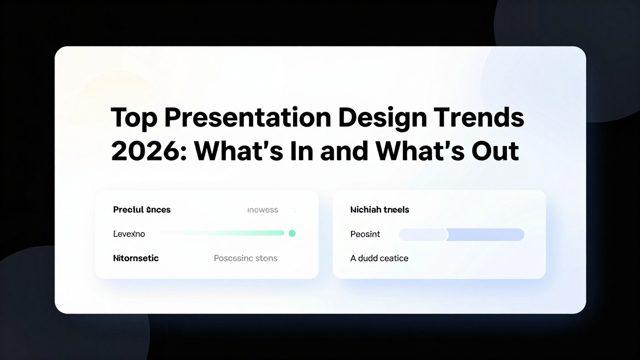
Top Presentation Design Trends 2026: What’s In & Out
July 2, 2026

The most practical presentation design direction for 2026 is clear: slides should look modern because they make the message easier to understand, not because they are covered in decorative effects. Clean editorial layouts, stronger hierarchy, accessible contrast, sharper data storytelling, fewer but better visuals, and AI-assisted deck creation are in. Dense bullet walls, random gradients, mismatched icons, tiny chart labels, generic stock photos, inconsistent fonts, and excessive animation are out.
If your current deck has cluttered text, jarring colors, mismatched images, weak alignment, inconsistent fonts, or slides that bury the main point, you do not need to become a designer overnight. You need a practical editing system: clarify one takeaway per slide, organize content into repeatable layouts, improve contrast and spacing, and use AI tools carefully to speed up structure and rewriting.
The best presentation design trends 2026 are useful across business updates, investor pitches, class presentations, marketing proposals, and research reports. The key is to apply trends selectively. A pitch deck may need bold visual storytelling; a finance review may need restrained charts; a lecture deck may need more context. Modern design is not one look. It is disciplined communication.
When you are ready to turn the workflow into slides, PopAi AI Presentation can help transform rough notes, documents, or prompts into an editable deck structure.
What Is In and Out for Presentation Design Trends 2026
This section gives you a fast, practical view of which design choices will feel current in 2026 and which habits will make slides look dated.
A dated presentation usually has the same symptoms: five or six bullets squeezed onto every slide, a title that describes the topic but not the point, clip-art-style icons from different sets, low-resolution stock images, decorative shapes that do not explain anything, and charts with labels too small to read from the back of a room. The problem is not only appearance. These slides make the audience work too hard to understand what matters.
The practical shift behind presentation design trends 2026 is toward clarity with controlled personality. Slides can be bold, visual, and memorable, but the design must support the message. Modern decks use typography, space, color, layout, and motion to guide attention. They also use AI to move faster from rough material to a structured draft, while leaving final judgment to the presenter.
- In: cleaner editorial layouts with strong headlines, fewer objects, and more intentional white space.
- In: bold but controlled typography, such as a large takeaway title paired with short supporting copy.
- In: AI-assisted structure, summarization, rewriting, and layout starting points that reduce blank-page time.
- In: purposeful motion that reveals a process, comparison, or sequence instead of distracting from it.
- In: stronger data storytelling where charts highlight the key point instead of showing every possible detail.
- In: document-to-deck workflows that turn reports, notes, proposals, and research material into editable slide structures.
- In: accessible color contrast, readable text sizes, and designs that work in both live and remote settings.
- In: fewer but better visuals, chosen because they explain, prove, or emotionally support the message.
- Out: dense bullet walls where every line has the same weight and nothing stands out.
- Out: random gradient backgrounds that reduce readability or feel disconnected from the topic.
- Out: mismatched icon packs, such as mixing outlined, filled, 3D, and illustrated icons in one deck.
- Out: overused stock photos that add polish but no meaning, such as generic handshakes or staged office smiles.
- Out: tiny chart labels, crowded legends, and dashboards copied directly into slides without simplification.
- Out: excessive animation, bouncing transitions, and motion that slows the presenter down.
- Out: inconsistent fonts, title sizes, colors, and spacing that make each slide feel like it came from a different deck.
Do not ask, “Is this trend popular?” Ask, “Will this help my audience understand the point faster in this setting?” A boardroom, classroom, webinar, investor meeting, and product launch may need different levels of visual energy.
The safest way to modernize a presentation is to make the main message obvious within a few seconds. That can mean a large headline, a simplified chart, a single strong image, a split-screen comparison, or a well-spaced agenda. It rarely means adding more decoration. In 2026, the most professional-looking slides will often be the ones that show the most restraint.
Evidence Behind 2026 Presentation Design Trends
Trend articles need source signals, not only style predictions. The patterns below come from current design-trend and design-workflow sources.
Canva’s 2026 design-trends materials frame the year around “Imperfect by Design,” with creators combining AI assistance, more tactile visuals, playful layouts, and less over-polished expression. For presentations, that does not mean messy slides. It means slides can look more human by using authentic screenshots, imperfect sketches, real examples, and visual texture instead of sterile template sameness.
Adobe’s 2026 creative trends point toward emotional, sensory, and AI-assisted visual communication. In slide design, that supports richer moodboards, stronger art direction, more deliberate image style, and fewer generic stock-photo layouts.
Figma’s State of the Designer 2026 focuses on how designers are navigating AI-era workflows. For presentation teams, the practical lesson is that AI can speed exploration, but people still need systems: design tokens, reusable components, hierarchy rules, and review standards.
Core Design Principles That Still Make Modern Slides Work
Trends change, but contrast, alignment, repetition, proximity, hierarchy, white space, and consistency still determine whether slides feel polished and readable.
Modern slide design is not the same as minimalist design. A minimalist slide can still fail if the audience cannot tell what matters. A detailed slide can still work if the hierarchy is clear, the spacing is controlled, and the presenter uses it in the right context. The goal is not to remove everything. The goal is to make the main idea easy to notice quickly.
- Contrast means making important elements visibly different. Edit the slide by increasing the headline size, using a darker title color on a light background, or highlighting one key number in a stronger color.
- Alignment means placing objects on an invisible grid. Edit the slide by aligning titles, text boxes, icons, charts, and images to common left edges or columns instead of placing them by eye.
- Repetition means using the same visual decisions throughout the deck. Edit the slide by repeating one color system, one icon style, one title treatment, and consistent section divider styles.
- Proximity means grouping related information together. Edit the slide by moving a label closer to its chart, grouping each feature with its icon, or separating unrelated content into different zones.
- Hierarchy means showing what to read first, second, and third. Edit the slide by enlarging the main takeaway, making supporting details smaller, and reducing the visual weight of background information.
- White space means giving content breathing room. Edit the slide by reducing text, increasing margins, and leaving space around charts, images, and key numbers.
- Consistency means making the deck feel like one connected experience. Edit the slide by standardizing fonts, capitalization, button shapes, color usage, and spacing across all slides.
A common before-and-after example is the six-bullet slide. Before: the slide title says “Market Update,” followed by six equal-weight bullets in small text. The audience has to decide what matters. After: the title says “Demand is growing fastest in mid-market accounts,” followed by three short supporting points and one highlighted number. The design did not become more modern because it became trendy. It became more modern because it became clearer.
In a business presentation, hierarchy might mean turning a dense quarterly update into one decision slide: headline, key metric, reason, recommendation. In an education deck, hierarchy might mean replacing a paragraph of lecture notes with a concept title, one diagram, and three labeled steps. The same principle works in both settings because audiences need direction before detail.
- Read the slide title and ask whether it states a takeaway, not just a topic.
- Circle the first thing your eye sees. If it is not the most important point, adjust size, color, weight, or placement.
- Remove or shrink anything that competes with the main idea but does not support it.
- Align every object to a shared edge, centerline, or column.
- Repeat the improved layout on similar slides so the deck feels intentional.
AI can help with these principles, especially when you are starting with too much content. A tool can shorten text, suggest a slide outline, group related ideas, or create a more consistent starting structure. But AI cannot fully understand the politics of your board meeting, the prior knowledge of your students, or the emphasis your sales team needs in a client pitch. The presenter still needs to check meaning, tone, accuracy, and audience fit.
A modern slide is not a decorated document. It is a guided visual decision: what should the audience notice, understand, and remember?
Modern Slide Layouts to Use in 2026
Use these practical layout patterns to build modern decks for pitches, reports, lectures, proposals, and research presentations.
Good layouts remove guesswork. Instead of moving text boxes around until the slide feels acceptable, choose a structure that fits the job of the slide. A cover slide should set tone and topic. An agenda should orient. A chart slide should explain a data point. A summary should help the audience remember or decide. When every slide has a job, layout becomes easier.
- Cover slide use case: opening a pitch, lecture, report, webinar, or proposal. Structure it with a clear title, short subtitle, presenter or organization name, and one strong visual or simple color field. Design tip: avoid overloading the cover with logos, dates, disclaimers, and decorative images.
- Agenda slide use case: helping the audience understand the journey. Structure it as three to five sections with short labels. Design tip: use numbers, section cards, or a vertical timeline instead of a long list of topics.
- Body slide use case: explaining one idea. Structure it with a takeaway headline, one main content area, and limited supporting detail. Design tip: use one large visual plus one clear message when possible.
- Chart slide use case: proving a point with data. Structure it with a takeaway title, simplified chart, highlighted data point, and short note if needed. Design tip: remove unnecessary gridlines and legends when labels can be placed directly.
- Timeline slide use case: showing stages, roadmap, history, or implementation. Structure it with three to seven milestones. Design tip: give every milestone the same visual treatment unless one needs emphasis.
- Comparison slide use case: evaluating options, competitors, strategies, plans, or before-and-after states. Structure it with two to four columns or paired cards. Design tip: keep criteria consistent so the comparison feels fair and easy to scan.
- Summary slide use case: closing a section or deck. Structure it with three takeaways, a recommendation, or next steps. Design tip: do not repeat the whole deck; remind the audience what to do or remember.
Grid systems are one of the fastest ways non-designers can improve a deck. A grid simply means that titles, content blocks, images, and charts align to invisible columns and margins. You do not need a complex design system. Start with a consistent left margin, a title line, and two or three content columns. If objects line up, the slide usually feels more professional even before you change colors or fonts.
Text-image combinations will remain central to modern slide design 2026 because they help audiences process ideas quickly. A split-screen layout can place a product screenshot on one side and a clear benefit statement on the other. An image-card layout can show three customer segments with consistent cards. A visual-anchor layout can place one large photo, diagram, or icon near the headline to create immediate context.
- Investor pitch deck: use bold section dividers, problem-solution layouts, market charts with highlighted takeaways, and concise traction slides. Avoid packing the business plan into tiny text.
- Quarterly business review: use consistent KPI cards, simplified trend charts, decision slides, and clear status indicators. Avoid copying spreadsheet dashboards directly into slides.
- Product launch deck: use strong product visuals, benefit-led headlines, comparison cards, and a launch timeline. Avoid decorative visuals that do not explain the product story.
- Lecture slides: use concept diagrams, step-by-step reveals, clear definitions, and consistent examples. Avoid turning lecture notes into paragraphs on slides.
- Research presentation: use structured evidence slides, readable charts, methods summaries, and cautious interpretation. Avoid over-minimizing context that the audience needs to evaluate the work.
- Marketing proposal: use audience insight slides, campaign concept visuals, channel plans, and before-and-after messaging examples. Avoid generic stock imagery that could fit any client.
Multi-element slides need especially disciplined spacing. If you have icons, numbers, labels, and short paragraphs on the same slide, group related items into cards or rows. Use equal spacing between items. Limit competing focal points. If everything is large, colorful, and centered, nothing has priority. Choose one dominant element and make the rest support it.
If you have rough notes for a product launch, use AI presentation software to turn the notes into an editable deck outline with sections such as market context, customer pain point, product promise, feature proof, launch plan, and next steps. Then refine each slide visually by choosing a consistent layout pattern, replacing generic visuals, and writing takeaway-style titles.
AI presentation software is particularly useful when you are not sure how to move from raw information to deck structure. Starting from a business idea, a document, class material, research notes, or a marketing brief, it can help create a first presentation draft that is easier to edit than a blank slide. The human work then becomes more focused: check the story, tighten the message, improve the visuals, and adapt the tone for the audience.
Visual Techniques That Will Make PPT Trends Feel Professional
These visual techniques help you apply current PPT trends without making slides chaotic, hard to read, or overly decorative.
Visual style is where many non-designers overcorrect. They see modern decks with dramatic typography, dark backgrounds, bright accent colors, animated reveals, and image-heavy layouts, then apply all of those ideas at once. The result can feel busier than the old template. The better approach is to choose a small number of visual rules and apply them consistently.
- Color: use a limited palette with one dominant background or base color, one secondary color, and one accent color. The 60-30-10 balance can help: roughly 60 percent base, 30 percent supporting color, and 10 percent accent. Avoid random neon colors, low-contrast text, and using red, yellow, and green without explaining what they mean.
- Typography: limit the deck to one or two font families. Create hierarchy with size and weight rather than using many fonts. For example, use a large bold title, medium-weight section labels, and readable body text. Avoid tiny body copy that only works on your laptop screen.
- Shapes and icons: use simple shapes for grouping, callouts, process steps, and visual rhythm. Keep icons from one visual family. Avoid mixing filled, outlined, 3D, emoji-style, and illustrated icons in the same deck unless there is a deliberate brand reason.
- Charts: choose the chart type that matches the message. Use a line chart for trends, a bar chart for comparisons, a stacked bar for composition when categories are limited, and a simple table-like layout only when exact values matter. Remove unnecessary gridlines and enlarge labels.
- Images: choose visuals that support the message directly. A photo of a real product, customer context, classroom setting, location, or process is stronger than a generic office scene. Avoid decorative images that take space without communicating.
- Animation: use motion to guide attention, reveal steps, or control information flow. Avoid transitions that make every slide spin, zoom, bounce, or fade slowly for no reason.
Small visual edits can make a major difference. If a slide title is 24-point regular weight and the body text is 18-point, the hierarchy may be too weak. Changing the title to 34-point bold and reducing body copy to three short lines can make the message easier to scan. If a chart uses six colors of equal intensity, changing the key bar to one accent color and making the other bars neutral can guide attention immediately.
Spacing is another practical lever. A slide with four cards may look amateur not because the card design is bad, but because the gaps between cards are uneven. Equal spacing can make the layout feel intentional. Larger margins can make a slide feel more premium. More space above a section label can signal a new idea. These are simple edits, but they usually improve readability.
- Write the chart takeaway as the slide title, such as “Renewals improved after onboarding changes,” instead of “Renewal Data.”
- Remove visual elements that do not support the takeaway, including extra gridlines, redundant legends, or decorative shadows.
- Highlight only the data point, trend, or comparison you want the audience to notice first.
- Increase label size enough that the chart can be read in the actual delivery format.
- Add a short annotation only if it explains why the data matters.
Dark mode decks and high-contrast color systems can look current, especially for product launches, technology presentations, webinars, and conference talks. They are not automatically better. A dark background with thin gray text can be difficult to read. If you use a dark style, increase text contrast, use generous spacing, and test projected readability. For printed handouts or dense reports, a lighter background may still be more practical.
A trend looks professional when it has a job. Use bold color to highlight a decision, large type to frame a takeaway, motion to control sequence, and images to create evidence or context. If a visual choice has no communication role, remove it.
AI-Assisted Workflow: How to Update an Old Deck for Modern Slide Design 2026
Use this step-by-step workflow to modernize an existing deck with AI support while keeping human judgment in control.
AI is best treated as a design assistant, not a replacement for presentation judgment. It can help you summarize long material, rewrite dense text, generate a deck outline, suggest a cleaner structure, and reduce repetitive editing. It cannot guarantee that the story is strategically correct, that the examples are appropriate, or that the final slide design fits your brand and audience.
- Audit the current deck. Mark slides that are too dense, visually inconsistent, off-message, duplicated, or hard to read.
- Identify the main message per slide. If you cannot write one sentence that captures the point, split the slide or rewrite it.
- Remove duplicate or low-value content. Keep what supports the decision, learning objective, recommendation, or story flow.
- Rewrite dense text. Turn paragraphs into takeaway headlines, short supporting points, labeled diagrams, or speaker notes.
- Choose a consistent layout system. Decide how cover slides, section dividers, body slides, chart slides, and summaries should look.
- Refine visuals. Replace generic images, simplify icons, clean up charts, and make sure every visual supports the message.
- Check accessibility. Review contrast, font size, label readability, color meaning, and whether the deck works in the actual presentation setting.
- Rehearse the story flow. Make sure the slides support what you will say rather than forcing you to read from the screen.
For a practical AI presentation software workflow, start with the content source that is slowing you down. That might be a strategy memo, a research summary, a campaign brief, class notes, or rough bullet points from a meeting. Use AI presentation software to turn that source into an editable deck structure. Then review the generated outline for logic: Does it open with the right problem? Does each section build toward the conclusion? Are there slides that should be merged, deleted, or expanded?
- Prompt example for a business report: “Turn this quarterly performance report section into five executive slides. Use one takeaway headline per slide, three supporting points maximum, and suggest where a chart would be useful.”
- Prompt example for a dense slide: “Rewrite this slide into one clear headline and three short supporting points for a senior leadership audience. Keep the tone concise and decision-oriented.”
- Prompt example for education: “Turn these lecture notes into a 12-slide class presentation with definitions, examples, and one recap slide. Keep slide text short and place detail in speaker notes.”
- Prompt example for a pitch deck: “Create an investor pitch deck outline from this business idea, including problem, solution, market, product, traction, business model, go-to-market, team, and ask.”
A consultant updating an old client proposal can paste rough discovery notes into AI presentation software and generate a first draft with sections for client challenge, insight, proposed approach, timeline, deliverables, and next steps. The consultant should then edit the language for client specificity, replace generic visuals with relevant examples, and simplify any charts before presenting.
Other AI-assisted capabilities may also help, depending on the tools you use: smart layout suggestions, template recommendations, AI rewriting, auto-color suggestions, and design consistency checks. These features are most valuable when they reduce mechanical work. They are less useful if you accept every suggestion without asking whether the slide still communicates the right message.
- Verify facts, names, numbers, dates, and claims before presenting.
- Review tone for the audience: executive, academic, sales, investor, classroom, or internal team.
- Adjust visuals for brand fit, including color palette, typography, image style, and icon style.
- Simplify charts manually when the generated or imported chart still contains too much detail.
- Make sure each slide has one clear takeaway and that supporting points do not compete with it.
- Move detail into speaker notes, appendix slides, handouts, or follow-up documents when it is necessary but too dense for the main deck.
When applying modern slide design 2026 expectations, AI can help you work faster, but your editing criteria should remain human: clarity, accuracy, relevance, credibility, and audience fit. If an AI-generated layout looks polished but the claim is vague, the chart is confusing, or the example is generic, the slide is not finished.
Common Mistakes When Following PPT Trends
Avoid these mistakes so your deck looks current without sacrificing clarity, credibility, or usefulness.
The biggest mistake is copying a visual style without considering the audience, room size, delivery format, and purpose. A dramatic dark deck may work well for a product keynote but may be less practical for a printed board packet. A highly minimal slide may look elegant in a portfolio but leave a technical audience without enough evidence. Trend choice should follow communication needs.
- Mistake: using too much minimalism. Fix it by adding necessary context, labels, definitions, or speaker notes, especially for technical, financial, academic, or research presentations.
- Mistake: accepting too many AI-generated visuals or layouts without refinement. Fix it by adding specific examples, brand language, real product context, and audience-relevant details.
- Mistake: using tiny text to fit everything on one slide. Fix it by splitting the slide, moving detail to notes or appendix, and increasing body text size.
- Mistake: choosing low-contrast color combinations. Fix it by testing readability and using stronger contrast between text and background.
- Mistake: decorating charts with gradients, shadows, icons, or unnecessary images. Fix it by simplifying the chart and highlighting the key data point.
- Mistake: mixing illustration styles. Fix it by choosing one icon or illustration family and applying it consistently.
- Mistake: adding excessive animation. Fix it by using motion only to reveal sequence, guide attention, or prevent information overload.
- Mistake: changing layout rules on every slide. Fix it by standardizing margins, title positions, card styles, chart treatments, and section dividers.
Too much minimalism deserves special attention. Many modern decks use large type and very little text, but not every slide should be reduced to a slogan. A finance review may need assumptions. A research presentation may need methodology. A technical training deck may need steps and warnings. The modern move is not to delete context blindly; it is to separate what belongs on the slide from what belongs in speaker notes, appendix pages, handouts, or verbal explanation.
AI-generated sameness is another risk. If every slide has a polished but generic headline, an abstract illustration, and a predictable three-card layout, the deck may look clean but feel forgettable. Add human specificity: the client’s actual problem, the class’s real example, the product screenshot, the market constraint, the decision being requested, or the insight behind the chart.
- Does this slide have one clear point?
- Can the audience read the slide quickly in the actual presentation setting?
- Are the design choices consistent with the rest of the deck?
- Does the visual support the message, or is it only decoration?
- Is the amount of detail appropriate for the audience’s knowledge level?
- Are charts, labels, and annotations large enough to understand?
- Are colors, fonts, icons, and spacing standardized?
- Would the slide still make sense if viewed as a screenshot after the meeting?
Use trends selectively. A slide should look current, but it must first be understandable, credible, and useful.
For most non-designers, the fastest improvement path is not chasing every new style. It is building a repeatable editing habit: reduce text, strengthen hierarchy, align elements, use consistent colors and fonts, simplify charts, and choose visuals that do communication work. Once that foundation is in place, 2026 design trends become easier to apply without overdecorating the deck.
FAQ
What are the biggest presentation design trends for 2026?
The most practical trends are cleaner layouts, stronger visual hierarchy, AI-assisted deck creation, accessible color contrast, purposeful visuals, better chart storytelling, document-to-deck workflows, and restrained animation that guides attention rather than distracts.
What PPT trends are outdated in 2026?
Dense bullet slides, inconsistent fonts, random gradients, generic stock photos, low-contrast text, cluttered charts, mismatched icon styles, and excessive transitions tend to make presentations feel dated.
How can I make an old PowerPoint look modern quickly?
Reduce text, rewrite slide titles as takeaways, align objects to a grid, standardize fonts and colors, replace weak visuals, simplify charts, increase contrast, and use AI to restructure rough content faster before refining the final design.
Should I use AI for presentation design?
Yes, if you use it as an assistant. AI is useful for outlines, summarization, rewriting, layout starting points, and consistency checks. You should still verify accuracy, adapt the message to the audience, and make final design choices.
How does AI presentation software help with modern slide design?
AI presentation software helps turn prompts, documents, notes, and rough ideas into structured presentation drafts, making it easier to move from a blank page to an editable deck before refining visuals, charts, tone, and delivery.
Build slides faster from your source material
Turn notes, prompts, documents, or rough outlines into a clearer presentation draft, then edit the story, facts, and visual details before presenting.
Try PopAi AI Presentation