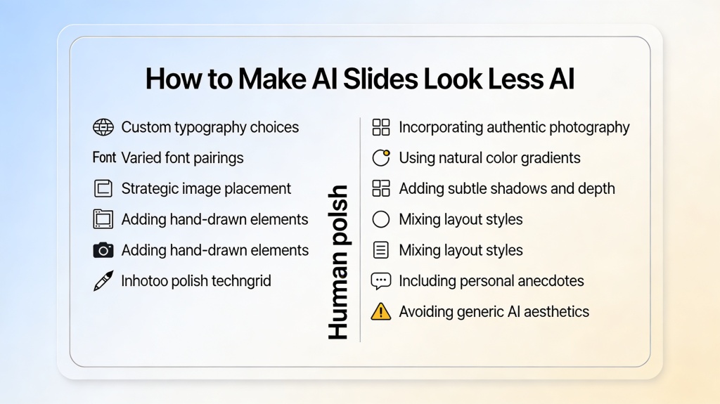
How to Make AI Slides Look Less “AI” (human polish list)
Published on April 23, 2026
Artificial Intelligence has revolutionized how we build presentations, turning hours of manual labor into seconds of automated generation. However, for startup founders pitching to VCs or marketing managers presenting to executives, there is a lingering problem: the "AI Look." You know it when you see it—repetitive bullet points, generic blue-and-white layouts, and stock icons that feel a bit too clinical. To truly resonate with an audience, you need to apply a human polish for AI slides that bridges the gap between efficiency and authenticity.
The goal isn't to hide that you used AI, but to ensure the AI serves your message rather than distracting from it. When a deck looks too "generated," it can signal a lack of effort or a lack of original thought. By following this polish list, you can take a raw AI draft and transform it into a high-stakes professional asset.
1. Refining the Narrative: Moving Beyond Bullet Points
AI is excellent at summarizing data, but it often defaults to the "Rule of Three" or endless bulleted lists. While organized, this structure is the hallmark of a machine-generated draft. To add human polish, you must inject a narrative arc into your slides.
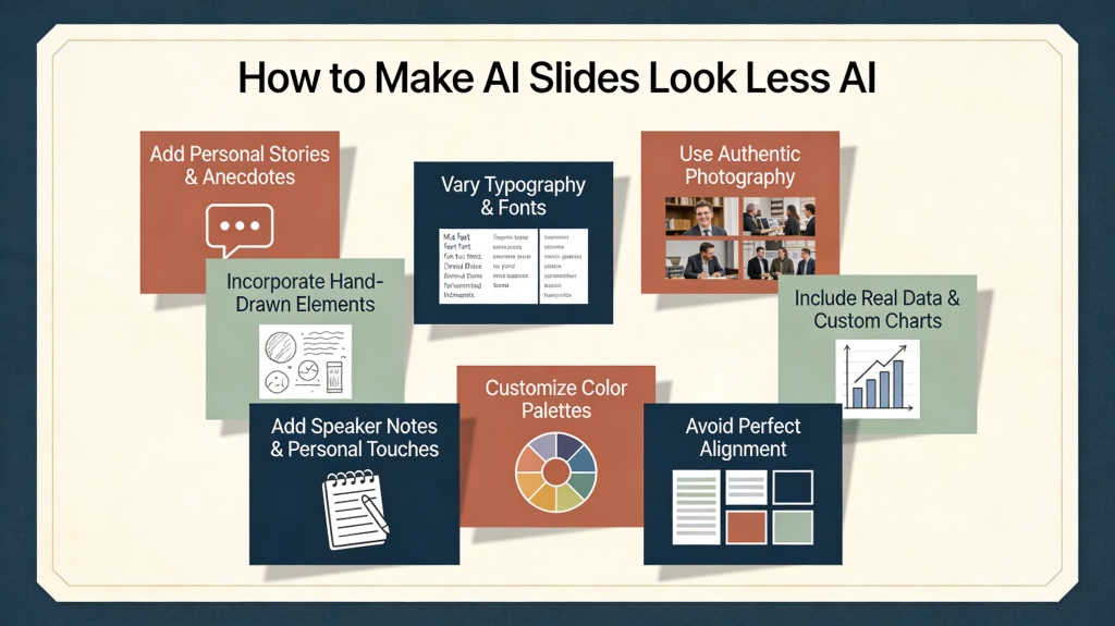
- Rewrite the Headlines: AI often generates descriptive headlines like "Market Analysis" or "Product Features." Change these to *action-oriented* headlines that tell a story, such as "Why Our Market is Ready for Disruption" or "Features That Save Users 10 Hours a Week."
- Vary the Pace: Don't let every slide have the same density. If your AI tool gave you five bullet points per slide, try moving three of them to the "speaker notes" and focusing the visual on one powerful statement.
Pro Tip: Use PopAi's AI Presentation tool to generate the foundation, then spend your energy on the "Hook" slide and the "Call to Action" slide—the two areas where human emotion matters most.
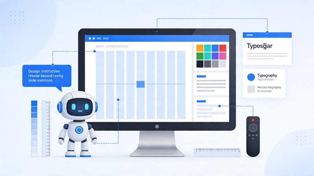
2. Visual Customization: Breaking the AI Grid
Most AI presentation tools operate on a rigid grid system. While this ensures alignment, it also creates a predictable visual rhythm that feels robotic. Breaking this grid is a primary step in applying human polish for AI slides.
Try "off-setting" your elements. If the AI placed an image on the left and text on the right for five slides in a row, manually swap them on the sixth. Better yet, create a full-bleed image slide with a single line of centered text overlaid. This visual "break" re-engages the audience's eyes and makes the deck feel custom-designed rather than template-driven.
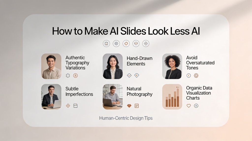
3. Humanizing Imagery: Swapping Generic for Authentic
AI image generators are powerful, but they often produce images that are "too perfect"—overly saturated colors, plastic-looking skin, or metaphorical concepts (like a literal lightbulb for an "idea") that feel cliché. To make your slides look less AI, you need a more curated approach to visuals.
Instead of the first AI-generated image that pops up, consider using high-quality editorial photography or custom illustrations that match your brand's specific color palette. If you do use AI images, look for those with a "grainy" or "cinematic" filter rather than the default "3D render" style. Authenticity in imagery builds trust with your audience.
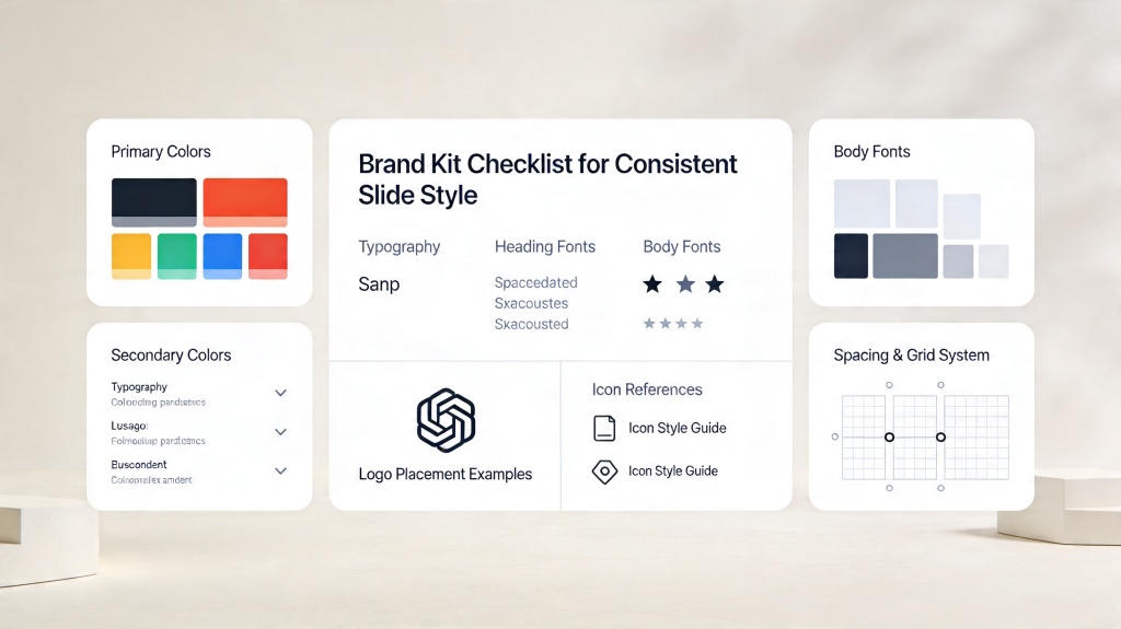
4. Typography and Branding: The Final Polish
Nothing screams "default AI" like standard system fonts like Arial or Calibri. One of the fastest ways to apply human polish for AI slides is to update the typography. Choose a font pair that reflects your brand's personality—perhaps a bold Serif for headings and a clean Sans-Serif for body text.
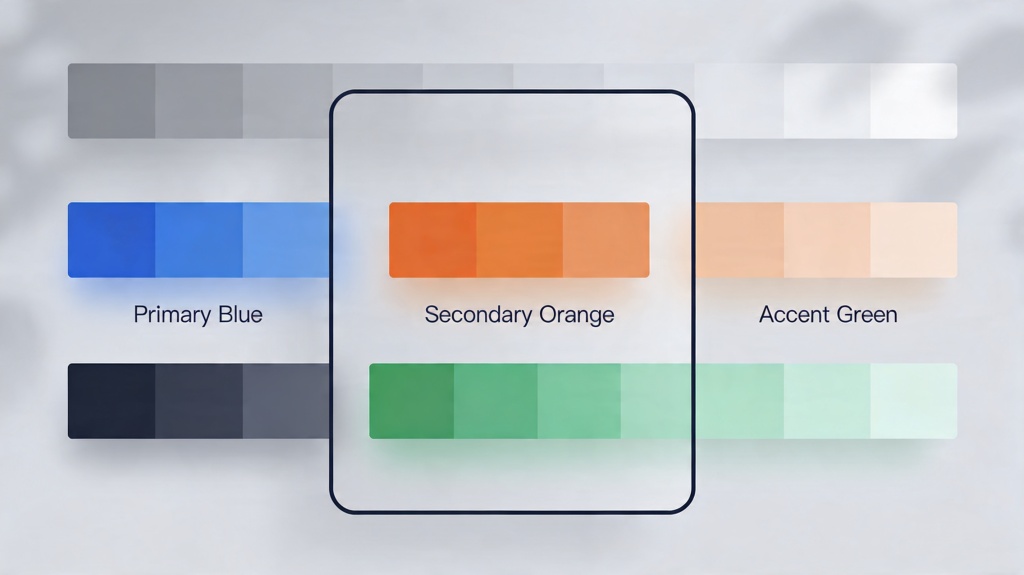
Additionally, check your brand colors. AI tools often pick a primary color and stick to it. A human designer knows how to use "accent colors" to draw attention to specific data points or buttons. Ensure your hex codes are exact and that your logo isn't just slapped in a corner, but integrated into the slide design through subtle watermarks or framed containers.
5. The Human Polish Checklist: 5 Minutes to Professionalism
Before you hit "Export," run through this quick checklist to ensure your deck has the necessary human touch:
- The "Squint Test": Squint at each slide. Does it look like a wall of text? If so, cut 20% of the words.
- Icon Audit: Replace generic outline icons with a consistent set that matches your brand style.
- Alignment Check: AI sometimes misses subtle alignment issues between text boxes and images. Use "Align" tools to snap everything into place.
- Data Visualization: If the AI generated a chart, ensure the labels are legible and the most important data point is highlighted in a contrasting color.
- Transition Check: Remove any flashy AI transitions. Stick to "Fade" or "None" for a sophisticated, professional feel.
Frequently Asked Questions
Why do AI-generated slides often look "generic"?
AI tools often rely on standardized templates, common stock icons, and predictable layouts to ensure safety and speed. This results in a "template-heavy" look that lacks the nuance and brand-specific flair of a human designer.
How much time should I spend on human polish for AI slides?
For a standard 10-slide deck, 15 to 20 minutes of targeted human polish can drastically improve the quality. Focus on headings, key imagery, and alignment to get the most impact in the shortest time.
Can I still use AI-generated images in professional decks?
Yes, but they require curation. Avoid images with "uncanny" details or overly glossy textures. Instead, use AI to generate backgrounds or abstract elements that support your text rather than being the main focus.
Create your presentation with one click now
Combine the speed of AI with professional design principles. Start your next project with PopAi today.
Get Started for Free