AI Portfolio Presentation for Creators: Visual-First Workflow | PopAi
Updated July 29, 2026 · Jordan Rivers
An AI portfolio presentation for creators should be visual first: large images, minimal text, clear project context, and a flow that helps clients or hiring teams understand your best work quickly. The job is not to make a generic deck. The job is to turn selected creative assets into a focused showcase.
This guide explains what the feature solves, the core workflow, when it fits and when it does not, practical limitations and workarounds, example portfolio results, and how this long-tail page connects back to the broader PopAi presentation workflow.
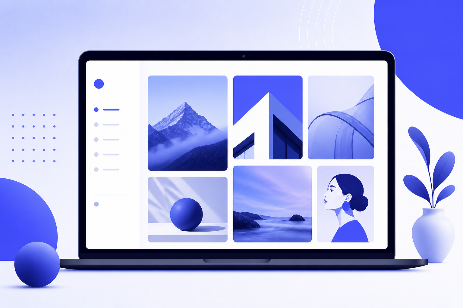
AI Portfolio Presentation for Creators: Visual-First Feature Guide
Creators often have strong work but weak presentation flow. Images sit in folders, case studies live in notes, and the final deck takes too long because every slide requires manual layout decisions. A visual-first AI portfolio workflow solves that packaging problem.
The feature is useful because AI can suggest order, layout, image grouping, captions, and CTA placement while keeping the creative work at the center. You still choose the best assets and approve the story, but AI removes much of the blank-slide and grid-layout friction.
What Problem This Portfolio Workflow Solves
Visual creators rarely need more text. They need a deck that shows the strongest work fast, explains the context briefly, and guides the viewer toward a next step. The problem is that manual presentation building often turns into layout tweaking instead of portfolio strategy.
- Photographers need image-led decks that preserve composition and mood.
- UI designers need case-study slides with problem, process, and final screens.
- Illustrators need clean project groupings without overcrowding artwork.
- Agencies need fast client-facing portfolio decks for new-business outreach.
- Freelancers need a short, polished portfolio that can be sent before a call.
Scenario 1: freelance photographer
A photographer can upload 20 selected images from three shoots and ask AI to build a 10-slide visual portfolio with one cover, three project chapters, one process slide, and a contact CTA.
Scenario 2: product designer
A product designer can upload screenshots, wireframes, and case-study notes. AI can group the assets into challenge, process, final design, and outcome slides while keeping text short enough for recruiters to scan.
Core Workflow for a Visual-First Portfolio Deck
The workflow should begin with curation, not generation. A portfolio deck improves when the creator chooses fewer, stronger projects and gives AI enough context to frame each one. The table below keeps the process focused.
| Step | Creator action | AI output to review |
|---|---|---|
| 1 | Select 3-5 strongest projects instead of uploading everything | Portfolio sequence and project grouping |
| 2 | Upload images, screenshots, videos, mockups, or case-study notes | Visual-first slide layout and suggested narrative |
| 3 | Describe audience: client, recruiter, gallery, agency, or investor | Tone, slide emphasis, and CTA direction |
| 4 | Replace weak placeholders with final work samples | Cleaner hierarchy, captions, and section order |
| 5 | Export PDF or share link after checking image quality | Final portfolio deck for review or outreach |
For a client pitch, place the most relevant project first. For a hiring portfolio, start with the project that best matches the role. For a gallery or creator showcase, lead with the strongest visual moment.
Best-Fit and Not-Fit Scenarios
A visual-first portfolio deck is not the right format for every creator asset. It works when images, mockups, or visual results carry the story. It is weaker when the work needs long technical explanation or private details that cannot be shown.
Good fit
- Photography, illustration, branding, UI/UX, architecture, fashion, interior design, and campaign showcases.
- Short client pitch decks where the viewer needs to see style and range quickly.
- Recruiter or agency portfolios where 8-12 slides are enough to start a conversation.
Poor fit
- Confidential work where visuals cannot be shown or anonymized.
- Highly technical case studies that require dense explanation before visuals make sense.
- Archive-style portfolios that list every project instead of selecting the strongest work.
Function Limits and Practical Workarounds
AI can speed up portfolio design, but it has limits. It may crop images poorly, over-explain simple visuals, choose a generic tone, or treat all projects as equally important. The creator should review the final deck as a brand asset, not as an automatic export.
- Cropping issue: upload landscape and portrait variants, then manually replace any awkward crop.
- Overwritten captions: ask for one-line captions focused on role, challenge, and result.
- Generic order: tell AI which project should open and which should close.
- Heavy file size: export a PDF for email and keep a higher-quality version for live review.
- Inconsistent style: repeat your visual direction, such as minimal white gallery layout or bold editorial grid.
Example Result and Copyable Prompt
Example result: a 10-slide creator portfolio with a bold cover, three project chapters, one process slide, one testimonial or results slide, and one contact CTA. Each project uses one hero image, one detail image, and a short caption.
After the first draft, ask AI to review the deck for visual hierarchy: "Which slides feel crowded, which images need more space, and where should text be shortened?"
How This Feature Connects to the Core Presentation Workflow
This page solves a specific creator portfolio use case. For broader deck creation from prompts, source files, documents, or web pages, use the core AI presentation maker workflow. Then return to this visual-first process when the goal is to showcase creative work, not explain a long report.
Before sharing the final deck, check image quality, mobile readability, slide order, contact information, and whether the first three slides clearly communicate your creative style.
Frequently Asked Questions
How should creators use an AI portfolio presentation visual-first workflow?
Start by selecting your strongest 3-5 projects, upload high-quality visual assets, describe the audience, and ask AI to build a deck with large images, minimal text, short captions, and a clear contact CTA.
How many slides should a creator portfolio presentation have?
Most visual-first portfolios work best at 8-12 slides. That is enough for a cover, selected works, several project chapters, process or results, and a final contact slide without overwhelming the viewer.
What image quality should I use for an AI portfolio deck?
Use crisp images large enough for presentation viewing, commonly at least 1920px wide for landscape assets. Compress only after checking that details still look sharp on a laptop or large screen.
What should I do if AI crops my artwork badly?
Replace the image manually, upload an alternate crop, or tell the AI to use full-bleed, centered, or contained image placement. For portfolio work, preserving the visual composition is more important than filling every slide edge.