For data analysts, business leads, and project managers, the monthly reporting cycle often feels like a race against time. You have the raw data, but translating that data into a compelling AI data report deck that stakeholders actually want to read is a massive hurdle. Most professionals spend hours wrestling with Excel formatting and PowerPoint alignments, only to end up with a presentation that looks cluttered and fails to highlight the "why" behind the numbers.
The Evolution of the AI Data Report Deck
Traditional data reporting was a linear, manual process: export data, clean it in a spreadsheet, create individual charts, copy-paste them into slides, and then manually type out observations. This method is not only prone to human error but also incredibly slow. In today's fast-paced business environment, by the time a manual report is finished, the data might already be outdated.
The emergence of AI-driven presentation tools has shifted the paradigm. We are moving from "data visualization" to "data storytelling." An AI data report deck doesn't just display a bar chart; it understands the context of that chart. It recognizes that a 15% dip in Q3 sales is an anomaly and automatically flags it for discussion, saving you the cognitive load of hunting for insights yourself.
Automating Charts: From Raw CSV to Visual Storytelling
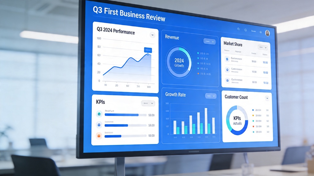
The core of any report is the data visualization. AI tools now allow you to upload a CSV or link a live Google Sheet, and within seconds, suggest the most effective way to visualize that specific dataset. If your data shows a progression over time, the AI will default to a line graph; if it's a comparison of categories, it chooses a clustered column chart.
Beyond just choosing the chart type, the AI ensures design consistency. One of the biggest pain points in manual decks is inconsistent font sizes, mismatched colors, and overlapping labels. An AI-powered workflow applies a unified theme across every slide, ensuring that your branding remains professional and your data remains the star of the show.
Generating Insights: How AI Interprets Trends
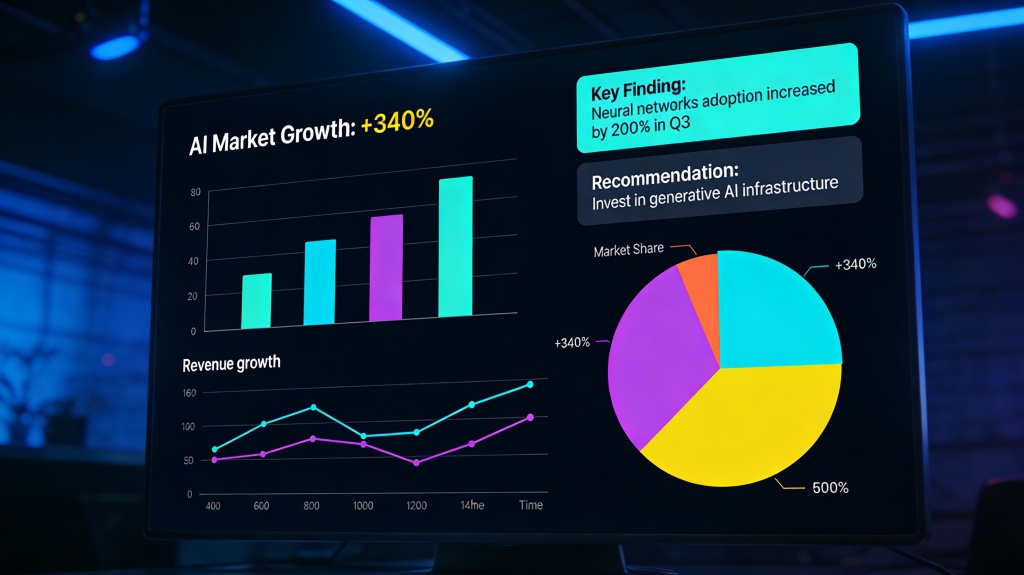
A collection of charts is just a gallery; a report requires insights. This is where the "AI" in AI data report deck truly shines. Using Large Language Models (LLMs), these tools can "read" the data points and generate executive summaries or bulleted insights that explain what the numbers mean.
For example, if your marketing deck shows a high conversion rate but a low total volume, the AI can generate a slide title like "High Efficiency, Low Scale: Opportunities for Budget Expansion." This moves the conversation from "What happened?" to "What should we do next?" It bridges the gap between raw information and strategic action.
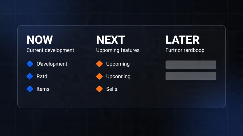
Designing for Clarity: Best Practices for Data Decks
Even with AI assistance, understanding design principles is crucial for a successful report. Clarity should always trump decoration. Here are three rules for your next deck:
- Maximize White Space: Don't crowd your charts. Give the data room to breathe so the viewer's eye is drawn to the most important point.
- Use Color Strategically: Use a single "action color" (like a bright blue or orange) to highlight the most important data point, while keeping the rest of the chart in neutral greys.
- Consistent Typography: Stick to two fonts maximum—one for headings and one for body text. AI tools typically handle this automatically, but it's good to keep an eye on readability.
Real-World Use Cases: Sales, Marketing, and Product
How are teams actually using an AI data report deck in the field? Here are a few examples:
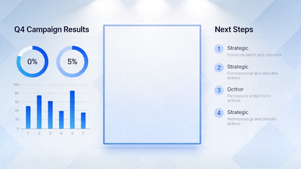
Sales Quarterly Business Reviews (QBRs): Sales leads use AI to aggregate individual representative performance, automatically generating leaderboard slides and identifying which regions are underperforming against their quotas.
Marketing Campaign Analysis: Instead of spending days on a post-mortem, marketers upload their ad spend and conversion data. The AI generates a deck that highlights the ROAS (Return on Ad Spend) and suggests which creative assets performed best.
Product Development: Product managers use AI to visualize user engagement metrics, turning complex behavioral data into simple funnels that show where users are dropping off in the app.
Common Pitfalls to Avoid in AI-Generated Reports
While AI is a powerful ally, it is not infallible. Users should be wary of "hallucinations"—where the AI might misinterpret a specific column header or make an incorrect assumption about a data outlier. Always perform a "human-in-the-loop" check. Verify that the AI's summary matches the actual numbers on the chart.
Another pitfall is over-automation. A report that is 100% AI-generated without your unique business context can feel cold and generic. Use the AI to build the foundation, then add your personal "Executive Commentary" to provide the nuance that only a human expert can offer.
Frequently Asked Questions
Can an AI data report deck handle complex Excel files?
Yes, modern AI presentation tools can process CSV and Excel files, identifying key variables to generate relevant charts and summaries automatically. They are designed to handle thousands of rows of data without slowing down.
How does AI generate insights from raw numbers?
AI uses Large Language Models (LLMs) to scan for patterns, anomalies, and trends within the data, then translates those mathematical findings into natural language narratives that stakeholders can easily understand.
Is my data secure when using an AI presentation maker?
Enterprise-grade AI tools like PopAi prioritize data encryption and privacy. It is always recommended to check the platform's security certifications and terms of service before uploading sensitive or proprietary corporate data.