15 PowerPoint Presentation Examples and What Makes Them Work
Updated July 16, 2026 · PopAi Editorial Team
The best PowerPoint presentation examples do more than look polished. They show how to turn a goal, a set of facts, and an audience need into a clear sequence of slides.
That is why copying a color palette rarely improves a weak deck. A useful example reveals the logic underneath the design: what the audience needs to understand first, which evidence belongs on screen, and what should happen after the final slide.
Below are 15 adaptable presentation blueprints for business, education, sales, research, and creative work. Each one includes a recommended slide sequence and the reason that structure works. Use them as starting points, then replace the sample logic with your own evidence, voice, and visual identity.
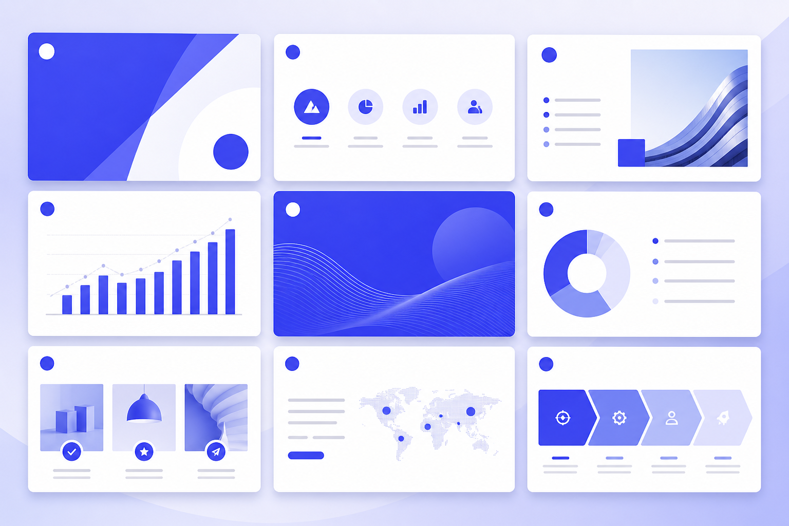
What Makes a Good PowerPoint Presentation Example?
A good example helps you answer five practical questions:
- Purpose: What should the audience know, feel, or do by the end?
- Audience: What context do they already have, and what might they question?
- Sequence: Does each slide create a reason to see the next one?
- Evidence: Are claims supported by data, examples, demonstrations, or credible sources?
- Delivery: Can the presenter explain the slide without reading it word for word?
Strong presentations also use visual hierarchy deliberately. The most important idea should be easy to identify within a few seconds. Supporting details can appear in charts, diagrams, short labels, or speaker notes instead of competing with the main point.
1. Quarterly Business Review Presentation
Recommended slide sequence: Executive summary → goals and key metrics → performance trends → wins → gaps → root causes → next-quarter priorities → decisions needed.
A quarterly business review works when it separates facts from interpretation. Start with the outcome, then show the data that explains it. Instead of placing every metric on one dashboard, group metrics by business question: growth, efficiency, customer health, or delivery.
The most useful slides pair a conclusion-style headline with one chart. “Retention improved after onboarding changes” is more informative than “Customer Retention.” End with owners, deadlines, and decisions so the deck becomes a management tool rather than a historical report.
2. Project Status Presentation
Recommended slide sequence: Project objective → current status → completed milestones → timeline → risks and dependencies → budget or resource update → next actions → support required.
Project status slides should reduce uncertainty. A simple red-amber-green status can help, but it needs a brief explanation: what changed, why it matters, and what action is proposed.
Keep the timeline at the level the audience can influence. Executives may need milestone dates and escalations; a delivery team may need workstreams and handoffs. A clear “asks” slide prevents risks from being discussed without a decision.
3. Sales Proposal Presentation
Recommended slide sequence: Client situation → desired outcome → cost of the current problem → proposed approach → solution in action → implementation plan → evidence → commercial next steps.
An effective sales proposal is organized around the buyer, not the seller. Open with the client’s situation in language they recognize. Introduce your company only after you have demonstrated that you understand the problem.
Use one visual to show how the proposed workflow changes the current state. Case studies are more credible when they explain the starting point, action, and measurable result. If a result cannot be verified, describe the process rather than making a broad performance claim.
4. Marketing Campaign Report
Recommended slide sequence: Campaign objective → audience and message → channel plan → creative examples → performance by funnel stage → insights → experiments → recommendations.
Marketing reports often become collections of screenshots and disconnected metrics. A stronger example connects each measure to the original objective. Reach can show distribution, engagement can indicate response, and conversion can show business action—but no single metric tells the whole story.
Annotate charts with the moment that changed performance, such as a creative refresh or audience adjustment. Finish with specific tests: what will change, what stays constant, and which metric will determine the result.
5. Product Launch Presentation
Recommended slide sequence: Market context → customer problem → product promise → key use cases → product demonstration → positioning → launch plan → readiness → success measures.
A product launch deck needs one consistent promise. Features should support that promise rather than appear as an inventory. Screenshots, short workflows, and before-and-after diagrams are often more useful than long feature lists.
Separate the customer story from the operating plan. The first section builds understanding; the second aligns teams on channels, owners, dependencies, and launch criteria. This keeps the presentation useful for both storytelling and execution.
6. Startup Pitch Deck
Recommended slide sequence: Problem → solution → product → market → business model → traction → go-to-market → competition → team → financial logic → ask.
Pitch deck examples are valuable because they show how much can be communicated with very little space. The strongest slides make one claim at a time and support it with evidence appropriate to the company’s stage.
Early-stage teams may use customer interviews, prototypes, or pilots. Later-stage teams can show retention, revenue quality, or repeatable acquisition. The structure is a guide, not a fixed formula; investors still need a coherent explanation of why this problem, solution, market, and team belong together.
7. Company Profile Presentation
Recommended slide sequence: One-sentence company overview → customer groups → capabilities → products or services → operating footprint → selected results → team → ways to work together.
A company profile should help a specific audience understand relevance quickly. Replace generic statements such as “a leading provider” with concrete information: whom you serve, what you deliver, and what makes your approach distinctive.
Use customer logos, project examples, or numbers only when permission and evidence are available. If the deck serves several audiences, create a short core version and add audience-specific sections rather than making every viewer sit through every detail.
8. Employee Training Presentation
Recommended slide sequence: Learning objectives → why the topic matters → concept → worked example → guided practice → knowledge check → job aid → next step.
Training slides should support learning, not simply store information. Alternate explanation with participation. A short scenario, classification task, or decision question can reveal whether learners understand the idea before the session moves on.
Keep procedures visually consistent. Use the same colors and labels for actions, warnings, and examples. Put detailed reference material in a handout or appendix so the live presentation remains easy to follow.
9. New Employee Onboarding Presentation
Recommended slide sequence: Welcome → company purpose → how the organization works → team and roles → essential tools → first-week plan → key policies → where to get help.
New employees need orientation more than corporate history. Organize information around the questions a new starter will ask: What am I here to do? Who should I contact? Which systems matter today? What does good progress look like in the first month?
A timeline and simple organization map are more useful than several slides of names. Link to living resources instead of embedding policy text that may change.
10. Lesson Presentation
Recommended slide sequence: Lesson question → prior-knowledge check → explanation → example → guided activity → discussion → quick assessment → summary and further practice.
A classroom presentation is effective when it creates opportunities to think. Use slides to frame questions, reveal steps, compare examples, and guide discussion. Avoid placing the entire lesson script on screen.
For complex concepts, progressively disclose information. Show the problem first, invite predictions, and then reveal the reasoning. This supports learning without turning the deck into an answer sheet.
11. Research or Thesis Presentation
Recommended slide sequence: Research question → why it matters → prior work → method → findings → interpretation → limitations → implications → conclusion.
Research presentations need selection. The audience rarely needs every table from the written paper. Choose the evidence required to understand the main argument and move secondary analyses to an appendix.
Use chart titles that state the finding, define unfamiliar terms, and explain axes clearly. A limitations slide strengthens credibility when it identifies what the study can and cannot establish without undermining the work.
12. Data Analysis Presentation
Recommended slide sequence: Decision to be made → data scope → key finding → supporting analysis → segment differences → caveats → recommendation → measurement plan.
Data presentations should start with the decision, not the database. Each chart needs a question and a takeaway. Remove legends when direct labels are clearer, and avoid decorative chart types that make comparison difficult.
When uncertainty matters, show it. Sample size, missing data, assumptions, and alternative explanations can be summarized without overwhelming the audience. The final recommendation should connect directly to the evidence shown.
13. Change Management Presentation
Recommended slide sequence: Why change is needed → what will change → what will not change → impact by audience → transition plan → support and training → feedback channels → immediate next steps.
People respond better to change when the practical impact is clear. A useful deck acknowledges concerns, distinguishes decisions from open questions, and gives people a way to participate.
Use a before-and-after process map for operational changes. Pair the timeline with support resources and named owners. Repeating a concise core message across several slides can be helpful when it answers different audience questions.
14. Conference or Keynote Presentation
Recommended slide sequence: Opening tension → central idea → story or evidence → development of the argument → practical implication → memorable close.
A conference presentation is experienced in real time, so the slides should be readable at a distance and understandable at a glance. Use full-screen images, short statements, and simple charts that support the speaker’s rhythm.
The opening should create a question the talk will answer. The close should resolve that question and leave the audience with one idea worth repeating. Speaker notes can hold detail that does not belong on screen.
15. Portfolio or Case Study Presentation
Recommended slide sequence: Role and context → challenge → constraints → approach → key decisions → final work → outcome → reflection.
A portfolio becomes more persuasive when it reveals thinking, not just polished outputs. Explain the constraints and trade-offs behind the work. If the project was collaborative, identify your contribution accurately.
Show enough process to make the result credible, but curate it. Two or three meaningful iterations usually communicate more than a wall of sketches. Close with what you learned and how that learning influenced later work.
Design Lessons You Can Reuse Across These Examples
Write message-led slide titles
A title such as “Three customer groups drive most renewals” tells the audience what to notice. Topic labels such as “Renewals” make the audience interpret the slide before they know why it matters.
Give each slide one primary job
A slide can explain a process, compare options, show evidence, or prompt a decision. Asking it to do all four usually creates clutter. Move secondary details to the notes, appendix, or next slide.
Use presentation rules as editing prompts, not laws
Rules such as 5-5-5 or 7-7-7 are popular because they remind presenters to limit on-screen text. They are not universal design standards. A quotation, legal statement, technical diagram, or workshop instruction may need a different treatment. Judge a slide by readability, purpose, and delivery context.
Match the visual to the relationship
Use a timeline for sequence, a matrix for comparison, a process diagram for flow, and a chart for quantitative evidence. Decoration should not compete with the information.
Build accessibility into the design
Use readable type, sufficient contrast, meaningful link text, and alternatives to color-only coding. Add alt text when the delivery format supports it, and avoid essential information that appears only in an animation.
How to Turn an Example Into Your Own Presentation
- Write the audience decision. Complete the sentence: “After this presentation, the audience should be able to…”
- Choose the closest structure. Select one of the examples above based on purpose, not appearance.
- Collect evidence. Gather the source documents, data, quotations, screenshots, and approvals you will need.
- Draft the storyline. Write slide titles in sequence before designing the slides.
- Add visuals selectively. Use a visual only when it explains, proves, or makes the idea easier to remember.
- Review for accuracy. Check numbers, names, dates, links, citations, and permissions.
- Rehearse in the real setting. Test screen size, timing, transitions, and any audience interaction.
Create a First Draft With PopAi
When the source material already exists, the slowest part is often turning it into a useful outline. The PopAi AI Presentation Maker can start from a prompt, PDF, Word document, PPTX file, or web page. You can review the proposed outline, choose a style, edit text and visuals online, and export the result as PPTX or PDF. A share link is also available for browser-based review.
Treat the generated deck as a draft. Confirm every factual claim, replace generic examples with your own evidence, and adjust the pacing for the audience. The presentation examples in this guide can serve as structural instructions in your prompt.
Try this prompt:
Start With Structure, Then Make It Yours
Good PowerPoint examples are useful because they reveal a repeatable pattern. Choose a structure that fits the audience’s decision, replace the example content with credible evidence, and design each slide around one clear job.
If you have a prompt or source document ready, use the PopAi AI Presentation Maker to turn it into an editable first draft, then apply the review steps above before you present.
Frequently Asked Questions
What is the best example of a PowerPoint presentation?
The best example is the one that matches your audience and objective. A sales proposal should focus on the buyer's situation and next decision, while a research presentation should focus on the question, method, findings, and limitations. Structure is more important than copying a visual style.
What is the 5-5-5 rule in PowerPoint?
The 5-5-5 rule is a simple editing guideline: no more than five words per line, five lines of text per slide, and five consecutive text-heavy slides. It can encourage brevity, but it is not a universal rule. Use the amount of text the audience can comfortably read in the delivery setting.
What is the 7-7-7 rule in PowerPoint?
The 7-7-7 rule generally recommends no more than seven lines per slide, seven words per line, and a limited run of similarly structured slides. Like other numeric rules, it is a prompt to reduce clutter rather than a requirement for every presentation.
How do I make a simple PowerPoint presentation look professional?
Use a consistent layout, one primary message per slide, clear type hierarchy, aligned elements, and a restrained color palette. Replace generic topic titles with conclusions, and use charts or diagrams only when they make the message easier to understand.
Can AI create a complete PowerPoint presentation?
AI can generate an outline, draft slide content, and propose layouts, which can reduce blank-page work. A human should still verify facts, adapt the story, check permissions, refine the design, and rehearse the delivery. Tools such as PopAi can export an editable PPTX so the draft can be reviewed and revised.