How to Make Slides Look Professional (AI + manual polish)
Published on April 21, 2026

Creating a presentation is easy, but learning how to make slides look professional is what separates a standard meeting from a high-stakes success. For many business professionals and marketing managers, the struggle isn't just about what to say—it's about how to present it without looking like an amateur. Inconsistent fonts, cluttered layouts, and generic clip-art can undermine even the most brilliant ideas.
In this guide, we will explore a hybrid approach to design: using Artificial Intelligence to handle the structural heavy lifting and applying a refined manual polish to achieve that "executive-ready" look. By the end of this article, you'll have a repeatable workflow to transform messy drafts into sleek, professional slide decks.
The Foundation: Why Professional Slide Design Matters
In a professional setting, your slides are a visual proxy for your competence. When slides are disorganized, your audience subconsciously questions the organization of your data and logic. A professional look builds immediate trust and keeps the focus on your message rather than distracting design flaws.
Professionalism in slides isn't about being "fancy." It’s about clarity, consistency, and constraint. You don't need a degree in graphic design; you simply need to follow a few core principles of visual communication. Whether you are pitching to investors or presenting a quarterly review, the aesthetic quality of your deck is your first impression.
Leveraging AI to Build Your Slide Framework
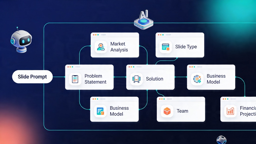
The hardest part of slide design is the "blank canvas" phase. This is where AI tools become invaluable. Modern AI presentation makers can generate a cohesive structure, suggest layouts, and even draft initial content based on a single prompt. This ensures that your foundation is solid before you even begin the manual refinement.
Using AI helps you avoid the "Frankenstein" effect—where different slides look like they belong to different presentations. AI ensures that your margins, font sizes, and basic color applications are uniform across the entire deck from the start.
Pro Tip: You can accelerate this process significantly by using the PopAi Presentation Maker to generate a professional base template in seconds.
The Power of Visual Hierarchy and Layout
To make slides look professional, you must master visual hierarchy. This means guiding the viewer’s eye to the most important information first. A professional slide usually follows a "one idea per slide" rule.
- The Headline: Should be the largest text on the page and clearly state the slide's takeaway.
- White Space: Don't be afraid of empty space. It prevents the slide from feeling cramped and allows the content to "breathe."
- Alignment: Use the grid. Professional designers never "eyeball" it. Everything should be aligned to a specific axis.
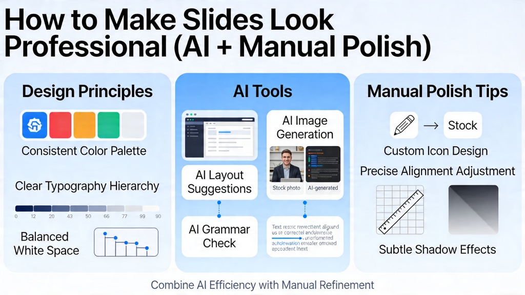
Choosing a Cohesive Color Palette and Typography
Nothing screams "amateur" like using five different fonts and a rainbow of colors. To maintain a professional edge, stick to a maximum of two font families—one for headings and one for body text. Sans-serif fonts like Montserrat or Lato are generally preferred for digital presentations due to their high legibility.
Your color palette should be limited to 3-4 colors: a primary brand color, a secondary accent color, and two neutral shades (like dark grey and off-white). AI tools are excellent at suggesting palettes, but you should manually ensure they match your company’s brand guidelines for that extra layer of polish.
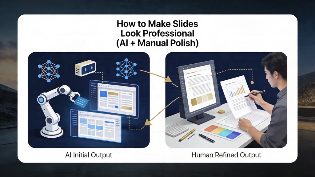
Manual Polish: The "Final 10%" That Makes the Difference
Once the AI has generated your slides, it’s time for the manual polish. This is where you inject personality and precision. Review every slide for "widows" (single words left on a line) and "orphans." Check that your icons all share the same line weight and style. If one icon is a solid silhouette and the next is a thin outline, the deck will feel disjointed.
Another key manual step is "data storytelling." AI can generate a chart, but you need to manually highlight the most important data point with a contrasting color or an arrow. This ensures your audience doesn't have to hunt for the meaning of the graph.
Common Pitfalls to Avoid in Professional Presentations
Even with AI assistance, certain habits can ruin a professional look. Avoid these common mistakes:
- Low-Resolution Images: Never use pixelated or watermarked photos. Use high-quality stock libraries.
- Over-Animation: Professional slides use subtle transitions (like "Fade" or "Push"). Avoid spinning, bouncing, or noisy animations.
- Text Walls: If the audience is reading your slide, they aren't listening to you. Keep text to a minimum.
- Default Shapes: Avoid using the standard, brightly colored shapes provided by basic software. Soften the colors and remove thick borders for a more modern look.
FAQ: Expert Tips for Professional Slides
How much text is too much on a professional slide?
A good rule of thumb is the 6x6 rule: no more than six bullet points per slide and six words per bullet point. Professional slides should focus on one key idea to maintain audience engagement.
Can AI really design a presentation as well as a human?
AI is excellent at handling the heavy lifting—alignment, layout, and content structure. However, the 'professional' edge comes from human polish: ensuring the tone is right and the branding is perfectly consistent.
What is the best font for professional presentations?
Clean, sans-serif fonts like Montserrat, Lato, or Open Sans are generally best for readability and a modern, professional look.
Create your presentation with one click now
Combine the power of AI with your unique vision. Build a professional deck in minutes, not hours.
Start Creating for Free