How to Create Charts KPIs Slides with AI
Published on April 21, 2026
In today's fast-paced business environment, the ability to communicate data effectively is a superpower. However, for many professionals, the task of manually building charts and tracking Key Performance Indicators (KPIs) in slide decks is a major bottleneck. You might spend hours wrestling with spreadsheet formatting only to end up with a cluttered slide that fails to tell a clear story. This is where artificial intelligence steps in to revolutionize your workflow.
Learning how to create charts KPIs slides with AI allows you to shift your focus from tedious data entry to strategic analysis. By leveraging AI, you can automate the visualization process, ensure accuracy, and produce professional-grade slides in a fraction of the time. Whether you are a startup founder pitching to investors or a marketing manager reporting quarterly results, AI-powered tools are now essential for high-impact communication.
The Evolution of Data Visualization: Why Use AI for KPIs?
Traditionally, data visualization required a deep understanding of software like Excel or specialized BI tools. You had to manually choose the chart type, clean the data, and style every element. AI has changed this paradigm by introducing "generative visualization." Instead of building a chart pixel by pixel, you can now provide raw data and a prompt, and the AI suggests the most effective way to display that information.
AI tools don't just "draw" charts; they analyze the underlying data to identify trends, outliers, and correlations. This means your KPI slides can automatically highlight what matters most—such as a sudden spike in user growth or a dip in retention—without you having to find those needles in the haystack yourself.
Identifying the Right KPIs for Your Presentation
Before you even touch an AI tool, you must know what you are trying to measure. A common mistake is overcrowding a slide with too many metrics, leading to "data vomit." To create effective KPI slides, focus on the 3-5 metrics that directly relate to your presentation's goal.
- Growth Metrics: Monthly Recurring Revenue (MRR), User Acquisition Cost (CAC), or Lead Conversion Rates.
- Efficiency Metrics: Burn Rate, Operational Margin, or Time-to-Market.
- Customer Metrics: Net Promoter Score (NPS), Churn Rate, or Customer Lifetime Value (CLV).
Once you have identified these, AI can help you structure the narrative around them, ensuring that each KPI is supported by a visual that makes the data "pop."
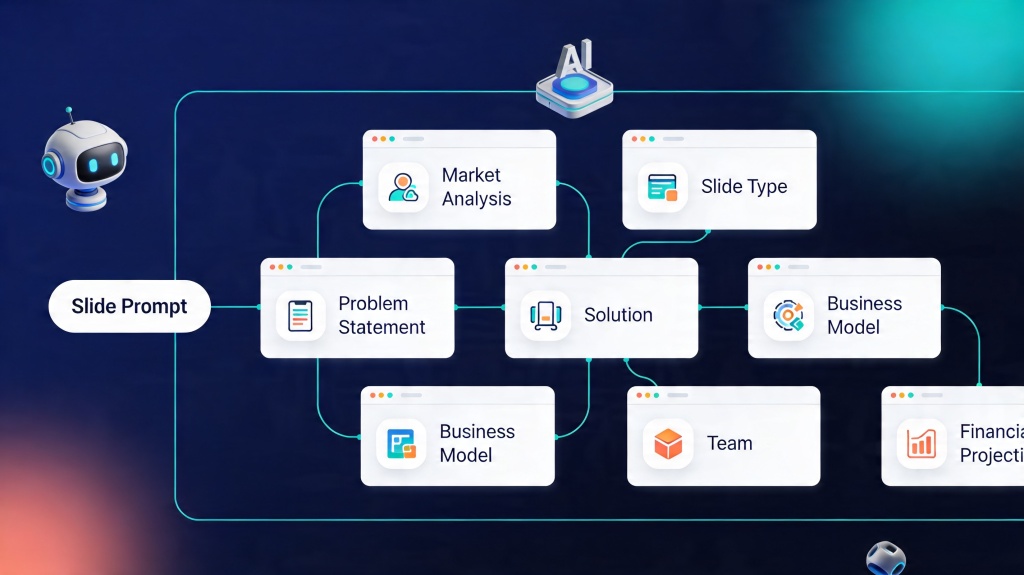
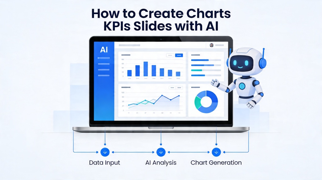
Step-by-Step: How to Create Charts KPIs Slides with AI
The process of using AI to generate data-driven slides is remarkably straightforward. Here is a typical workflow using an advanced tool like PopAi:
- Prepare Your Data: Ensure your data is in a clean format, such as a CSV or Excel file. AI works best when headers are clear and there are no merged cells.
- Upload and Prompt: Upload your file to the AI presentation maker. Use a descriptive prompt like, "Create a dashboard slide showing our Q3 revenue growth and highlight the 15% increase in September."
- Select Visualization Style: The AI will offer several chart options. Choose the one that best suits your audience—clean and minimal for executives, or detailed and technical for analysts.
- Refine and Contextualize: AI provides the foundation, but you should add the "Why." Use the AI's text generation features to add a brief executive summary or bullet points explaining the data trends.
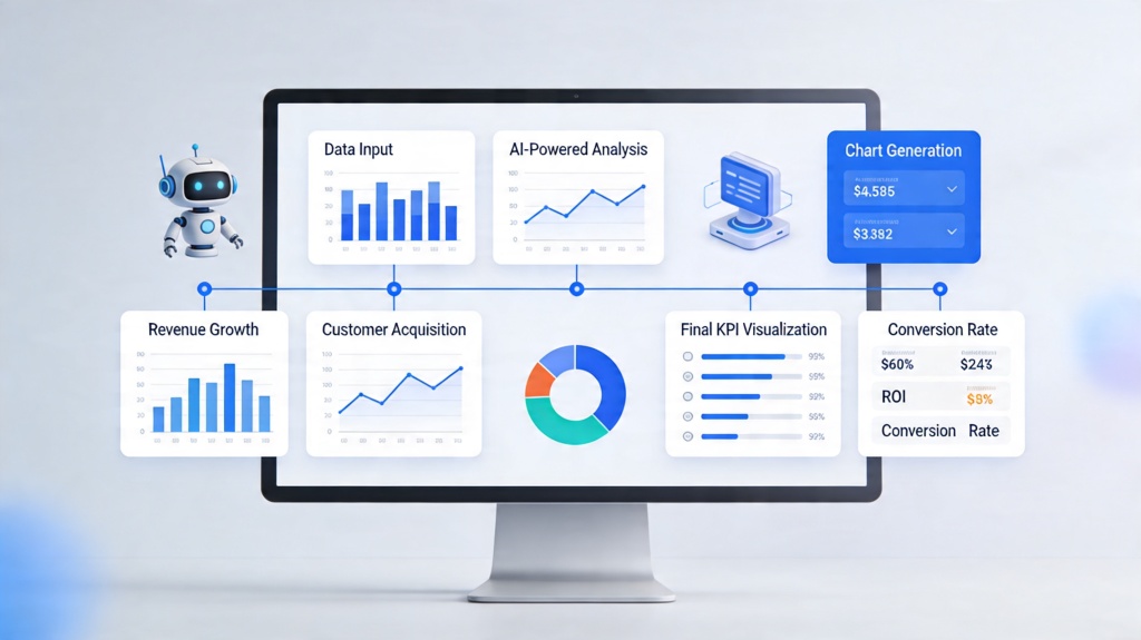
Pro Tip: When you create charts KPIs slides with AI, always ask the AI to "summarize the key takeaway" for the slide. This ensures your audience knows exactly what the data means for the business. Start building today at PopAi Presentation Maker.
Choosing the Best Chart Types for Effective Communication
AI is excellent at suggesting chart types, but a basic understanding of data storytelling helps you make the final call. Not all charts are created equal when it comes to KPIs:
- Line Charts: Best for showing trends over time (e.g., revenue growth over 12 months).
- Bar Charts: Ideal for comparing different categories (e.g., performance across different regions).
- Pie Charts: Use sparingly for showing parts of a whole (e.g., market share), but avoid if you have more than 5 categories.
- Gauge Charts: Perfect for individual KPIs that have a specific target (e.g., reaching a $1M sales goal).
Design Tips for Visualizing Data-Heavy Slides
Even with AI doing the heavy lifting, design principles still apply. To keep your KPI slides professional:
1. Use High Contrast: Ensure your data points stand out against the background. If you are presenting in a dark room, a dark mode slide with bright data lines works well. For printed reports, stick to high-contrast light backgrounds.
2. Limit Color Palettes: Use 2-3 primary colors. Use a distinct color (like red or bright green) only to highlight the most important data point on the chart.
3. Prioritize Whitespace: Don't feel the need to fill every corner of the slide. Whitespace helps the viewer focus on the chart itself.

Avoiding Common Pitfalls in AI-Generated Charts
While AI is powerful, it is not infallible. One common pitfall is the "hallucination" of data trends. Always double-check that the AI has interpreted your numbers correctly and hasn't smoothed out a significant dip that needs to be discussed. Additionally, avoid over-automating the narrative. An AI can tell you that "revenue is up," but it doesn't know that it's because of a specific marketing campaign you ran—you need to provide that context.
Frequently Asked Questions
Can AI automatically update my KPI slides?
Yes, many modern AI presentation tools allow you to link live data sources like Google Sheets or CSV files. When the source data changes, the AI-generated charts can be refreshed with a single click, ensuring your KPIs are always current.
Which AI tool is best for creating data-heavy slides?
Tools like PopAi are specifically designed to handle complex data inputs and transform them into visual narratives. The best tool is one that combines generative AI for design with robust data processing capabilities.
Is my data secure when using AI presentation makers?
Security varies by provider. Reputable platforms use encryption and do not use your private business data to train their public models. Always check the privacy policy of the AI service you choose.
Create your presentation with one click now
Stop wasting hours on manual chart formatting. Let AI transform your data into stunning KPI slides instantly.
Try PopAi for Free