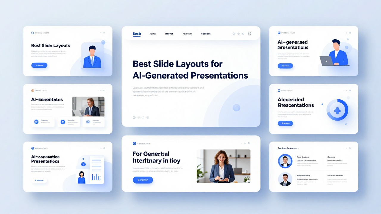
Best Slide Layouts for AI-Generated Presentations
June 23, 2026
The best AI-generated slide layout is the one that matches the slide’s job. Use a cover layout to create a first impression, an agenda layout to orient the audience, a single-message layout for key ideas, a split layout for text plus visual explanation, a comparison layout for choices, a chart layout for evidence, a timeline layout for sequence, and a summary layout for takeaways.
AI can create a deck quickly, but speed does not guarantee clarity. A slide may look clean while still burying the message in crowded bullets, mismatched visuals, weak alignment, or repeated templates that feel generic. Good layout is not only design talent; it is a set of learnable decisions about hierarchy, spacing, contrast, and purpose.
Tools like PopAi AI Presentation are especially useful for turning prompts, documents, notes, or rough ideas into an editable first draft. The professional step is to review each slide and ask: what should the audience understand, believe, compare, or do after seeing this slide?
When you are ready to turn the workflow into slides, PopAi AI Presentation can help transform rough notes, documents, or prompts into an editable deck structure.
Quick Answer: The Best AI Presentation Layouts Match the Slide’s Job
This section gives you a fast layout selection framework before you start editing individual slides.
A common AI deck problem starts like this: you upload a document, get a complete presentation in minutes, and the first impression is promising. Then you notice the rough edges. One slide has six bullets and three icons fighting for attention. Another has a chart squeezed into a corner. The title slide looks polished, but the body slides repeat the same pattern until the deck feels automatic rather than intentional.
The fix is not to chase the prettiest template. The fix is to match each slide to its communication job. A slide that introduces a topic needs a different structure from a slide that proves a claim with data. A slide that compares two options should not use the same layout as a slide that explains a step-by-step process.
- Cover slide: use a clear title, short subtitle, presenter or company detail, and one strong visual or clean background.
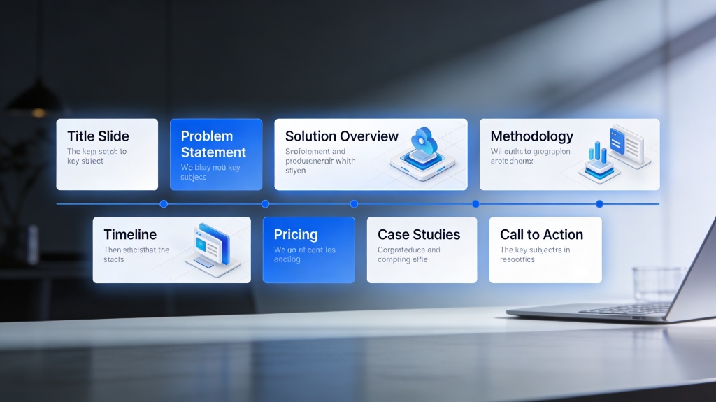
- Agenda slide: use a numbered list, section cards, or a simple timeline-style agenda to show where the deck is going.
- Single-message slide: use one bold headline and one supporting visual or short proof point when the slide has a key insight.
- Split text-image slide: use two columns when a concept needs both explanation and an image, diagram, screenshot, or example.
- Comparison slide: use side-by-side columns, cards, pros and cons blocks, or a simple decision matrix when the audience must choose between options.
- Chart slide: make the chart the visual focus and write the headline as the insight, not just the chart topic.
- Timeline or process slide: use horizontal timelines for chronological order, vertical steps for detailed explanation, and cycles only when the process repeats.
- Summary slide: use three to five takeaway cards, a recommendation statement, or a next-steps layout.
Before accepting an AI layout, finish this sentence: This slide helps the audience understand, compare, prove, sequence, persuade, or remember _____. If you cannot complete the sentence, the layout probably needs editing.
PopAi AI Presentation can help you move from messy input to a structured deck faster than starting from a blank slide. For example, you can paste a rough product idea, upload meeting notes, or summarize a research document into a first presentation draft. After that, the most valuable design step is checking whether every layout supports the message instead of simply looking balanced.
Choose Layouts by Message Type, Not by What Looks Pretty
This section explains how to select layouts based on what the slide must communicate.
The main decision rule is simple: identify the one thing the audience should understand after the slide. Not three things. Not everything from the source document. One thing. Once that message is clear, layout selection becomes much easier.
AI tools often generate visually balanced slides because balance is easier to automate than judgment. A slide can have equal columns, matching icons, and pleasant colors while still using the wrong structure. If the slide’s purpose is to prove a market trend, a decorative icon grid is weaker than a chart-focused layout. If the purpose is to compare product plans, a paragraph layout is weaker than a decision matrix or side-by-side card layout.
- Big idea: use a single focal statement with a large headline, one supporting phrase, and a simple visual or accent shape.
- List of points: use a three-card or four-card grid when the points are parallel and belong to one category.
- Comparison: use two columns for direct contrast, feature cards for multiple options, or a decision matrix for criteria-based evaluation.
- Process: use a horizontal timeline for chronological order, vertical steps for explanation depth, or a swimlane-style layout if different teams own different actions.
- Data proof: use a chart-first layout with the insight in the title and only the labels needed to interpret the chart.
- Recommendation: use a strong statement at the top, followed by two or three supporting reasons or proof blocks.
- Quote or testimonial: use a quote-focused layout with generous white space, attribution, and one contextual detail.
- Case example: use a problem-solution-result structure, but avoid inventing numbers if the source material does not include them.
- Closing summary: use three to five takeaway cards or a next-steps layout with owner, action, and timing if that information is known.
For example, an AI-generated sales slide may turn product value into five bullets: saves time, improves reporting, supports collaboration, integrates with workflows, and reduces manual effort. Instead of leaving the slide as a bullet list, convert it into three value cards: speed, visibility, and teamwork. Each card gets one icon, one short headline, and one supporting phrase. The remaining details can move to speaker notes or a follow-up slide.
- Read the AI-generated slide title and ask whether it states a message or only names a topic.
- If it only names a topic, rewrite it as a takeaway headline.
- Identify the slide’s job: explain, compare, prove, sequence, persuade, or summarize.
- Choose the layout that makes that job easiest for the audience to understand.
- Remove any element that does not support the job.
Use PopAi to generate a pitch deck outline from a business idea. Then label each slide by purpose: problem, audience, solution, proof, comparison, roadmap, and next steps. This turns layout choice into a communication decision instead of a decoration decision.
Core Layout Principles That Make AI Slides Look Professional
This section covers the practical design principles non-designers need to edit AI-generated slides confidently.
Professional-looking slides usually come from a few repeatable principles: contrast, alignment, repetition, proximity, hierarchy, and white space. These are not abstract design terms. They are editing checks you can apply to any AI-generated layout in a few minutes.
- Contrast means making the most important element visibly different through size, font weight, color, or placement. Before: a long title, six equal bullets, and a small chart compete equally. After: the key message becomes a bold headline, the chart becomes the largest element, and only two supporting notes remain.
- Alignment means lining up text, images, icons, and shapes so the slide feels intentional. Before: icons float at slightly different heights and text blocks start in different places. After: all cards share the same top edge, same left margin, and same internal spacing.
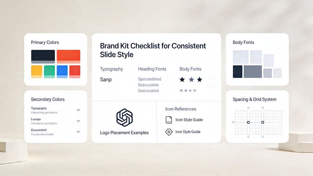
- Repetition means reusing font styles, colors, icon styles, spacing, and slide structures across the deck. Before: one slide uses rounded cards, another uses sharp boxes, and another uses floating text. After: the deck repeats a recognizable system.
- Proximity means placing related items close together and separating unrelated items with space. Before: labels sit far from the visuals they describe. After: each label is grouped tightly with its image, number, or chart segment.
- Hierarchy means guiding the eye from title to main point to supporting detail. Before: the audience does not know whether to read the bullet list, chart, or image first. After: the headline states the point, the visual proves it, and small notes explain it.
- White space means leaving breathing room so the slide does not feel crowded. Before: every corner is filled. After: fewer elements create a calmer, more confident slide.
A reliable editing move is to enlarge what matters and delete what does not. If the slide is about a trend, the chart should not be smaller than the supporting text. If the slide is about a recommendation, the recommendation should not be hidden in the third bullet. If the slide is about a process, the sequence should be visually obvious before the audience reads the details.
- Limit each slide to one main idea whenever possible.
- Keep body text short enough that the audience can scan it while listening.
- Avoid using too many font styles; use size and weight first.
- Use consistent margins so slides feel related.
- Keep spacing between similar objects consistent, especially in cards, timelines, and comparison layouts.
- Do not make every element colorful; reserve accent color for emphasis.
A strong AI slide is not the slide with the most generated content. It is the slide where the audience immediately knows what to notice first.
PopAi can help generate organized slides from rough material, which is often the hardest first step for non-designers. Once the draft exists, inspect contrast, alignment, hierarchy, and white space before presenting. AI can accelerate structure, but the presenter still decides what deserves emphasis.
Best Layouts for Common AI-Generated Deck Slides
This section shows how to apply specific layouts to the slide types you are most likely to create.
Most AI-generated presentations include familiar slide types: title, agenda, section divider, body content, comparison, chart, timeline, and summary. The layouts below work across business, class, research, marketing, sales, and product decks because they are tied to communication needs rather than visual trends.
- Cover slide: structure it with a clear title, short subtitle, presenter or organization detail, and one strong visual or simple background. For a research presentation, the visual might be a clean abstract image or topic-related photo. For a product deck, it might be a product screenshot or brand-colored gradient. Avoid placing five logos, a long subtitle, and a busy image on the same cover.
- Agenda slide: use a simple numbered list for short decks, section cards for medium decks, and timeline-style agendas for presentations with a clear journey. In a class presentation, a numbered agenda helps students follow the lesson. In an executive briefing, section cards can show the main decision areas without overexplaining them.
- Body content slide: use one-message slides for key insights, two-column text-image layouts for explanation, three-card layouts for grouped ideas, and section divider slides when the topic changes. If PopAi summarizes a long document into several dense slides, look for places to turn paragraphs into cards or diagrams.
- Comparison slide: use side-by-side columns for two options, feature cards for three or four choices, pros and cons blocks for trade-offs, and decision matrices when criteria matter. Avoid overcrowded tables with tiny text; if a table requires too much reading, split it into two slides or highlight only the deciding criteria.
- Chart slide: make the chart the visual focus. Put the insight in the headline, keep labels readable, remove decorative clutter, and use accent color to highlight the key bar, line, or segment. A sales deck might use a bar chart to compare package adoption. A research deck might use a line chart to show a trend over time.
- Timeline or process slide: use horizontal timelines for chronological milestones, vertical steps for detailed explanation, and loop layouts only when the process repeats. A product roadmap works well as a horizontal timeline. A customer onboarding process may work better as vertical steps with short descriptions.
- Summary slide: use three to five takeaway cards, a recommendation statement with supporting proof, or a next-steps layout. In a marketing deck, the summary might be audience, message, channel, and next action. In a class presentation, it might be key concepts, example, and practice task.
The best body slide layout depends on whether the content is parallel, sequential, or evidence-based. Parallel ideas belong in cards. Sequential ideas belong in timelines or steps. Evidence belongs in charts, diagrams, screenshots, or annotated visuals. When AI converts everything into bullets, your job is to identify the hidden structure.
Upload a research document to PopAi AI Presentation and generate an editable deck. Then review each dense slide: background information can become a section divider or one-message slide, findings can become chart-focused slides, methodology can become a process layout, and implications can become takeaway cards.
- For a business proposal, start with cover, problem, opportunity, solution, comparison, proof, implementation timeline, and next steps.
- For a class presentation, start with cover, learning goals, agenda, concept explanation, example, activity or discussion prompt, and summary.
- For a marketing deck, start with audience insight, campaign idea, message pillars, channel plan, creative examples, timeline, and success measures if provided.
- For a product deck, start with problem, user need, solution, feature walkthrough, competitive comparison, roadmap, and call to action.
Do not force every deck into the same structure. A short founder pitch may need fewer agenda and background slides. A training deck may need more examples and exercises. A research deck may need more evidence and caveats. AI gives you a usable starting point; professional layout editing makes the deck fit the situation.
How to Improve AI Layouts with Color, Type, Images, Icons, Charts, and Animation
This section explains the visual techniques that make generated slides clearer without requiring advanced design skills.
Once the layout is structurally right, polish the visual system. Color, typography, images, icons, charts, and animation should support the message. They should not create extra work for the audience.
- Color: use the 60-30-10 rule as practical guidance, not a performance guarantee. Let roughly 60 percent of the slide be a dominant base or background color, 30 percent be a secondary support color, and 10 percent be an accent color for emphasis. In most business decks, a neutral background with one brand accent is safer than multiple bright colors.
- Typography: limit fonts and keep title and body sizes consistent. Make headings visibly stronger than supporting text through size and weight before adding more colors. If the slide title is 32 points on one slide and 22 points on the next, the deck feels less controlled.
- Images: choose images that explain, prove, or emotionally reinforce the message. Avoid images that only decorate the slide. Crop images consistently, never stretch them, and avoid low-quality visuals that reduce credibility.
- Icons and shapes: use one icon style across the deck, such as outline icons or filled icons, not both mixed randomly. Use shapes as grouping tools for cards, callouts, or process steps rather than as scattered decoration.
- Charts: choose chart type by the question. Use bar charts for comparison, line charts for trends, pie or donut charts only for simple part-to-whole relationships, and scatter plots for relationships when needed. Remove visual noise that does not help interpretation.
- Animation: use motion sparingly to reveal sequence, process, or emphasis. Avoid effects that make the deck feel theatrical when the audience needs clarity.
Consider an AI-generated market slide with a bright blue background, two fonts, four icon styles, a small chart, and a paragraph of commentary. The slide looks energetic but unfocused. A cleaner version uses a neutral background, one accent color, one consistent icon style, and a chart-focused layout. The headline states the market insight. The chart occupies the center. The commentary becomes two short notes under the chart.
- If the slide feels loud, reduce color before reducing content.
- If the slide feels messy, check alignment and spacing before changing the template.
- If the slide feels generic, rewrite the headline as a specific takeaway.
- If the slide feels crowded, move details to speaker notes or split the content into two slides.
- If the slide feels childish, remove unnecessary icons, shadows, gradients, and animations.
Use font weight, size, and placement before adding new colors. Most AI slides become more professional when the visual system becomes simpler, not busier.
PopAi is useful here because it helps you create editable slides from content quickly. After generation, you can apply smart layout judgment and optional font or color unification tools to reduce inconsistency. Other AI presentation tools may suggest layouts or color systems, but you still need to check whether the visual choices clarify the message.
A Practical Workflow for Turning AI Drafts into Presentation-Ready Layouts
This section gives you a repeatable process for transforming an AI-generated deck into a polished presentation.
The fastest way to improve AI-generated slides is to separate structure from polish. Do not spend your first editing pass adjusting colors and icons. Start with audience, goal, story, and slide purpose. Then choose layouts. Then polish.
- Start with a clear prompt or source document. State the audience, goal, topic, desired length, and tone. For example: Create a 10-slide product launch presentation for sales managers. The goal is to explain the customer problem, introduce the solution, compare it with current workflow, and end with next steps.
- Use PopAi AI Presentation to generate a first structured deck from a prompt, document, notes, or rough idea. This helps you avoid the blank slide problem and gives you a deck you can actually edit.
- Review the outline before polishing visuals. Remove duplicated points, merge similar slides, and reorder the story so it follows the audience’s decision path.
- Label each slide’s job: introduce, explain, compare, prove, sequence, persuade, or summarize.
- Match each slide to the right layout based on that job. Use cards for grouped ideas, charts for proof, timelines for sequence, and single-message slides for key insights.
- Reduce text by turning paragraphs into headlines, short bullets, cards, diagrams, or speaker notes. If the slide needs a paragraph to make sense, the layout is probably doing too little work.
- Apply consistency checks: same title position, similar margins, repeated colors, consistent icons, and unified typography.
- Run an audience test. Can someone understand the slide’s main point in a few seconds without you explaining everything? If not, improve the headline, hierarchy, or layout.
Here is a realistic product launch workflow. You start with a rough internal document containing target users, pain points, product features, launch timeline, sales messaging, and open questions. PopAi turns it into a first deck with a title slide, problem slide, audience slide, solution overview, feature explanation, comparison slide, roadmap, and next steps. You then edit the problem slide into a single-message layout, the feature slide into three value cards, the comparison slide into side-by-side columns, and the roadmap into a horizontal timeline.
The important caveat is accuracy. If the source document does not include pricing, growth numbers, customer results, or launch dates, do not invent them to fill a layout. Use placeholders, qualitative statements, or speaker notes until the real information is available.
- Use a one-message layout when the slide should land one important insight.
- Use a split layout when explanation and visual evidence need to work together.
- Use a card layout when you have three to five parallel points.
- Use a comparison layout when the audience must evaluate options.
- Use a chart layout when data is the reason to believe the claim.
- Use a timeline layout when order, progress, or milestones matter.
- Use a summary layout when the audience needs to remember or act.
AI speeds up the draft, but the presenter decides what the audience should notice first.
Common AI Slide Layout Mistakes and How to Fix Them
This section helps you spot and repair the most frequent layout problems in AI-generated presentations.
Most AI slide layout mistakes are not dramatic. They are small issues that add up: too much text, weak hierarchy, inconsistent spacing, decorative visuals, and layouts that look fine but do not fit the message. A final review pass can catch these problems before the deck reaches your audience.
- Mistake: accepting every AI-generated layout without checking the message. Fix: define the slide’s one main idea and adjust the layout accordingly.
- Mistake: using too much text. Fix: move detail to speaker notes, split one slide into two, or convert bullets into cards, timelines, diagrams, or visuals.
- Mistake: weak hierarchy. Fix: make the key takeaway the headline and enlarge or highlight the most important visual.
- Mistake: inconsistent fonts, colors, icons, and spacing. Fix: create a simple style system and repeat it across the deck.
- Mistake: using decorative images that do not support the point. Fix: choose visuals that explain, prove, or emotionally reinforce the message.
- Mistake: choosing the wrong chart layout. Fix: match the chart type to the question being answered and use a headline that states the insight.
- Mistake: overusing animation. Fix: use animation only to reveal steps, focus attention, or control information flow.
The most common text problem is not simply having too many words. It is having too many words with the same visual weight. Six equal bullets tell the audience that everything matters equally. Usually, that is not true. Rewrite the slide so the main idea becomes the title, the strongest proof becomes the visual center, and only the necessary context remains.
- Final review checklist: one main point per slide.
- Final review checklist: visible hierarchy from title to main visual to supporting detail.
- Final review checklist: aligned elements with consistent margins.
- Final review checklist: readable text on screen or projector.
- Final review checklist: enough white space around major elements.
- Final review checklist: consistent fonts, colors, icon style, and spacing.
- Final review checklist: layout matched to purpose, not just template appearance.
After generating a deck quickly in PopAi, use this mistake checklist before sending it to a client, manager, professor, or audience. The final 15 minutes of layout cleanup often makes the difference between an AI draft and a presentation-ready deck.
Manual adjustment is worth it when the slide carries an important decision, claim, recommendation, or data point. Accept the AI layout when it already supports the slide’s job, has clear hierarchy, uses readable text, and fits the deck’s style. Adjust it when the message is buried, the layout repeats too often, the visual does not support the point, or the audience would need extra explanation just to understand the slide.
FAQ
What is the best layout for an AI-generated presentation?
There is no single best layout for every AI-generated presentation. The best choice depends on the slide’s job: explaining an idea, comparing options, showing data, presenting a process, persuading the audience, or summarizing takeaways.
How do I make AI-generated slides look less generic?
Improve the hierarchy, reduce text, rewrite topic titles as takeaway headlines, use consistent fonts and colors, vary repeated layouts, and choose visuals that support the message rather than decorate the slide.
Which layout should I use for text-heavy AI slides?
Convert dense text into one-message slides, three-card layouts, two-column text-image layouts, diagrams, timelines, or speaker notes. If the content contains several ideas, split it into multiple slides.
Are AI presentation layouts good enough to present without editing?
AI layouts can be a strong first draft, but you should still review accuracy, audience fit, hierarchy, visual consistency, and whether each slide layout supports the message before presenting.
How can PopAi help with presentation layouts?
PopAi AI Presentation can turn prompts, documents, notes, and rough ideas into structured editable decks, helping you move quickly from blank page to layout draft while still allowing human refinement.
Create your presentation with one click now
Use PopAi AI Presentation to turn your ideas or documents into an editable deck, then refine each layout with clear design judgment.
Try PopAi AI Presentation