Best Color Combinations for Business Presentations (2026)
June 23, 2026
If your slides feel messy, the problem is often not the topic; it is the color system. Cluttered text, mismatched accent colors, weak contrast, random gradients, and charts that use five bright colors can bury the main message. For 2026 business presentations, the safest professional direction is a restrained palette: a neutral base, one dominant brand or theme color, one supporting color, and one accent color used only for emphasis.
Good presentation color design is not pure talent. It is a learnable system built around contrast, hierarchy, repetition, proximity, alignment, and white space. AI tools can help execute that system faster, especially when you start with a clear color direction and then use PopAi AI Presentation to turn notes, documents, or prompts into a structured deck with consistent layouts.
Use the palettes below as practical starting points, then adjust them to your brand, audience, screen conditions, and data density. A color combination that looks elegant on a laptop can fail in a bright conference room if the text is too light or the accent color is overused.
When you are ready to turn the workflow into slides, PopAi AI Presentation can help transform rough notes, documents, or prompts into an editable deck structure.
Quick Answer: The Best Business Presentation Color Schemes for 2026
Here are business-ready color directions you can use immediately before fine-tuning them for your brand and slide content.
The best business slides in 2026 tend to look calm, high-contrast, and intentional. They avoid the old habit of decorating every object with a different color. Instead, they use color to guide attention: dark headlines, clean backgrounds, repeated accents, and chart highlights that make the key number obvious.
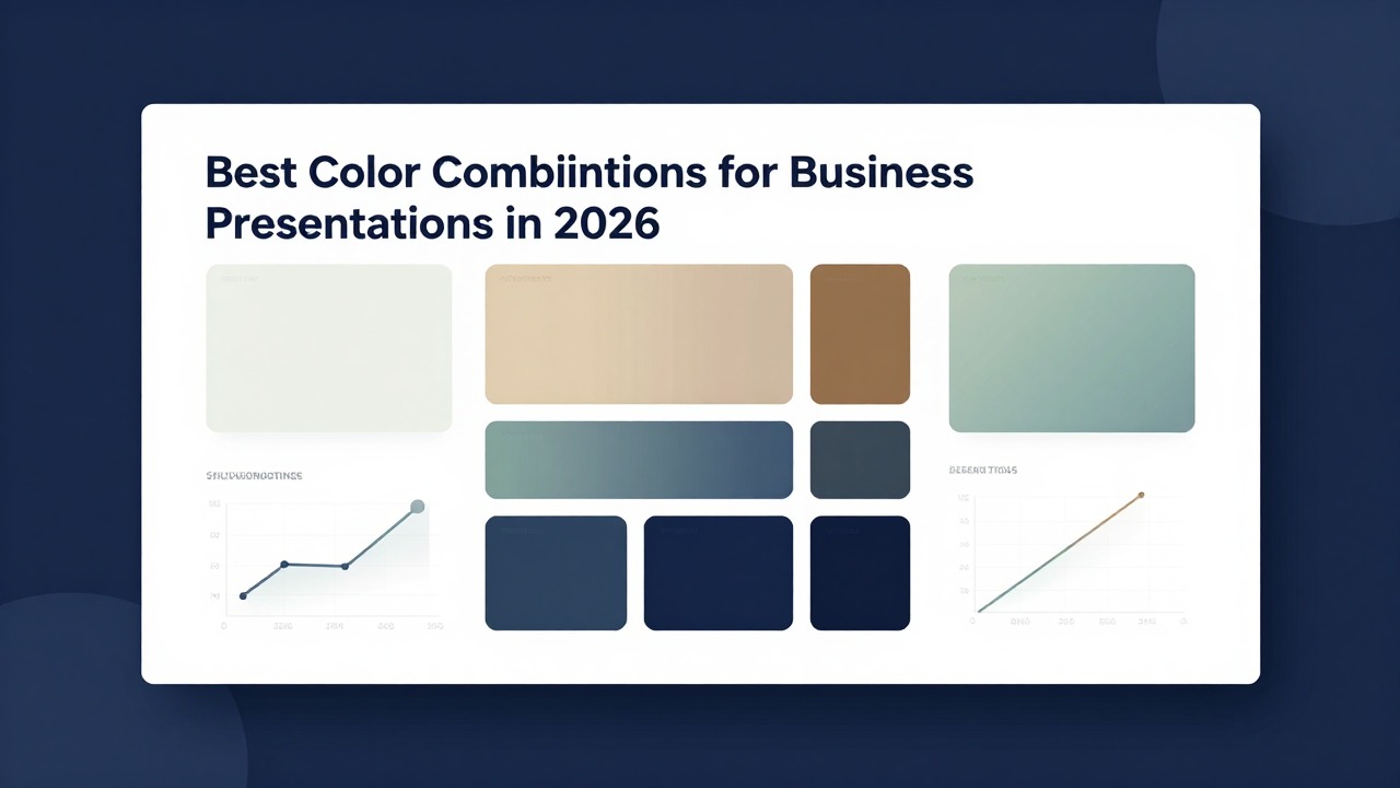
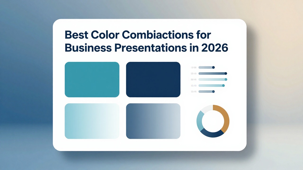
For most professional decks, start with four roles: a base background color, a primary color for structure, a secondary color for support, and an accent color for emphasis. This keeps the deck flexible enough for title slides, agendas, body slides, charts, section dividers, and summaries without looking random.
- Executive report: try navy as the primary color, white as the background direction, muted blue as the secondary color, and cyan as a restrained accent. This is a safe professional direction for board updates, annual reviews, and leadership summaries.
- Quarterly business review: try charcoal as the primary color, light gray as the background direction, medium blue as the secondary color, and a small green accent for positive movement. It works well for data-heavy decks because the neutral base lets charts breathe.
- Investor pitch deck: try deep navy as the primary color, white as the background direction, cyan as the accent, and soft gray as the support color. It often feels confident, modern, and clean without becoming flashy.
- Product launch: try black or near-black as the primary color, white as the contrast color, and one electric accent such as bright blue, lime, or coral. Use this only when the product story needs energy and the text remains highly readable.
- Sales deck: try slate blue as the primary color, white or pale gray as the background, soft orange as the call-to-action accent, and charcoal for text. This direction can feel approachable while still staying businesslike.
- Training deck: try teal as the primary color, white as the background, lime or mint as the accent, and dark gray for text. This can make learning content feel organized and fresh without overwhelming learners.
- Education or research presentation: try muted purple as the primary color, lavender as the secondary color, gray as the base, and white for open space. It can suggest curiosity and structure when used softly.
- Marketing strategy deck: try burgundy as the primary color, cream as the background, charcoal as the text color, and gold as the accent. This direction works well when you want warmth, sophistication, or a more editorial look.
- Sustainability or growth strategy: try forest green as the primary color, cream as the background, charcoal as the text color, and muted gold as the accent. Use the green for section structure and the gold only for key decisions or opportunities.
- Internal strategy meeting: try slate, off-white, muted purple, and soft orange. This combination can make strategic trade-offs feel clear while giving you enough contrast for diagrams, roadmaps, and priorities.
Do not judge a palette by the title slide alone. Test it on one dense content slide and one chart slide. If body text, labels, and the main insight are not instantly readable, adjust the palette before designing the full deck.
How to Choose PPT Color Combinations That Look Professional
Professional color choices come from the message, audience, and viewing context, not from trend lists alone.
Color has five practical jobs in a business presentation. It creates hierarchy, sets mood, emphasizes decisions, groups related information, and protects readability. If a color does not help with one of those jobs, it is usually decoration.
A simple way to control color is the 60-30-10 rule. About 60% of the slide should be the base or background, 30% should be the supporting color, and only 10% should be the accent. In a deck, this might mean white or light gray backgrounds, navy section headers, and cyan only for key numbers, arrows, or buttons.
- For trust and executive presence, use navy, white, charcoal, and a cool accent. This is strong for leadership updates, financial reviews, and client proposals.
- For analysis and clarity, use charcoal, light gray, medium blue, and restrained green or orange highlights. This works well when the audience needs to compare numbers.
- For growth or sustainability, use forest green, cream, charcoal, and muted gold. Keep green as the system color instead of making every object green.
- For urgency or action, use a neutral base with warm orange, coral, or red-orange as the accent. Reserve the warm accent for calls to action, deadlines, and key decisions.
- For innovation or strategy, use muted purple, lavender, slate, and gray. This can feel modern when paired with clean layouts and plenty of white space.
- For creativity or marketing, use burgundy, cream, charcoal, and gold, or slate blue with soft orange. Keep saturation controlled so the deck does not look like an event flyer.
Avoid choosing colors only because they are trendy. A neon accent may look current, but it can feel wrong in a risk committee update. A muted palette may look elegant, but it can become dull if every slide has the same low-contrast gray. The right palette matches your audience’s expectations and your content’s seriousness.
- Define audience formality: boardroom, classroom, investor meeting, internal workshop, or sales call.
- Check brand alignment: use brand colors as guidance, but do not force them into every background or chart.
- Consider room lighting: bright rooms and projectors usually need stronger contrast than laptop-only decks.
- Estimate data density: chart-heavy decks need calmer palettes than product launch decks.
- Plan for screen or projector use: saturated colors can glow on screens and wash out on projectors.
- Review accessibility: avoid relying only on red versus green or subtle shade differences.
- Set emotional tone: decide whether the deck should feel stable, urgent, optimistic, premium, analytical, or exploratory.
AI can shorten the setup phase, but it works best when you give it direction. In PopAi AI Presentation, you can draft the deck structure from a topic, document, or rough notes, then apply your chosen palette across the generated title slides, section dividers, charts, and summary slides instead of styling each page manually from a blank canvas.
A professional palette is not the one with the most interesting colors. It is the one that makes the message easier to understand.
Business Color Scheme Examples by Presentation Scenario
Use these scenario-based combinations when you need to choose quickly and still make a deck feel intentional.
Different presentations need different levels of energy, restraint, and contrast. A sales proposal can use a warmer call-to-action color than a quarterly business review. A product roadmap can use category colors, while an investor pitch usually benefits from a sharper, more controlled palette.
- Investor pitch deck: use navy, white, and cyan. Navy gives the deck a confident structure, white keeps it clean, and cyan can highlight traction, product screenshots, and the final ask. Apply navy to the cover and section dividers, white to most content slides, cyan to key metrics, and gray to supporting chart elements.
- Quarterly business review: use charcoal, light gray, and blue. Charcoal headlines feel serious, light gray backgrounds reduce glare, and blue can highlight progress or focus areas. Use blue for the main data series, gray for comparison data, and one green or orange marker only when the slide needs status meaning.
- Sales proposal: use slate blue, white, and soft orange. Slate blue creates trust, white keeps the proposal easy to scan, and orange can guide the buyer to next steps. Use orange for callout boxes, pricing emphasis, and proposal milestones, not for every icon.
- Product roadmap: use black, white, and one electric accent. This direction can feel sharp for technology and product launches. Use black or near-black for the cover, white for roadmap details, and the accent for the next release, launch window, or strategic bet.
- Marketing campaign plan: use burgundy, cream, charcoal, and gold. Burgundy and cream can feel editorial and brand-led, while charcoal protects readability. Use gold sparingly for campaign pillars, priority channels, or executive recommendations.
- Training deck: use teal, white, and lime or mint. Teal can organize modules, white gives learners breathing room, and lime can mark exercises, quizzes, or key reminders. Keep body text dark gray and use the accent only for interaction points.
- Education or research presentation: use muted purple, lavender, and gray. Purple can suggest exploration and strategy without becoming playful if it stays muted. Use lavender for section dividers or diagram backgrounds, gray for body text, and purple for important terms.
- Internal strategy meeting: use slate, off-white, muted purple, and soft orange. Slate and off-white keep the deck grounded, muted purple can separate strategic themes, and soft orange can mark risks or decisions. This works well for prioritization slides, roadmap debates, and leadership workshops.
Before-and-after thinking helps you diagnose color problems. Before: a slide uses red, green, blue, yellow, and purple on icons, headings, bullets, and bars because each object was formatted separately. The audience has to guess what matters. After: the slide uses a neutral background, a dark headline, gray supporting text, one blue chart series, and one orange callout for the decision. The slide now has a clear reading path.
Another common before-and-after: a quarterly report uses bright green for positive results, bright red for declines, yellow for warnings, blue for totals, and purple for notes. The slide looks busy. A cleaner version uses charcoal text, light gray dividers, blue bars for all categories, and direct labels such as “above target” or “needs attention.” Color supports the interpretation instead of carrying all meaning by itself.
Prompt PopAi with: “Create a sales proposal deck for a SaaS product for a mid-market operations team. Use a professional slate blue, white, and soft orange visual direction. Include problem, solution, product proof, pricing logic, implementation plan, and next steps.” Then review the generated deck and keep the orange accent only for buyer actions, important numbers, and decision slides.
How to Apply a Color Scheme Across Real Slides
A palette becomes professional only when it is applied consistently to slide components, not just selected in theory.
- Choose the base background first. For most business decks, use white, off-white, light gray, charcoal, or deep navy. Avoid switching background colors randomly from slide to slide.
- Set heading and body text colors. Use dark text on light backgrounds or light text on dark backgrounds. Keep body text calmer than headlines.
- Assign the accent color. Decide exactly what the accent means: key number, next action, risk, opportunity, selected option, or current section.
- Define chart colors. Use neutral colors for supporting data and the accent color only for the most important data point or trend.
- Standardize icons and shapes. Use either outline icons or filled icons, not both without a reason. Keep shapes within the same color system.
- Check contrast in presentation mode. Do this on the device or room setup you will actually use whenever possible.
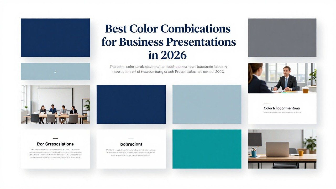
On cover slides, you can use stronger contrast than on body slides. A navy cover with a white title and a cyan accent line can look sharp. But avoid adding multiple competing accent blocks, gradients, large photos, and bright icons all at once. The cover should set the tone, not exhaust the palette.
On agenda slides, keep the background calm and use color to create navigation. For example, use charcoal for the agenda title, gray for inactive sections, and blue for the current or most important section. If every agenda number is a different bright color, the slide can look childish instead of organized.
On section dividers, color can be more assertive. Use a full navy background, a large white section title, and one cyan line or number. Repeating the same divider style between sections creates rhythm and tells the audience they are entering a new part of the story.
On content slides, use color to create hierarchy. The headline should be the first thing seen, the supporting evidence second, and the accent third. If the accent color appears on every bullet, icon, underline, and border, it stops feeling important.
On comparison slides, assign colors to meaning. If Option A is blue and Option B is gray on one slide, do not reverse them later. Keep labels close to the relevant content so the audience does not have to decode a distant legend.
On chart slides, use neutral colors for context and one highlight color for the insight. A bar chart showing regional performance might use gray bars for all regions and one blue bar for the top-priority region. The title should state the insight, such as “West region drove the strongest renewal growth,” instead of simply “Regional Renewal Rates.”
On timeline slides, use one continuous color system. A teal line with dark milestone labels and one lime highlight for the current phase is easier to follow than seven unrelated milestone colors. Use additional colors only if milestones belong to clearly different categories, such as product, marketing, and legal.
On summary slides, color should point to the final recommendation or next action. If the summary has three takeaways, use the accent color for the one decision that matters most. White space around that decision can make the color feel deliberate.
- Use contrast for readability: text and key numbers must stand out from the background.
- Use hierarchy for importance: the strongest color should belong to the strongest message.
- Use repetition for consistency: repeat the same colors for the same slide roles.
- Use proximity for grouping: place colored labels close to the content they explain.
- Use alignment for order: color cannot rescue objects that are scattered across the slide.
- Use white space for intention: a small accent on a clean slide feels more premium than many accents on a crowded slide.
PopAi can help generate slide layouts from your content so you are not manually building every page. Still, review whether your chosen colors create enough contrast and support the message. AI can speed up execution, but final judgment should come from the presenter’s understanding of the audience, brand, and decision context.
Color Rules for Text, Charts, Icons, and Backgrounds
These rules prevent the most common readability and consistency problems in business slides.
- Text rule: use dark text on a light background or light text on a dark background. Avoid low-contrast combinations such as light gray on white, pale yellow on white, dark blue on black, or saturated red on blue.
- Typography rule: color cannot fix tiny text, crowded slides, or too many font styles. Limit fonts, then use size, weight, and color together for hierarchy.
- Chart rule: fewer colors usually make charts easier to read. Use one highlight color for the main insight and neutral colors for everything else.
- Icon rule: use a consistent icon style. Do not mix thin outline icons, heavy filled icons, 3D illustrations, and emoji-like symbols in the same business deck.
- Shape rule: choose one shape language. If rounded rectangles are used for process steps, keep using rounded rectangles instead of switching to circles, hexagons, and random badges.
- Background rule: avoid busy photo backgrounds behind body text unless you add a dark overlay, light overlay, blur, or solid text panel.
For text, color and typography work together. A headline can be larger, bolder, and darker than body text. A keyword can use the accent color. But if every sentence has colored words, the reader cannot tell which words matter. Use color to clarify the reading order, not to decorate phrases.
A practical fix: change a pale yellow headline on a white slide to charcoal text with a yellow accent underline. The yellow still contributes warmth, but the headline becomes readable. This small change usually looks more professional than trying to find a darker yellow that still struggles on white.
For charts, resist rainbow formatting unless the categories genuinely require separation. A multicolor bar chart can make every category look equally important. A cleaner chart might use gray bars for all categories plus one blue highlighted bar for the segment you want to discuss. Add direct labels so the audience does not rely only on color.
For icons and shapes, consistency matters more than novelty. If your icon set uses navy outlines, keep all icons navy or gray, then use the accent color for one selected icon. If every icon has a different color, the slide begins to look like clip art rather than a business argument.
For backgrounds, the safest business choice is usually a calm solid color or a very subtle gradient. Photo backgrounds can work on covers and dividers, but they often fail on body slides. If you must use a photo, place text in a solid panel or apply an overlay so the words stay readable.
Accessibility should be treated as a design requirement, not an optional polish step. Check contrast, avoid communicating meaning only through color, and add labels, patterns, direct annotations, or explanatory text when needed. A red dot and green dot may be obvious to some viewers, but a label such as “risk” and “on track” is clearer for everyone.
Smart layout, template suggestions, and auto-color assistance can speed up consistency, but always inspect the finished deck in presentation mode. Projectors, meeting room displays, and screen-sharing compression can change how contrast and saturation appear.
A Practical AI Workflow for Building a Color-Consistent Business Deck
AI is most useful when you combine a clear visual system with human review of message, brand, readability, and data accuracy.
A common mistake is asking AI to “make it look good” without giving the tool a design direction. You get better results when you define the audience, message, and color system first. Then use AI to accelerate structure, layout variation, and consistency.
- Define the audience and goal. Decide whether the deck needs to persuade, explain, report, train, or align a team.
- Choose a color scheme. Pick a base, primary, secondary, and accent color direction before generating or redesigning slides.
- Generate the deck outline. Use PopAi to turn a prompt, document, meeting notes, or rough idea into a structured presentation flow.
- Create the slide draft. Let the AI produce editable slides with title, agenda, body, chart, divider, and summary sections.
- Apply the visual system. Keep backgrounds, headings, accents, chart colors, icons, and callouts consistent across the deck.
- Review readability. Check contrast, font size, chart labels, and whether the key takeaway is visually obvious.
- Export or edit. Fine-tune wording, brand details, data accuracy, and final hierarchy before presenting.
Workflow example one: you need an investor deck for a B2B SaaS product. Prompt PopAi with: “Create a 10-slide investor pitch deck for a B2B SaaS product using a professional navy, white, and cyan visual direction. Include problem, solution, market, product, traction, business model, go-to-market, competition, team, and funding ask.” PopAi can help you move from blank page to structured deck. Your review should then focus on whether the cyan accent is reserved for traction, product proof, and the ask instead of being scattered everywhere.
Workflow example two: you have a quarterly report document with operational metrics, revenue notes, and team updates. Prompt PopAi with: “Turn this quarterly report into a concise presentation with a clean executive style and consistent chart slides. Use charcoal, light gray, and blue, with green only for positive movement and orange only for risks.” After PopAi creates the structure, check that chart colors stay consistent and that each slide has one clear headline insight.
PopAi is especially helpful when you do not want to design from a blank slide. It can turn prompts, documents, notes, and rough ideas into an editable presentation faster, then give you a working structure to refine. That matters because color consistency is easier when the deck already has a clear sequence of cover, agenda, sections, evidence, charts, and conclusion.
- Are all headings readable from a distance?
- Is the accent color used sparingly enough to feel meaningful?
- Are chart colors consistent from one slide to the next?
- Does every slide feel like part of the same deck?
- Is the key takeaway visually obvious within a few seconds?
- Do brand colors support the message instead of overpowering it?
- Are labels and annotations included so meaning does not depend only on color?
Other AI design features, such as smart templates, auto-color suggestions, and layout suggestions, can also help reduce manual formatting. The important caveat is that AI cannot know every brand constraint, stakeholder preference, or room condition. Use it as a fast design assistant, then inspect the deck like a presenter responsible for the final decision.
The best AI workflow is not prompt, export, and hope. It is prompt, structure, apply a visual system, review, and refine.
Color Mistakes That Make Business Slides Look Unprofessional
Most color problems are fixable once you identify whether the issue is contrast, inconsistency, overuse, or unclear meaning.
- Mistake: using too many accent colors. Quick fix: reduce the slide to one accent color and use neutrals for supporting text, lines, and shapes.
- Mistake: weak contrast. Quick fix: darken text, lighten the background, or place text inside a solid panel.
- Mistake: using brand colors too aggressively. Quick fix: keep brand colors for accents, section markers, and selected highlights while using neutral backgrounds.
- Mistake: inconsistent chart palettes. Quick fix: assign the same color to the same metric, category, or meaning across the entire deck.
- Mistake: random gradient backgrounds. Quick fix: use solid backgrounds or very subtle gradients that do not compete with text.
- Mistake: decorative colors with no purpose. Quick fix: define what each color means before applying it.
- Mistake: color-coded categories that are not explained. Quick fix: add labels, legends, or direct annotations near the content.
- Mistake: overusing red and green. Quick fix: add words, icons, patterns, or status labels so the meaning remains clear without relying only on color.
A typical messy slide has red, green, blue, yellow, and purple elements because each object was formatted independently. The title is blue, the chart has rainbow bars, the callout is red, the icons are mixed colors, and the footer has a different brand shade. Nothing tells the audience where to look first.
A cleaner version uses a charcoal-white-blue system with one orange callout. The headline is charcoal, the background is white, supporting shapes are light gray, the chart uses blue for the key series, and the orange callout marks the decision. The content may be the same, but the slide now feels controlled.
Trendy palettes can still fail if alignment, spacing, typography, and hierarchy are weak. A fashionable electric accent cannot fix cramped bullet lists. A sophisticated muted palette cannot fix tiny chart labels. Color works best when the layout already has order.
Always check the deck in presentation mode, not only in the editor. Some colors look acceptable while editing because you are close to the screen. In a meeting room, low-contrast gray text, thin accent lines, and pale chart labels may disappear. Projectors can also wash out subtle colors, while bright screens can make saturated accents feel harsh.
If the audience cannot identify the key message in a few seconds, simplify the palette, strengthen contrast, add white space, and make the main takeaway visually dominant.
The larger principle is simple: color should support hierarchy and meaning, not decorate every object. When a color is repeated consistently, it teaches the audience how to read the deck. When it changes randomly, it adds mental work.
FAQ
What are the safest colors for business presentations?
Navy, charcoal, white, light gray, muted blue, and restrained accent colors are generally safe professional choices. They work because they provide strong contrast and do not distract from the message. Still, match the palette to your brand, audience, content type, and viewing conditions.
How many colors should I use in a PowerPoint presentation?
Use a practical limit of a neutral base, one primary color, one supporting color, and one accent color. You can add more colors for charts or category systems, but each extra color should have a clear meaning and be used consistently.
What color combination is best for pitch decks?
High-contrast, confident palettes work well for pitch decks, such as navy-white-cyan, black-white with one electric accent, or charcoal-blue-light gray. Use the accent color for traction, problem-solution moments, product proof, and the final call to action.
Should I use my company brand colors on every slide?
Your brand colors should guide the presentation, but they do not need to dominate every slide. Heavy brand-color backgrounds can hurt readability. A stronger approach is to use neutral backgrounds with brand colors for accents, section markers, icons, and selected highlights.
How can I make chart colors look professional?
Use neutral colors for supporting data and one highlight color for the main insight. Avoid rainbow charts unless the categories genuinely need separation. Add direct labels, annotations, or patterns so the audience does not rely only on color to understand the data.
Create your presentation with one click now
Use PopAi AI Presentation to turn your ideas, notes, or documents into a structured deck, then refine it with a clean professional color system.
Try PopAi AI Presentation