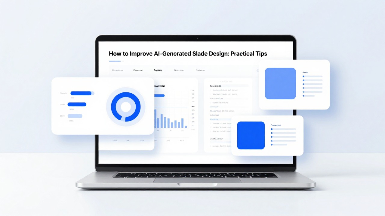
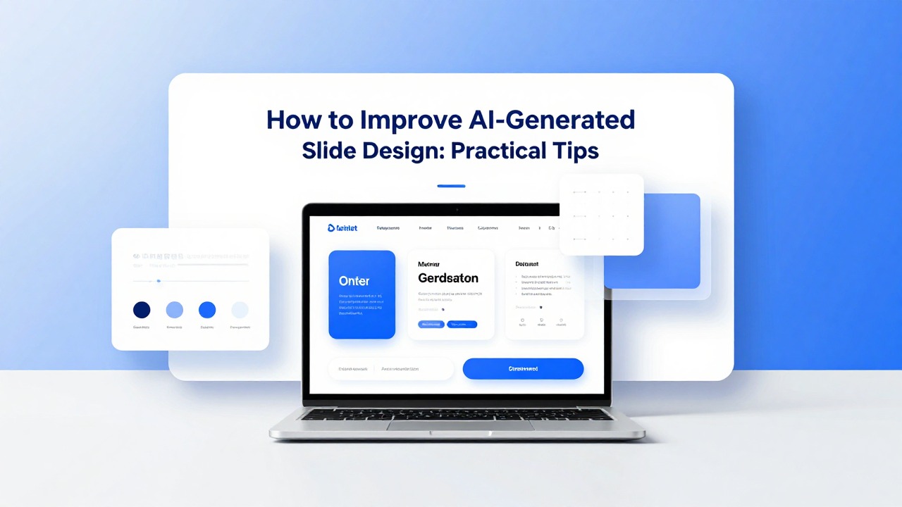
How to Improve AI-Generated Slide Design
June 23, 2026
AI-generated slides are useful first drafts, but they often look unfinished: crowded text, random colors, mismatched images, weak alignment, and slide titles that describe the topic instead of making a point. The fastest fix is not to decorate the deck. It is to clarify the message, reduce clutter, create visual hierarchy, align elements, and unify the design system.
Good slide design is not only artistic talent. It is a set of learnable decisions: what matters most, where the viewer should look first, what can be removed, and which visual style should repeat across the deck. AI tools can help execute those decisions faster, but the final judgment still belongs to you.
Use the workflow below to polish an AI-generated presentation without rebuilding everything from scratch. It shows what to check first, when to edit manually, when to regenerate with AI, and how PopAi AI Presentation can help you move from rough content to a cleaner, more professional deck.
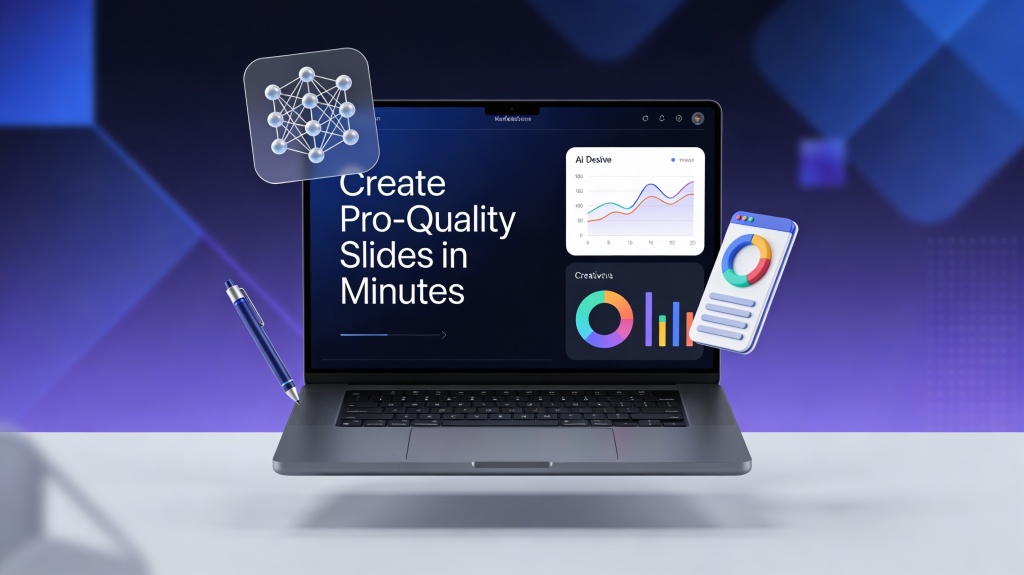
When you are ready to turn the workflow into slides, PopAi AI Presentation can help transform rough notes, documents, or prompts into an editable deck structure.
Quick Answer: The 7-Step Checklist to Polish AI-Generated Slides
Start with a deck-level scan, then fix message clarity, hierarchy, layout, consistency, visuals, charts, and final flow in that order.
The common mistake is opening the first messy slide and immediately changing colors or adding icons. That feels productive, but it can waste time because you may be styling a slide that should be split, merged, or regenerated. Before touching individual objects, zoom out and review the entire deck in thumbnail or slide sorter view.
- Clarify one message per slide. Each slide should answer, “What should the audience understand or decide after seeing this?”
- Reduce text. Keep the claim and the strongest supporting points; move details to speaker notes, appendix slides, or a handout.
- Create hierarchy. Make the title, key number, or main phrase visibly more important than supporting details.
- Align elements. Use consistent invisible edges for titles, text blocks, images, charts, icons, and footnotes.
- Unify fonts and colors. Use one or two fonts, a small palette, and a repeatable style for titles, body text, callouts, and charts.
- Improve visuals and charts. Replace generic images, crop consistently, simplify charts, enlarge labels, and highlight the point the audience should notice.
- Review flow and consistency. Check the deck in slideshow mode, confirm the story arc, and remove slides that interrupt the narrative.
If you use PopAi AI Presentation, treat it as a fast structure and iteration partner. For example, you can paste meeting notes, a product brief, or a research document into PopAi to create an editable deck structure. Then you can review the generated slides, mark weak slides for regeneration, and polish the final hierarchy, spacing, and brand fit yourself.
Fix meaning before style. A beautifully formatted slide with three competing ideas is still a confusing slide.
Diagnose the AI Deck Before You Start Editing
A short diagnostic pass helps you find the real problems instead of making random cosmetic changes.
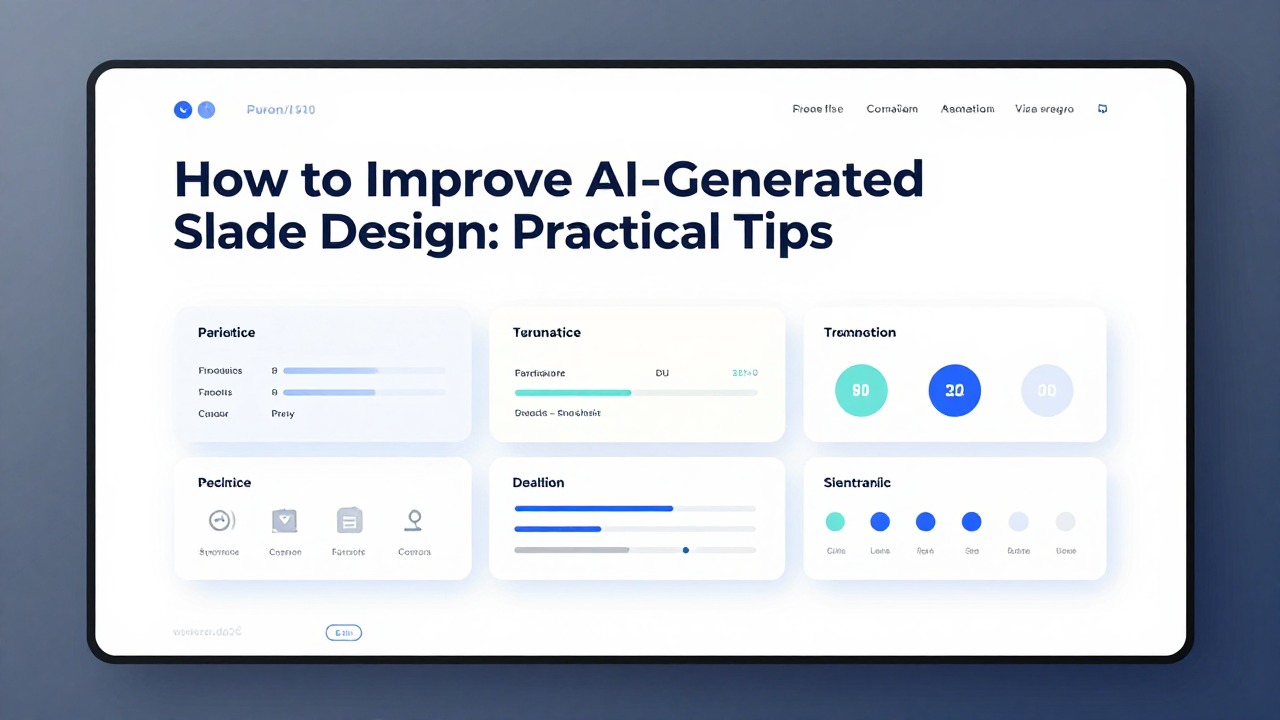
Open the deck in slide sorter or thumbnail view. Do not read every bullet yet. Look for patterns: Do all slides use the same title-plus-bullets layout? Are some slides much denser than others? Do images feel like decoration instead of evidence? Are colors changing for no reason? Does the deck have a clear beginning, middle, and ending?
AI decks often look unfinished because the tool is optimizing for speed and coverage, not final presentation judgment. It may summarize content accurately but fail to decide which idea deserves emphasis. It may choose a nice-looking image that does not support the message. It may generate a chart slide where labels are too small or the title says only “Revenue Overview” instead of the actual takeaway.
- Message clarity: Can you state the main point of each slide in one sentence?
- Layout balance: Are elements aligned, evenly spaced, and visually stable, or do they appear to float randomly?
- Visual consistency: Do fonts, colors, icons, image crops, and chart styles repeat across the deck?
- Readability: Can the audience read titles, labels, and key text from the back of a room or on a shared screen?
- Audience fit: Does the style match the context, such as investor pitch, class presentation, executive update, workshop, or sales meeting?
As you scan, mark each slide with a decision: keep, revise, split, merge, or regenerate. Keep slides that already have a clear message and useful structure. Revise slides with small design problems. Split slides that contain two or more important ideas. Merge slides that repeat the same point. Regenerate slides when the concept or structure is wrong.
- Regenerate when the slide has too many competing ideas and no clear focal point.
- Regenerate when the layout type does not fit the content, such as forcing a process into a bullet list.
- Regenerate when the section flow is wrong, such as presenting recommendations before the problem is established.
- Edit manually when the issue is small: alignment, spacing, font size, color, cropping, or removing extra decoration.
A good diagnostic pass saves more time than a long design pass because it tells you which slides are worth polishing.
Fix the Message First: One Slide, One Main Point
Professional-looking slides begin with hierarchy: the viewer should know what to read first, second, and third.
Hierarchy simply means visual order. On a strong slide, the audience sees the takeaway first, the evidence second, and the details third. On a weak AI-generated slide, everything has equal weight: the title, bullets, icons, and chart all compete for attention.
Start by rewriting descriptive titles into takeaway titles. A title like “Market Trends” names a topic, but it does not guide the audience. A stronger title would be “Remote Teams Are Driving Demand for Async Collaboration Tools.” The second version tells the audience what the slide proves.
- Weak title: “Customer Feedback”
- Better title: “Customers Want Faster Setup More Than Additional Features”
- Weak title: “Q3 Performance”
- Better title: “Q3 Growth Came From Enterprise Renewals, Not New Leads”
- Weak title: “Research Findings”
- Better title: “Students Retain More When Examples Follow Each Concept”
After the title, reduce the body. If a slide has seven bullets, ask which bullet supports the main claim most directly. Keep three short supporting points if the slide is for speaking. Move background detail to speaker notes. If all seven bullets are truly important, the slide is probably trying to do too much and should be split.
Use design to support the hierarchy. Make the takeaway title larger than the body text. Bold or color only the key phrase, not every important-sounding word. If there is a key number, enlarge it and place the explanation beside it. Put secondary details lower on the slide or in a smaller caption style.
- Before: A slide titled “Adoption Metrics” contains five equal-weight bullets, a small chart, and two icons.
- After: The slide title becomes “Activation Dropped After Step 3 in the Onboarding Flow.” The chart is enlarged, Step 3 is highlighted in the accent color, and the bullets become three short reasons below the chart.
- Result: The audience understands the problem before they inspect the details.
PopAi can help with this stage when you have rough notes but no structure. A practical workflow is to upload a product review document, ask PopAi to create a presentation outline, and then prompt it to rewrite section titles as takeaway statements. You still need to review those titles for accuracy and audience relevance, but the tool can quickly produce alternatives that are easier to refine than a blank slide.
If the slide title and the largest visual element do not support the same point, the slide will feel confusing even if it looks polished.
Clean Up Layout with Alignment, Proximity, and White Space
Alignment, proximity, and white space are the fastest layout principles for making AI-generated slides look intentional.
Alignment means objects share clean edges. In practice, align all slide titles to the same left margin, align body text with the title or a grid line, and make image and chart edges line up with nearby text blocks. Avoid elements that are almost aligned; those small differences make a slide look amateur.
Proximity means related things sit close together, while unrelated things are separated by space. If an icon labels a paragraph, move the icon close to that paragraph. If two ideas are separate, do not squeeze them into the same cluster. Space is a design tool, not empty waste.
White space means the areas without text, icons, charts, or images. Non-designers often try to fill every corner because empty space feels unfinished. In reality, white space gives the viewer room to understand the message. A quote slide, for example, often looks stronger with one large quote and generous margins than with multiple decorations around it.
- Use a simple two-column layout: text on the left 60 percent and image on the right 40 percent.
- Use three equal cards for three related ideas, with the same width, icon size, title style, and spacing.
- Use one large chart with a short takeaway above it instead of a small chart surrounded by bullets.
- Use equal margins around the slide so content does not feel trapped against the edges.
- Avoid floating elements; every object should relate to an invisible grid, a nearby group, or the slide boundary.
For cover pages, keep the layout simple: a strong title, subtitle, date or presenter name, and one relevant visual or shape treatment. For agenda slides, use a clean numbered list or horizontal roadmap. For body slides, choose one dominant layout per message type: text plus image, three cards, chart plus annotation, or process steps.
For timelines, make the time direction obvious. Use equal spacing between milestones unless the actual time gaps matter. Keep labels short and place them consistently above or below the line. For summary slides, avoid creating a crowded collage of everything in the deck. Use three to five takeaways, each with one sentence and a repeated visual style.
- Agenda slide: Use large section numbers, short labels, and enough spacing between items.
- Body slide: Put the main point at the top, the evidence in the center, and the supporting detail beneath.
- Timeline slide: Use a single direction, consistent milestone markers, and short labels.
- Summary slide: Use repeated cards or a clean list of final decisions, not a dense recap.
- Quote slide: Give the quote breathing room and make the speaker attribution smaller.
AI layout suggestions in tools such as PopAi, Beautiful.ai, or Gamma can give you a cleaner starting arrangement. Still, check the details manually. Smart layouts can align objects mathematically, but they cannot always know that one statement deserves more space than another or that a photo crop removes the most important part of the image.
If an AI-generated sales deck has six bullet-heavy product slides, use PopAi to regenerate those slides as three formats: problem-solution, feature-benefit cards, and customer workflow. Choose the clearest structure, then manually align margins, reduce labels, and make the strongest benefit visually dominant.
Unify the Visual System: Fonts, Colors, Icons, and Images
A deck feels professional when visual choices repeat in a controlled way instead of changing from slide to slide.
Repetition is the design principle that makes a deck feel intentional. Repeat title styles, body text sizes, accent colors, icon style, image treatment, chart colors, and spacing patterns. The audience should feel that every slide belongs to the same presentation, even when the content changes.
Start with typography. Limit the deck to one or two fonts. Use one style for slide titles, one for body text, one for small captions, and one for key numbers if needed. Avoid using many weights such as light, regular, medium, semibold, bold, and black in the same deck. Too many weights create visual noise.
- Title text: large, consistent, and placed in the same general area on most slides.
- Body text: readable, not squeezed, and used in short phrases rather than paragraphs.
- Captions and sources: smaller but still legible, with consistent placement.
- Emphasis: use bold or one accent color, not bold, underline, italics, shadow, and bright color at the same time.
- Line spacing: give bullets enough vertical space so they do not look like a block of fine print.
For color, choose a small palette and use it consistently. The 60-30-10 guideline is useful: about 60 percent of the design uses a neutral or background color, 30 percent uses a secondary color, and 10 percent uses an accent color. This is not a mathematical requirement, but it prevents every slide from becoming equally loud.
Reserve accent colors for emphasis: key numbers, highlighted chart bars, section markers, or important callouts. If every icon, heading, shape, and chart segment uses a different bright color, nothing stands out. If you have brand colors, use them as the starting point and avoid adding unrelated colors unless there is a clear reason.
- Good color use: dark text, light background, one brand accent for key points, muted supporting colors for charts.
- Risky color use: red, purple, orange, green, and blue all used as accents on the same slide without meaning.
- Good contrast: dark navy text on white or off-white background.
- Poor contrast: pale gray text on white, yellow text on light background, or thin text over a busy photo.
Icons should clarify ideas, not decorate empty corners. Choose one icon style: outline, filled, simple line, or flat. Do not mix outline icons with 3D icons, emoji-style illustrations, and heavy filled icons in the same deck. Keep icon sizes consistent and pair them with short labels.
AI-selected images often need replacement. Generic stock photos can make a deck feel vague, especially in business, education, or research contexts. Replace images that do not add meaning. If you keep images, crop them consistently, match their tone, and avoid mixing bright cartoon illustrations with serious documentary-style photography unless that contrast is intentional.
PopAi can help speed up consistency work by giving you structured slides and smart template directions before you polish. A useful workflow for an educator is to upload lecture notes, generate a class presentation in PopAi, then apply one clean visual system: one title style, one accent color for key terms, one diagram style for processes, and one image treatment for examples. The result still needs review, but you avoid rebuilding the deck slide by slide.
Consistency does not mean every slide must look identical. It means the audience can recognize the same design language across different slide types.
Improve Charts, Diagrams, and Visual Explanations
Data and process slides need extra review because AI may create a plausible layout without making the evidence clear.
AI-generated chart slides should always be checked for accuracy, labeling, scale, and narrative emphasis. A chart can look attractive while still hiding the main point. Before styling the chart, verify the data, axis labels, units, time period, legend, and source. Never adjust data values to make a visual pattern look better.
- Use line charts for trends over time.
- Use bar charts for comparisons across categories.
- Use pie charts only for simple parts of a whole, usually with very few slices.
- Use tables only when the audience needs precise lookup values.
- Use diagrams for processes, relationships, systems, or cause-and-effect explanations.
Once the chart type is right, highlight the key point. If one bar matters most, use the accent color on that bar and mute the others. If a trend changes after a specific date, add an annotation at that point. If the takeaway is a gap between two groups, label the gap directly instead of making the audience calculate it.
- Rewrite the chart title as a takeaway, such as “Enterprise Renewals Offset Slower New Sales.”
- Remove unnecessary gridlines, borders, shadows, and decorative effects.
- Enlarge axis labels and data labels so they are readable in slideshow mode.
- Simplify the legend or label lines and bars directly when possible.
- Round numbers where precision is not necessary, while keeping the meaning accurate.
- Use one accent color to show the data point that supports the slide message.
Diagrams need the same discipline. A process slide should have a clear start and end point. Use consistent shapes for equivalent steps. Keep labels short. Leave enough space between steps so the flow can be understood quickly. If a process has five stages, do not add five different shape styles unless each style means something.
For complex ideas, consider replacing a paragraph with a visual explanation. A customer journey can become a left-to-right timeline. A strategy can become three pillars. A workflow can become numbered steps. A relationship between teams can become a simple hub-and-spoke diagram. The goal is not to make the slide more decorative; it is to make the logic easier to see.
Do not invent numbers, sources, or precision to make a chart look more convincing. If evidence is unavailable, use qualitative wording and make the limitation clear.
Avoid the Most Common AI Slide Design Mistakes
Polishing an AI deck also means knowing what not to fix with more design, more templates, or more animation.
The first mistake is accepting the first AI draft as the final deck. AI is strong at producing structure quickly, but the first output often reflects average patterns: generic section titles, familiar stock visuals, balanced but bland layouts, and too much text. Treat it as a draft, not a finished presentation.
- Mistake: Adding more decoration when the slide feels weak. Fix: remove clutter and strengthen the main point.
- Mistake: Using too many templates in one deck. Fix: choose one visual system and adapt it across slide types.
- Mistake: Making every slide visually loud. Fix: create rhythm with a mix of simple, detailed, and high-emphasis slides.
- Mistake: Overusing animation. Fix: use animation only to reveal sequence, focus attention, or explain a process.
- Mistake: Ignoring brand or audience context. Fix: match the tone to the meeting, class, client, or decision moment.
- Mistake: Keeping decorative visuals that do not support the message. Fix: replace, crop, or remove them.
Animation deserves restraint. Use a simple appear or fade when revealing steps in sequence. Use a build to walk through a process or chart. Avoid excessive transitions, spinning effects, bouncing objects, and animations that slow the speaker down. If the audience notices the effect more than the idea, the effect is too strong.
Manual editing is better when the slide is conceptually sound and only needs polish. Adjust alignment, increase title size, crop the image, reduce the number of colors, remove an extra icon, or add spacing between groups. These edits are faster than regenerating the slide and then checking everything again.
AI regeneration is better when the slide’s structure is wrong. If the content grouping is unclear, the layout does not match the message, or the slide contains several unrelated ideas, ask the tool for a different format. You might prompt PopAi to turn a dense bullet slide into a comparison slide, process diagram, executive summary, or three-card recommendation slide.
- View the deck in slideshow mode, not only edit mode.
- Check whether every title communicates a takeaway.
- Read the smallest text from a distance or on the actual presentation screen.
- Verify data, claims, names, dates, and sources.
- Test charts for readability and remove unnecessary detail.
- Confirm that fonts, colors, icon styles, and image treatments are consistent.
- Check that the deck has visual rhythm: not every slide should have the same density or intensity.
- Rehearse the flow and remove slides that do not support the audience’s decision or understanding.
The practical recommendation is to use PopAi as a fast structure-and-iteration partner. Let it help you move from prompts, documents, notes, and rough ideas into an editable deck. Use it to regenerate weak slide structures and explore cleaner formats. Then apply human review for clarity, accuracy, brand fit, and audience relevance. That combination is how AI-generated slides become meeting-ready instead of merely template-ready.
If you only have 20 minutes, fix titles, remove clutter, align objects, unify fonts and colors, check charts, and present in slideshow mode once before sharing.
FAQ
How do I make AI-generated slides look less generic?
Customize the deck beyond the default template. Rewrite slide titles as specific takeaways, use a restrained color palette, apply consistent fonts, replace generic stock images, tighten spacing, and add examples that fit your audience, brand, topic, or meeting goal.
Should I edit AI slides manually or regenerate them?
Edit manually when the slide has a clear message and only needs small fixes such as alignment, font size, spacing, color, cropping, or removing extra elements. Regenerate when the structure, content grouping, or layout concept is fundamentally wrong.
What is the fastest way to polish an AI PPT before a meeting?
Start with the highest-impact fixes: rewrite weak slide titles, remove clutter, align elements, unify fonts and colors, check charts and images, then review the full deck in slideshow mode. Do not spend time decorating slides that still have unclear messages.
How many fonts and colors should I use in an AI-generated presentation?
Use one or two fonts and a small color palette. Keep one main accent color for emphasis, use neutral colors for most text and backgrounds, and apply the same styles consistently across titles, body text, charts, icons, and callouts.
Can PopAi AI Presentation improve slide design automatically?
PopAi AI Presentation can help generate structured decks, suggest layouts, and speed up formatting and iteration. You should still review message clarity, visual consistency, data accuracy, brand fit, and audience relevance before presenting.
Create your presentation with one click now
Use PopAi AI Presentation to turn rough content into an editable deck, then polish it with a clear design workflow.
Try PopAi AI Presentation