Presentation Summary
Explore the rich history of typography, from ancient origins to modern typefaces, and understand the anatomy and iconic designs in graphic design.
Full Presentation Transcript
Slide 1: The Evolution of Typography
A Journey Through Type History, Anatomy, and Iconic Typefaces in Graphic Design
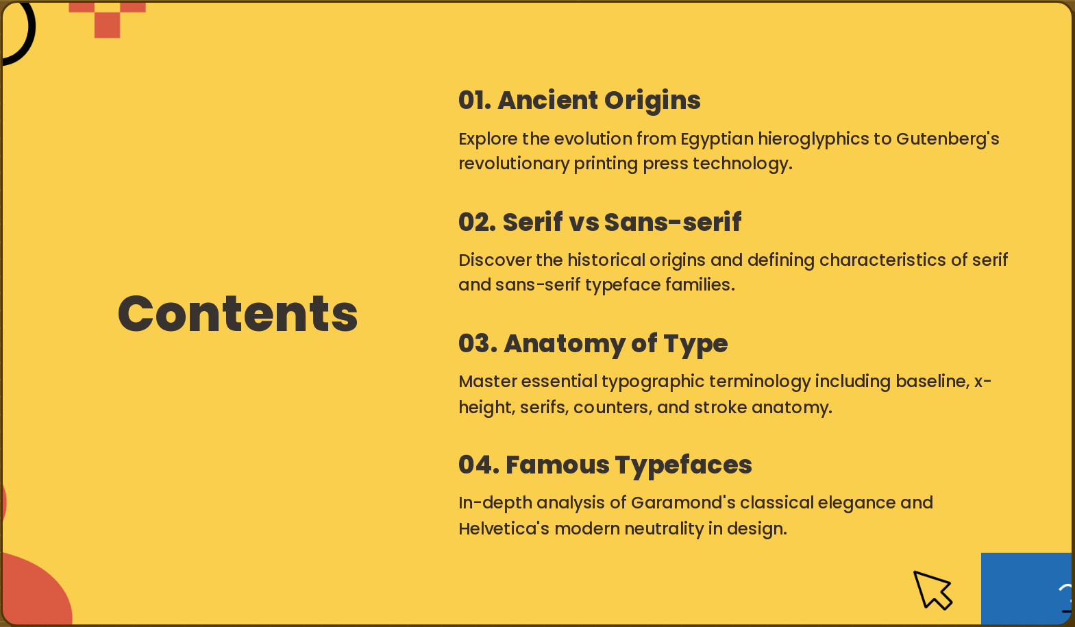
Slide 2: Contents
- Ancient Origins: Explore the evolution from Egyptian hieroglyphics to Gutenberg's revolutionary printing press technology.
- Serif vs Sans-serif: Discover the historical origins and defining characteristics of serif and sans-serif typeface families.
- Anatomy of Type: Master essential typographic terminology including baseline, x-height, serifs, counters, and stroke anatomy.
- Famous Typefaces: In-depth analysis of Garamond's classical elegance and Helvetica's modern neutrality in design.
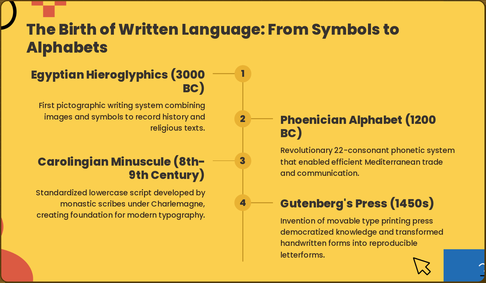
Slide 3: The Birth of Written Language: From Symbols to Alphabets
- Egyptian Hieroglyphics (3000 BC): First pictographic writing system combining images and symbols to record history and religious texts.
- Phoenician Alphabet (1200 BC): Revolutionary 22-consonant phonetic system that enabled efficient Mediterranean trade and communication.
- Carolingian Minuscule (8th-9th Century): Standardized lowercase script developed by monastic scribes under Charlemagne, creating foundation for modern typography.
- Gutenberg's Press (1450s): Invention of movable type printing press democratized knowledge and transformed handwritten forms into reproducible letterforms.
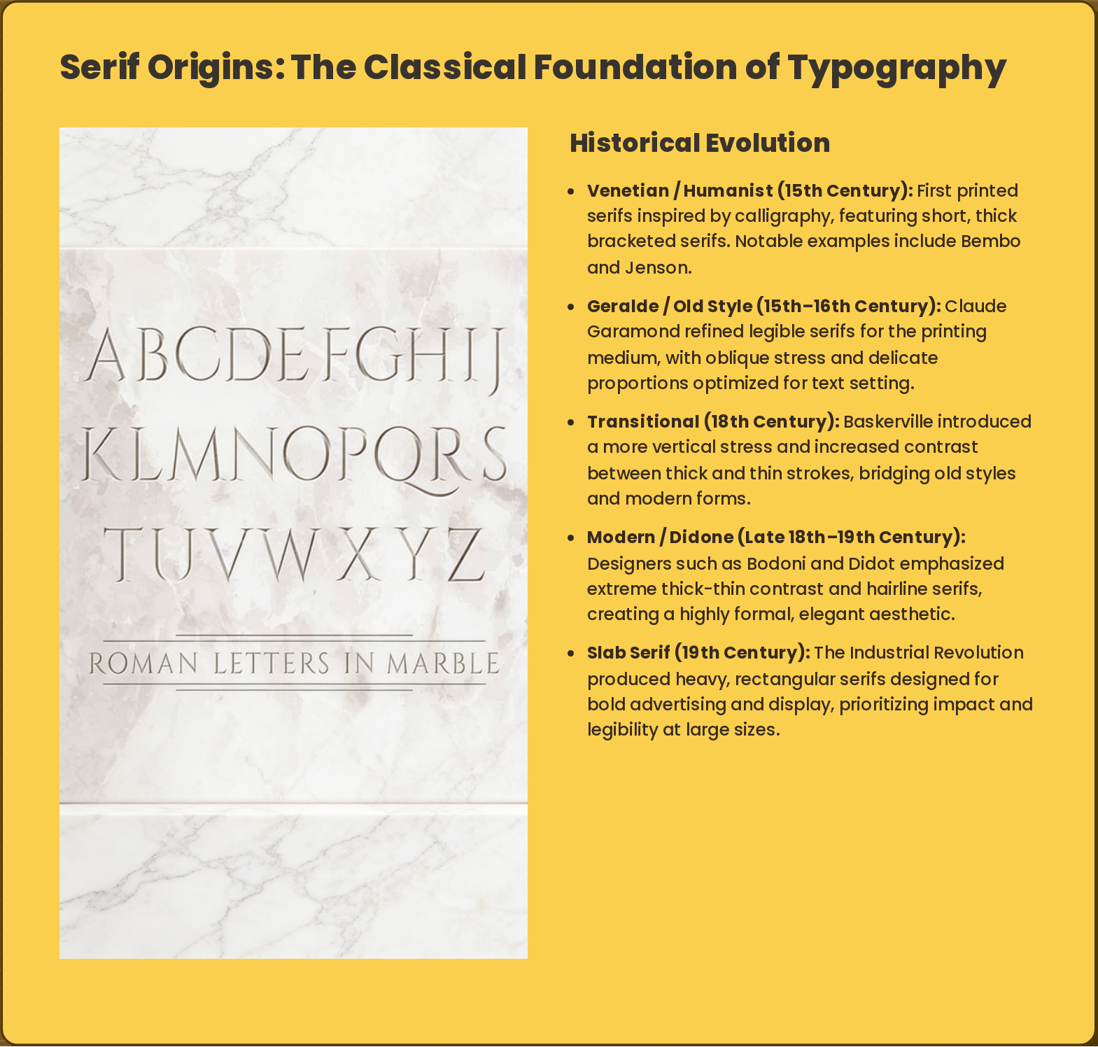
Slide 4: Serif Origins: The Classical Foundation of Typography
Venetian / Humanist (15th Century): First printed serifs inspired by calligraphy, featuring short, thick bracketed serifs. Notable examples include Bembo and Jenson.
Geralde / Old Style (15th–16th Century): Claude Garamond refined legible serifs for the printing medium, with oblique stress and delicate proportions optimized for text setting.
Transitional (18th Century): Baskerville introduced a more vertical stress and increased contrast between thick and thin strokes, bridging old styles and modern forms.
Modern / Didone (Late 18th–19th Century): Designers such as Bodoni and Didot emphasized extreme thick-thin contrast and hairline serifs, creating a highly formal, elegant aesthetic.
Slab Serif (19th Century): The Industrial Revolution produced heavy, rectangular serifs designed for bold advertising and display, prioritizing impact and legibility at large sizes.
- Venetian / Humanist (15th Century): First printed serifs inspired by calligraphy, featuring short, thick bracketed serifs. Notable examples include Bembo and Jenson.
- Geralde / Old Style (15th–16th Century): Claude Garamond refined legible serifs for the printing medium, with oblique stress and delicate proportions optimized for text setting.
- Transitional (18th Century): Baskerville introduced a more vertical stress and increased contrast between thick and thin strokes, bridging old styles and modern forms.
- Modern / Didone (Late 18th–19th Century): Designers such as Bodoni and Didot emphasized extreme thick-thin contrast and hairline serifs, creating a highly formal, elegant aesthetic.
- Slab Serif (19th Century): The Industrial Revolution produced heavy, rectangular serifs designed for bold advertising and display, prioritizing impact and legibility at large sizes.
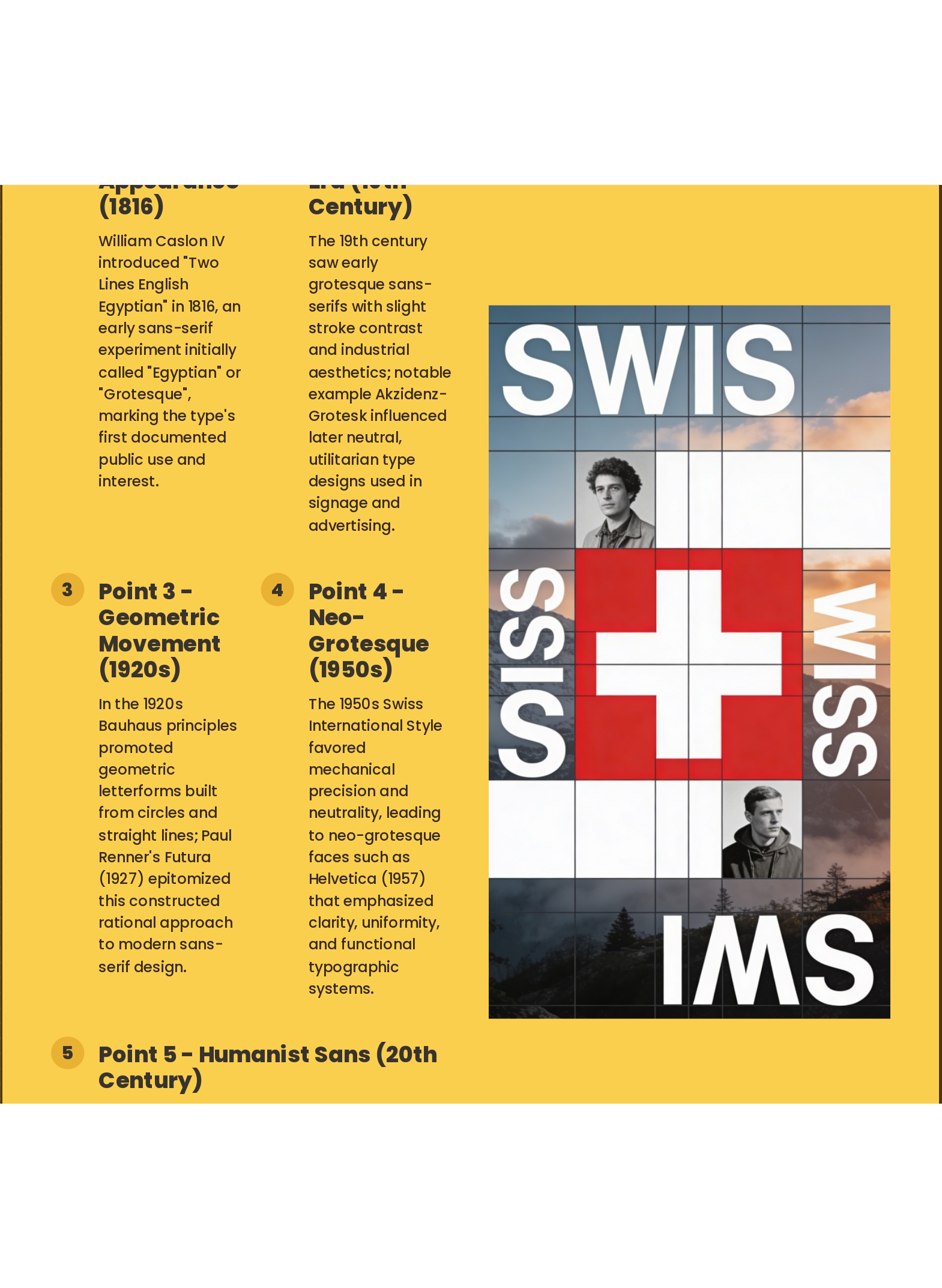
Slide 5: Sans-serif Origins: The Modern Revolution
- Point 1 - First Appearance (1816): William Caslon IV introduced "Two Lines English Egyptian" in 1816, an early sans-serif experiment initially called "Egyptian" or "Grotesque", marking the type's first documented public use and interest.
- Point 2 - Grotesque Era (19th Century): The 19th century saw early grotesque sans-serifs with slight stroke contrast and industrial aesthetics; notable example Akzidenz-Grotesk influenced later neutral, utilitarian type designs used in signage and advertising.
- Point 3 - Geometric Movement (1920s): In the 1920s Bauhaus principles promoted geometric letterforms built from circles and straight lines; Paul Renner's Futura (1927) epitomized this constructed rational approach to modern sans-serif design.
- Point 4 - Neo-Grotesque (1950s): The 1950s Swiss International Style favored mechanical precision and neutrality, leading to neo-grotesque faces such as Helvetica (1957) that emphasized clarity, uniformity, and functional typographic systems.
- Point 5 - Humanist Sans (20th Century): Humanist sans faces combined classical proportions with sans-serif simplicity; designs like Gill Sans balanced humanist letter structures with modernist readability for versatile typographic use across media.
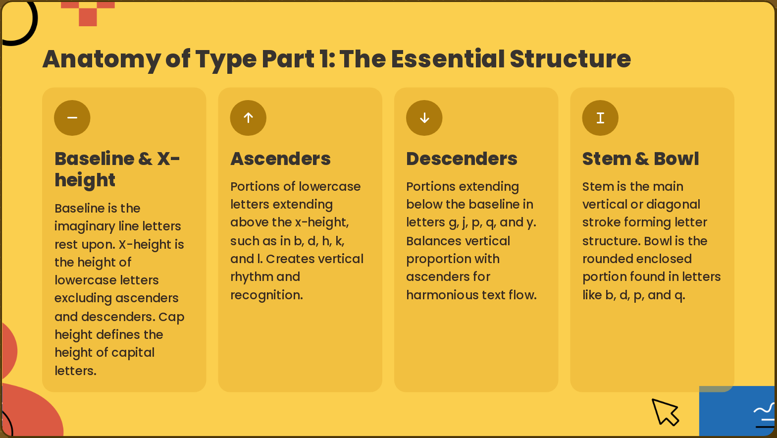
Slide 6: Anatomy of Type Part 1: The Essential Structure
- Baseline & X-height: Baseline is the imaginary line letters rest upon. X-height is the height of lowercase letters excluding ascenders and descenders. Cap height defines the height of capital letters.
- Ascenders: Portions of lowercase letters extending above the x-height, such as in b, d, h, k, and l. Creates vertical rhythm and recognition.
- Descenders: Portions extending below the baseline in letters g, j, p, q, and y. Balances vertical proportion with ascenders for harmonious text flow.
- Stem & Bowl: Stem is the main vertical or diagonal stroke forming letter structure. Bowl is the rounded enclosed portion found in letters like b, d, p, and q.
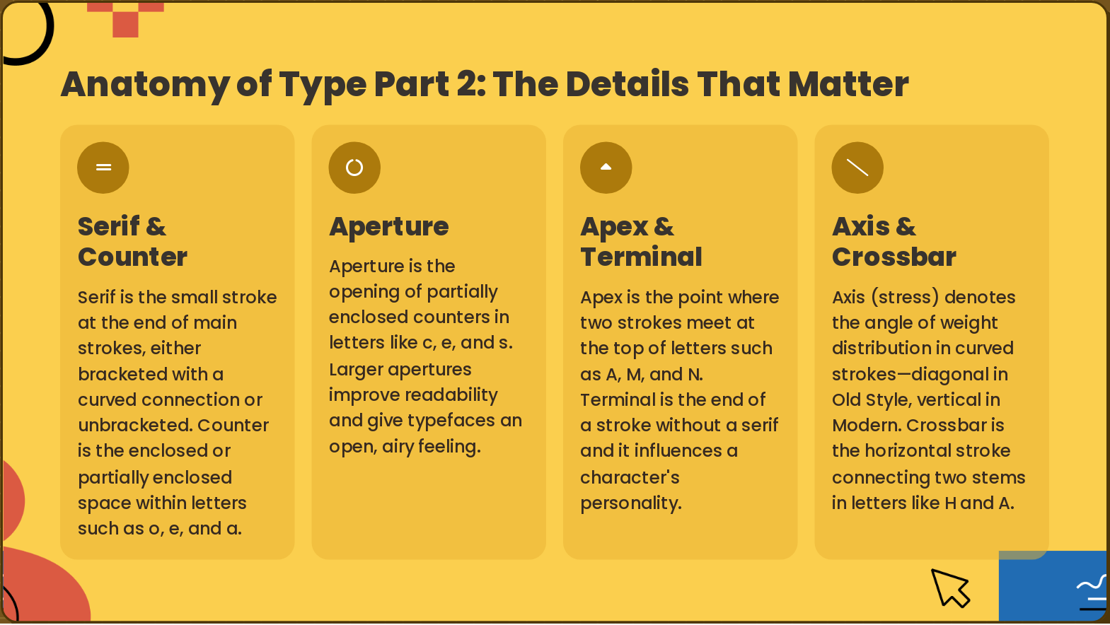
Slide 7: Anatomy of Type Part 2: The Details That Matter
- Serif & Counter: Serif is the small stroke at the end of main strokes, either bracketed with a curved connection or unbracketed. Counter is the enclosed or partially enclosed space within letters such as o, e, and a.
- Aperture: Aperture is the opening of partially enclosed counters in letters like c, e, and s. Larger apertures improve readability and give typefaces an open, airy feeling.
- Apex & Terminal: Apex is the point where two strokes meet at the top of letters such as A, M, and N. Terminal is the end of a stroke without a serif and it influences a character's personality.
- Axis & Crossbar: Axis (stress) denotes the angle of weight distribution in curved strokes—diagonal in Old Style, vertical in Modern. Crossbar is the horizontal stroke connecting two stems in letters like H and A.
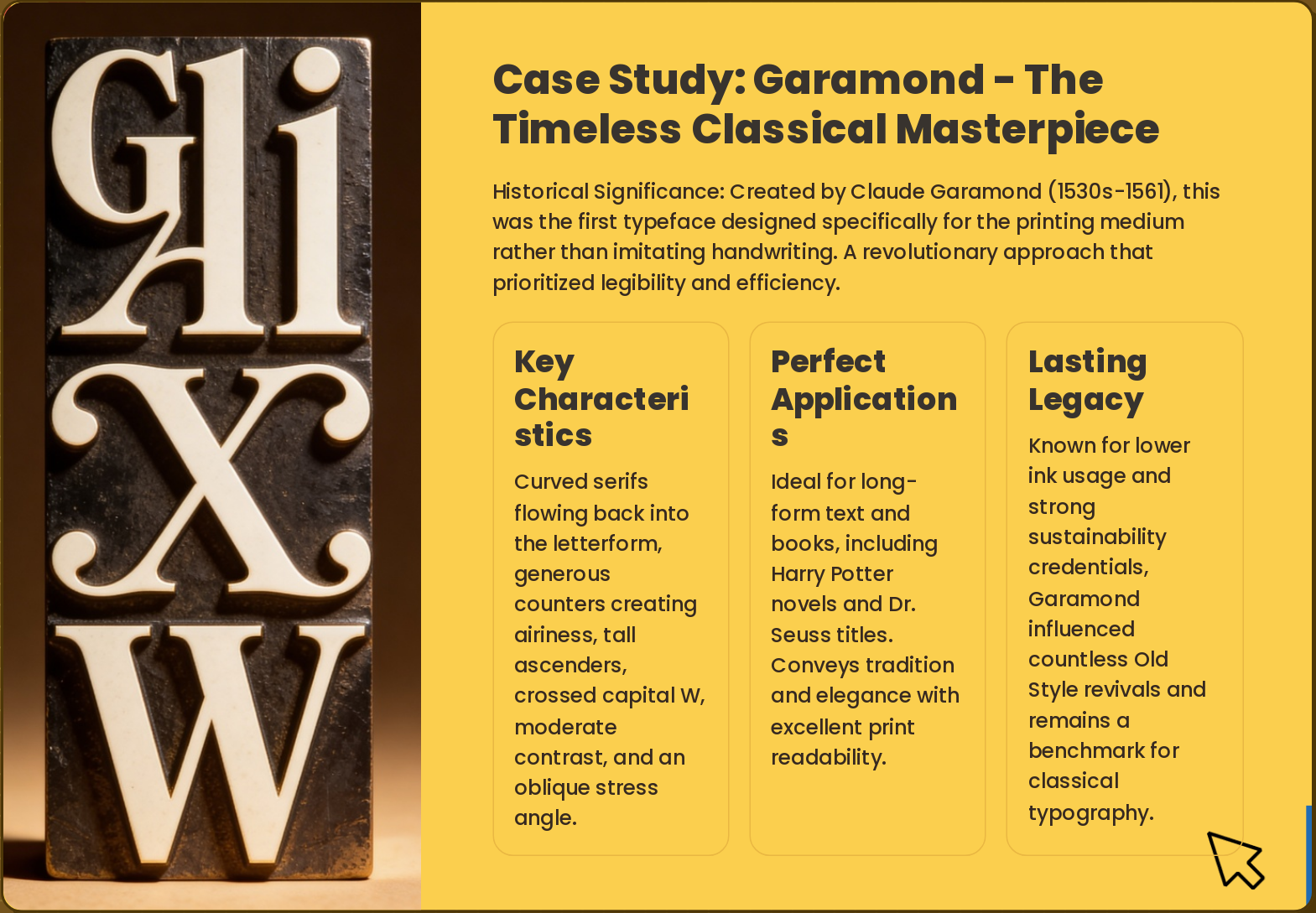
Slide 8: Case Study: Garamond - The Timeless Classical Masterpiece
- Key Characteristics: Curved serifs flowing back into the letterform, generous counters creating airiness, tall ascenders, crossed capital W, moderate contrast, and an oblique stress angle.
- Perfect Applications: Ideal for long-form text and books, including Harry Potter novels and Dr. Seuss titles. Conveys tradition and elegance with excellent print readability.
- Lasting Legacy: Known for lower ink usage and strong sustainability credentials, Garamond influenced countless Old Style revivals and remains a benchmark for classical typography.
Historical Significance: Created by Claude Garamond (1530s-1561), this was the first typeface designed specifically for the printing medium rather than imitating handwriting. A revolutionary approach that prioritized legibility and efficiency.
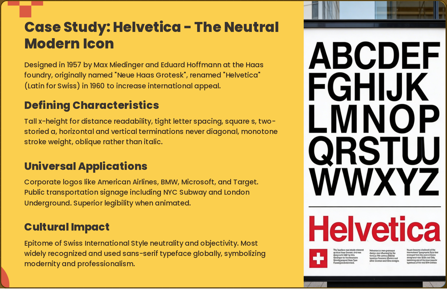
Slide 9: Case Study: Helvetica - The Neutral Modern Icon
- Defining Characteristics: Tall x-height for distance readability, tight letter spacing, square s, two-storied a, horizontal and vertical terminations never diagonal, monotone stroke weight, oblique rather than italic.
- Universal Applications: Corporate logos like American Airlines, BMW, Microsoft, and Target. Public transportation signage including NYC Subway and London Underground. Superior legibility when animated.
- Cultural Impact: Epitome of Swiss International Style neutrality and objectivity. Most widely recognized and used sans-serif typeface globally, symbolizing modernity and professionalism.
Designed in 1957 by Max Miedinger and Eduard Hoffmann at the Haas foundry, originally named "Neue Haas Grotesk", renamed "Helvetica" (Latin for Swiss) in 1960 to increase international appeal.
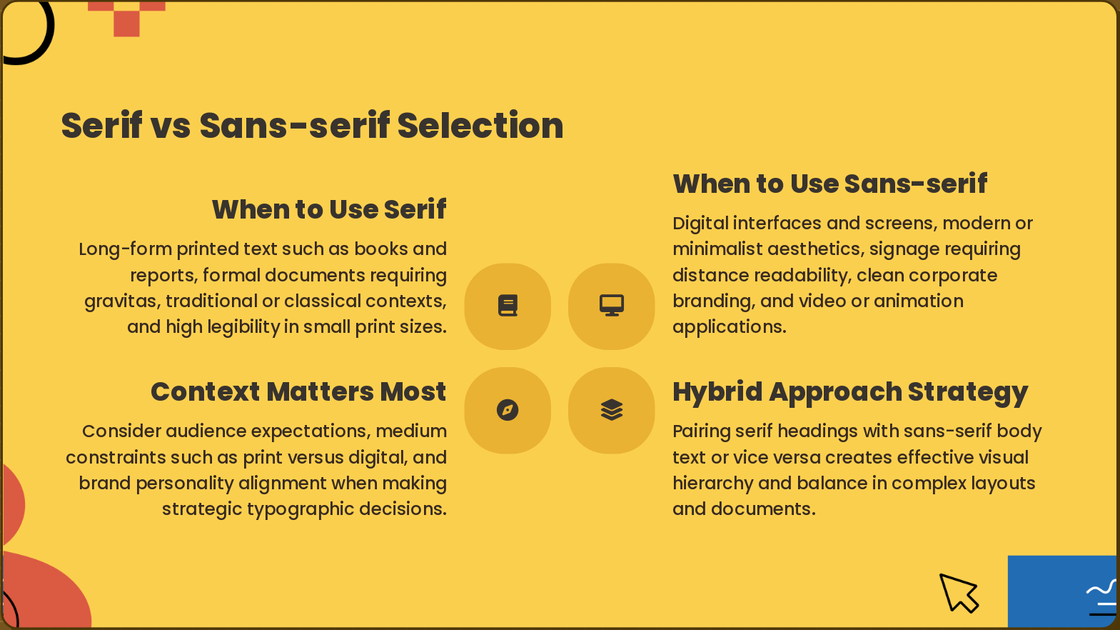
Slide 10: Serif vs Sans-serif Selection
- When to Use Serif: Long-form printed text such as books and reports, formal documents requiring gravitas, traditional or classical contexts, and high legibility in small print sizes.
- When to Use Sans-serif: Digital interfaces and screens, modern or minimalist aesthetics, signage requiring distance readability, clean corporate branding, and video or animation applications.
- Hybrid Approach Strategy: Pairing serif headings with sans-serif body text or vice versa creates effective visual hierarchy and balance in complex layouts and documents.
- Context Matters Most: Consider audience expectations, medium constraints such as print versus digital, and brand personality alignment when making strategic typographic decisions.
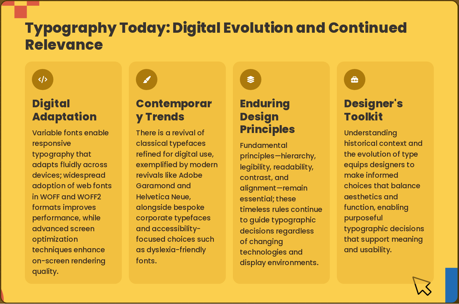
Slide 11: Typography Today: Digital Evolution and Continued Relevance
- Digital Adaptation: Variable fonts enable responsive typography that adapts fluidly across devices; widespread adoption of web fonts in WOFF and WOFF2 formats improves performance, while advanced screen optimization techniques enhance on-screen rendering quality.
- Contemporary Trends: There is a revival of classical typefaces refined for digital use, exemplified by modern revivals like Adobe Garamond and Helvetica Neue, alongside bespoke corporate typefaces and accessibility-focused choices such as dyslexia-friendly fonts.
- Enduring Design Principles: Fundamental principles—hierarchy, legibility, readability, contrast, and alignment—remain essential; these timeless rules continue to guide typographic decisions regardless of changing technologies and display environments.
- Designer's Toolkit: Understanding historical context and the evolution of type equips designers to make informed choices that balance aesthetics and function, enabling purposeful typographic decisions that support meaning and usability.
Slide 12: Typography: Cultural Heritage and Design Foundation
Typography: Cultural Heritage and Design Foundation Apply historical understanding to create purposeful, context-appropriate typographic solutions that honor tradition while embracing innovation.