Quarterly Review PPT Template Guide for AI Business Reviews
July 03, 2026
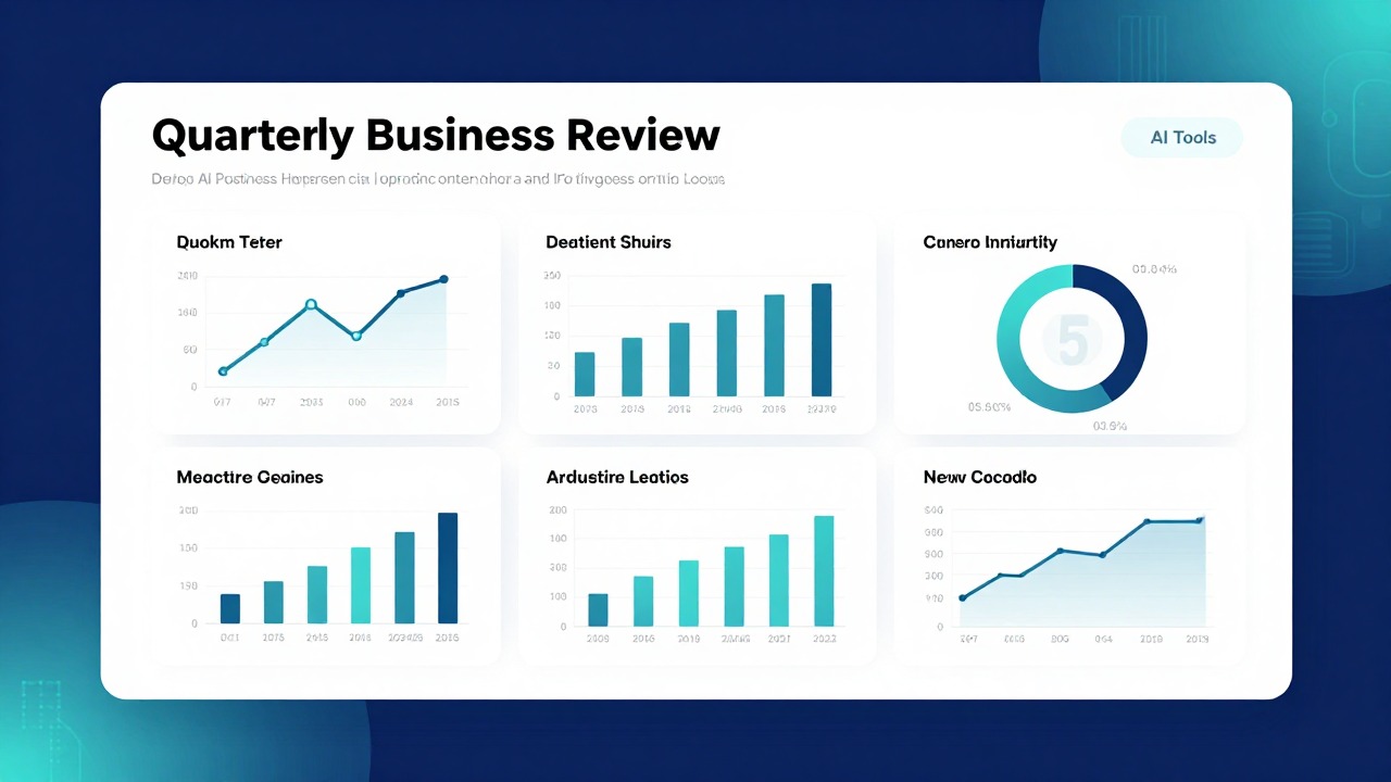
A good QBR deck is not just a report with better colors. It should explain what happened this quarter, why it happened, what it means, and what the team will do next. The right quarterly review PPT template gives you a structure for executive summary, KPIs, goals versus results, wins, misses, risks, priorities, and action owners without forcing every data point onto the main slides.
The fastest way to create a useful QBR is to pair a practical template with a clear workflow: choose a layout that fits your real data, use AI to turn notes and reports into a first draft, verify every number and claim, then customize the design for your audience. AI can help with structure, summarization, slide titles, and consistency, but business judgment still decides what matters.
Use this guide when you have scattered metrics, meeting notes, pipeline updates, customer feedback, or leadership questions and need to turn them into business review slides that are concise, credible, and ready for discussion.
When you are ready to turn the workflow into slides, An AI presentation tool can help transform rough notes, documents, or prompts into an editable deck structure.
What a Good Quarterly Review PPT Template Must Do
This section explains what makes a QBR template useful when real business data, stakeholder questions, and next-quarter decisions are involved.
Saving dozens of attractive templates does not solve the harder problem: choosing one that can carry your actual quarterly story. Many templates look polished in preview mode because they use short sample text, perfect charts, and clean placeholder numbers. Once you add a full KPI dashboard, sales pipeline breakdown, customer risk list, and action plan, the design can collapse quickly.
A QBR presentation is a performance, insight, and action-planning deck. It is not only a metrics report. The template must help you move from facts to interpretation: what changed, why it changed, where the business is exposed, what tradeoffs need discussion, and what the next quarter requires.
- Executive summary slide for the quarter’s headline story and required decisions.
- Goals versus results slide to show commitments, outcomes, and gaps.
- KPI review slide or dashboard for the most important health indicators.
- Performance highlights slide for wins, momentum, and meaningful progress.
- Misses and root-cause slide for honest analysis of what did not work.
- Customer, market, or operational insight slide to explain context behind the numbers.
- Financial, sales, pipeline, or usage update slide depending on the business function.
- Risks and blockers slide for issues that need escalation or support.
- Next-quarter priorities and action plan slides with owners, timing, and expected outcomes.
- Appendix slides for supporting tables, detailed charts, definitions, and backup evidence.
The best template depends on who is in the room. Executive leadership needs concise insights, decisions, and risk visibility. Client stakeholders need proof of value delivered, progress against agreed goals, recommendations, and shared next steps. Sales leaders need pipeline health, conversion issues, forecast confidence, and account priorities. Customer success teams need adoption, value realization, renewal risk, and engagement plans. Product teams need customer signals, usage trends, blockers, and roadmap implications. Investors may need financial performance, growth drivers, runway context, risks, and management priorities.
Choose a QBR template for the decisions it helps people make, not for how impressive it looks before your data is added.
A practical QBR template should also make bad news presentable without hiding it. If the deck only has celebration slides and glossy image layouts, it will not help you discuss missed targets, churn risk, delayed initiatives, hiring constraints, budget pressure, or execution blockers. Strong business review slides make both progress and problems easy to understand.
Choose the Right QBR Template in a 10–15 Minute Review
This section gives you a quick evaluation method for deciding whether a template will survive real QBR content before you spend time editing it.
A 10–15 minute template review is a practical guideline, not a guaranteed requirement. The goal is to identify obvious fit problems before you commit. Open the template, scan the slide types, and imagine inserting your real quarter’s data. If you already know that your main update needs KPI cards, trend charts, and a detailed risk register, do not choose a template built mostly around full-bleed images and inspirational quotes.
- Check layout diversity. Look for summary, dashboard, chart, timeline, roadmap, comparison, quote or insight, action plan, and appendix slide options.
- Check chart support. Confirm that line charts, bar charts, funnel charts, progress charts, and simple tables can fit without shrinking labels too far.
- Check KPI-card layouts. A strong QBR often needs quick performance indicators such as revenue, pipeline, retention, activation, NPS, usage, margin, or project status.
- Check timeline and roadmap slides. You need space to show what happened during the quarter and what is planned for the next one.
- Check section divider slides. They help separate performance, analysis, risks, and action planning.
- Check appendix capacity. If the template has no clean backup slide format, dense supporting data may leak into the main story.
- Check export compatibility. Make sure the final deck can be used in PowerPoint, PDF, or your required meeting platform.
- Check editability. Brand colors, fonts, icons, and chart styles should be changeable without rebuilding the entire deck.
Content capacity fit is often the deciding factor. A template with huge image blocks and minimal text may work for a client success story or investor narrative, but it may fail for a dense KPI review. A data-heavy template may work for an internal operating review, but it can feel cold and transactional in a client QBR where relationship context and value narrative matter.
- For executives: choose templates with strong summary slides, decision boxes, risk heatmaps, and concise charts.
- For clients: choose templates with value delivered, progress against goals, recommendation, roadmap, and next-step layouts.
- For internal teams: choose templates with blockers, owners, dependencies, operating priorities, and project status slides.
- For sales reviews: choose templates with pipeline, forecast, account segmentation, conversion, and territory performance layouts.
- For customer success: choose templates with adoption, health score, engagement, renewal risk, business outcomes, and success plan slides.
A beautiful but impractical QBR template creates design debt: every slide you edit takes longer because the template was never built for your content.
Before choosing, test one demanding slide. Paste a real chart title, three KPI values, a short explanation, and a next action into a candidate layout. If the slide immediately looks cramped, misaligned, or unreadable, the template is not a good fit. This small stress test prevents hours of reformatting later.
Use AI to Turn Notes, Reports, and Metrics into QBR Business Review Slides
This section shows how QBR presentation AI can help organize raw inputs while keeping accuracy, confidentiality, and human review central.
AI is useful for structure, summarization, slide drafting, wording options, and consistency checks. It can help you move from scattered inputs to a logical deck faster. It cannot know whether an unverified number is correct, whether a sensitive account risk should be shared, or whether a recommendation is politically realistic. You must verify all numbers, conclusions, and claims before presenting.
- Collect source material: KPI exports, CRM notes, finance summaries, customer updates, project reports, meeting notes, and prior-quarter commitments.
- Define the audience: executive team, client sponsors, internal operators, sales leadership, product leadership, or investors.
- State the purpose: inform, align, request decisions, secure support, renew commitment, or agree on next-quarter priorities.
- Write an AI prompt that includes audience, quarter, main metrics, known risks, required slide count, and desired tone.
- Generate an outline first rather than a full deck immediately.
- Review the outline for missing decisions, unsupported claims, irrelevant sections, or excessive detail.
- Create slide drafts from the approved outline.
- Verify every metric, trend statement, and recommendation against source material.
- Polish titles, layout, charts, and speaker notes for the actual meeting.
A useful prompt is specific enough to produce business review slides, not generic corporate slides. For example: Create a 12-slide QBR presentation for an executive audience using the notes below. Include title, agenda, executive summary, quarterly goals versus results, KPI dashboard, sales pipeline update, customer or market insights, wins, misses and root causes, risks and blockers, next-quarter priorities, and action plan. Use insight-led slide titles. Flag any claims that require data verification. Keep recommendations practical and avoid unsupported conclusions.
An AI presentation tool fits this workflow when you need to turn prompts, notes, documents, or rough business ideas into an editable deck structure quickly. For example, an account manager preparing a client QBR could upload sanitized meeting notes and paste key adoption metrics, then ask an AI presentation tool to draft a deck with value delivered, open risks, renewal considerations, recommendations, and next steps. The account manager would then replace placeholder wording with verified client-specific data and adjust tone for the relationship.
A second AI-assisted presentation workflow is useful for internal operators. A startup operations lead may have a finance summary, hiring update, support backlog notes, and product delivery status spread across several documents. An AI presentation tool can help summarize those inputs into a QBR outline with an executive summary, operating metrics, bottlenecks, owner-based action plan, and appendix. The operator still needs to validate data, decide which issues deserve escalation, and align the final deck with leadership priorities.
- Use AI to convert raw labels into insight-led slide titles, such as changing “Sales Data” to “Enterprise pipeline grew, but late-stage conversion needs attention.”
- Use AI to shorten long report paragraphs into slide-ready bullets.
- Use AI to identify repeated themes across customer notes or internal updates.
- Use AI to draft alternative executive summary versions for different audiences.
- Use AI to check whether slide titles, action items, and recommendations are consistent.
- Use AI to propose which details belong in the appendix instead of the main deck.
Before uploading reports, customer data, financials, or employee information to any AI tool, remove sensitive information or follow your company’s data policies and approved tool guidelines.
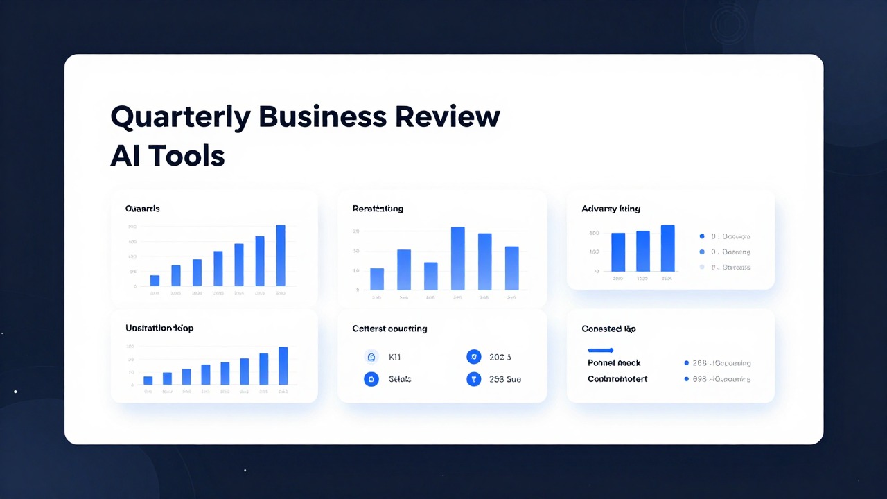
Build the Core QBR Slide Flow from Summary to Action Plan
This section gives you a flexible slide order for quarterly business review decks and explains what each slide should accomplish.
The safest QBR structure moves from context to performance, then from interpretation to action. Do not start with every metric. Start with the story: what the quarter means and what decisions or alignments are needed. Then show the evidence that supports that story.
- Title slide: identify the quarter, business unit, account, region, or audience.
- Agenda: preview the conversation and set expectations for discussion points.
- Executive summary: state the quarter’s headline outcomes, key risks, and requested decisions.
- Quarterly goals: show what the team committed to at the start of the quarter.
- KPI dashboard: provide at-a-glance performance across the few metrics that matter most.
- Performance highlights: explain wins, progress, and positive changes worth repeating.
- Misses and root causes: show where results fell short and why.
- Customer or market insights: connect performance to external signals, customer behavior, or operational context.
- Financial or sales update: cover revenue, cost, pipeline, forecast, margin, bookings, usage, or other function-specific measures.
- Risks and blockers: identify what could affect next-quarter performance if not addressed.
- Next-quarter priorities: define the few focus areas that matter most.
- Action plan: assign owners, timing, dependencies, and expected outputs.
- Appendix: include detailed tables, definitions, extra charts, segment cuts, and backup evidence.
Every slide should answer at least one of four questions: What changed? Why did it happen? Why does it matter? What will we do next? If a slide answers none of these, it may belong in the appendix or outside the deck.
- Use dashboards for at-a-glance metric status, especially when comparing targets, actuals, and trends.
- Use charts for movement over time, mix shifts, pipeline stages, regional comparisons, or performance gaps.
- Use short text blocks for interpretation, root causes, decisions, and recommendations.
- Use timelines for project progress, implementation plans, and next-quarter milestones.
- Use appendix slides for detailed raw tables, definitions, methodology, and secondary analysis.
Internal and client QBRs should not use the same emphasis. Internal decks can be more operational: blockers, owners, missed commitments, hiring constraints, process gaps, and tradeoffs. Client QBRs should focus on value delivered, progress toward the client’s goals, risks that require shared attention, practical recommendations, and agreed next steps. The same metrics may appear in both decks, but the interpretation should change.
Keep one main message per slide. A slide titled “Q3 Performance Overview” invites a data dump. A slide titled “Expansion revenue offset slower new-logo conversion” tells the audience what to notice. Put secondary details in speaker notes or appendix slides so the main deck remains useful in the meeting.
Ask AI to draft the first structure, but manually adjust emphasis based on stakeholder priorities, known sensitivities, and the decisions you need from the room.
Customize Colors, Fonts, Charts, and Layouts Without Breaking the Template
This section explains how to edit a QBR template efficiently while preserving design quality and readability.
Use a fill-in-the-blank mindset. Each template slide has an intended role: summary, metric dashboard, trend explanation, risk overview, roadmap, or action plan. Match your content to that role instead of pasting full report paragraphs into every placeholder. If the slide was built for three insights, do not force eight insights into it.
- Replace placeholder headlines with insight-led titles before editing body copy.
- Convert long paragraphs into grouped bullets with clear labels such as Cause, Impact, and Next step.
- Keep dense operational detail in the appendix unless it is needed for a decision.
- Use speaker notes for explanation that does not need to appear on screen.
- Split overloaded slides before reducing font size below comfortable reading size.
Color adaptation should be intentional. Apply brand colors to headers, section dividers, and selected accents. Use one highlight color for key numbers, risk flags, or decisions. Avoid turning every metric into a different color unless the color has a consistent meaning. For example, one color may indicate positive movement, another may indicate risk, and a neutral color may indicate context.
Font control matters because QBR slides often include chart labels, KPI captions, and small explanatory notes. Limit font variety. Use one heading style, one body style, and one small-label style. If the template includes decorative fonts, check whether they remain readable in dense slides. A font that looks stylish on a title slide may fail inside a sales pipeline chart.
- If a slide has too much content, split it into two slides: one for the key message and one for supporting evidence.
- If a slide has too little content, combine it with a related slide or add a short interpretation box.
- If a chart needs more explanation, add a single takeaway sentence rather than a paragraph.
- If several slides repeat similar metrics, consolidate them into one dashboard and move details to the appendix.
- If a section feels visually repetitive, use a divider slide or summary slide to reset the audience’s attention.
Chart and icon consistency make the deck feel credible. Use the same chart style for similar metrics. Do not show revenue as a 3D bar chart on one slide, a donut chart on the next, and a decorative infographic later unless each format serves a real purpose. Label charts clearly enough that a stakeholder can understand the takeaway without listening to a long explanation.
AI-assisted optimization can reduce cleanup work. Depending on the tool and workflow, you may use AI for style consistency checks, font unification, layout suggestions, one-click recolor where available, and converting rough bullets into concise slide copy. In an AI presentation tool, a practical approach is to generate the deck structure from your source notes first, then refine the slide copy and visual hierarchy before applying final brand formatting.
When a QBR template starts to break, the answer is usually not smaller text. It is sharper prioritization.
Avoid the QBR Template Mistakes That Make Stakeholders Tune Out
This section highlights common QBR deck problems and how to correct them before the presentation loses focus.
The most common mistake is reporting every metric without explaining what the numbers mean. Stakeholders do not need a guided tour of every dashboard export. They need interpretation: which changes matter, which results require action, which assumptions changed, and which decisions are needed now.
- Weak: “Support tickets increased 18%.” Stronger: “Support tickets rose after onboarding volume increased, but resolution time stayed stable.”
- Weak: “Pipeline by stage.” Stronger: “Pipeline coverage improved, but late-stage slippage creates forecast risk.”
- Weak: “Customer engagement.” Stronger: “Executive engagement improved in strategic accounts, while mid-market adoption needs a new enablement plan.”
- Weak: “Marketing results.” Stronger: “Lead volume grew, but lower qualification rates require tighter campaign targeting.”
Overfilled slides are another common failure. Screenshots, raw tables, dense charts, and small text may feel thorough, but they often make the audience work too hard. If the presenter has to say, “I know this is hard to read,” the slide should be redesigned. Use the appendix for backup, not as the main storytelling surface.
Inconsistent formatting also weakens trust. Mismatched icons, random colors, uneven alignment, mixed chart styles, and changing font sizes make the deck feel unfinished. Stakeholders may not mention the design, but they will feel the lack of control. For a QBR, visual consistency supports credibility.
Do not accept AI-generated wording just because it sounds polished. Check whether it matches actual performance, business context, company tone, and the level of confidence supported by your data.
Do not bury bad news. A strong QBR clearly shows misses, causes, risks, and corrective actions. Hiding a problem deep in an appendix can create more friction than addressing it directly. If a target was missed, explain the gap, the likely drivers, the impact, and the response plan. That is more useful than a vague positive spin.
- Remove metrics that do not affect the quarter’s story or next-quarter decisions.
- Replace generic slide titles with insight-led titles.
- Move raw data tables to the appendix unless the table itself is the discussion.
- Standardize chart colors, icon style, and alignment before sharing.
- Check that every risk has an owner or clear next step.
- Export and test the deck in the required format before the meeting.
Delivery format can create last-minute problems. A deck that looks clean in the original editor may shift when opened in PowerPoint, exported to PDF, or shared through a meeting platform. Check fonts, chart rendering, embedded images, links, and speaker notes before presenting. If stakeholders will read the deck asynchronously, add enough context for the slides to stand on their own.
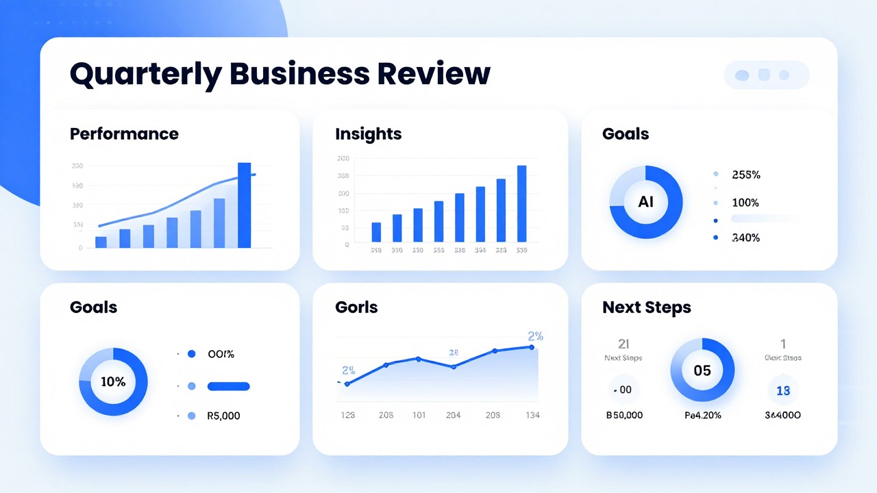
Final QBR Checklist: Decide If the Deck Is Ready to Present
This section gives you a final review process for checking accuracy, narrative clarity, design consistency, and meeting readiness.
Before sending or presenting the QBR, review it as a decision tool rather than a slide file. Ask whether the audience can understand the quarter’s performance, trust the evidence, see the risks, and know what action is required next. If the answer is no, simplify the deck before adding more slides.
- Numbers are accurate, current, and traceable to approved sources.
- Executive summary states the quarter’s main story without requiring the full deck for context.
- Each slide has one main message and a title that communicates insight.
- Charts are readable, labeled, and paired with interpretation.
- Colors, fonts, icons, and alignment are consistent across the deck.
- Risks and misses are visible, not hidden or softened into vague language.
- Next steps are realistic and tied to owners, timing, or decision points.
- Appendix slides support the story without cluttering the main flow.
- The export works in PowerPoint, PDF, or the required meeting platform.
- Sensitive data has been removed or handled according to company policy.
Use audience-specific review questions. For executives, ask: What decision do they need to make, what risk do they need to understand, and what tradeoff should they discuss? For clients, ask: What do they need to trust, what value has been delivered, and what shared next step should they agree to? For internal teams, ask: What needs to happen next, who owns it, and what blocker must be removed?
Rehearse the narrative, not just the slide order. Practice the transitions between summary, evidence, risk, and action plan. A QBR can fail even with a good template if the presenter reads slides instead of leading a discussion. The deck should support the conversation, not replace it.
If you are starting from scattered notes, reports, and rough bullet points, an AI presentation tool can help you move quickly into a structured draft. Use it to create an initial outline, summarize documents into presentation-ready sections, and generate editable slide flow. Then refine the deck manually for data accuracy, business nuance, stakeholder sensitivity, and brand requirements.
You can start with a quarterly review PPT template, but the finished QBR still needs a clear workflow, verified data, and careful AI-assisted review.
AI can accelerate preparation, but it should not replace account knowledge, financial review, customer judgment, or leadership alignment. The strongest QBR decks combine a practical template, verified business evidence, a concise story, and an action plan that people can actually execute.
Once your outline and source material are ready, PopAi AI Presentation can help turn notes, documents, or prompts into an editable first deck. Treat the result as a draft and keep the final review human.
FAQ
What is the difference between a QBR presentation and a normal business update?
A QBR connects quarterly performance, insights, risks, and next actions. A normal business update may only report recent activity. A strong QBR explains what changed, why it matters, and what decisions or actions should follow.
How many slides should a quarterly business review have?
The right length depends on the audience, meeting time, and business complexity. Executive QBRs should be concise and decision-focused. Client QBRs may need more context on delivered value and next steps. Detailed data should usually move to the appendix.
Can AI create a complete QBR presentation from my notes?
AI can create a strong draft from notes, reports, prompts, or documents. It is especially useful for structure, summarization, slide titles, and first-pass wording. You still need to verify numbers, adjust recommendations, remove sensitive information, and apply business context.
What should be on the first few slides of a QBR deck?
Start with context, agenda, executive summary, key results, and the main decisions or discussion points. The opening should tell the audience what the quarter means before showing detailed charts.
How do I make business review slides less boring?
Turn raw metrics into insight-led slide titles, use charts only where they clarify change or comparison, highlight what changed, and connect performance to actions. Replace generic labels like “Sales Data” with specific takeaways that guide discussion.