
Creating a presentation can be a daunting task, especially if you don't consider yourself a "creative" person. We've all been there: staring at a blank white slide, wondering how to turn a mountain of data into something that won't make your audience fall asleep. The truth is, you don't need a degree in graphic design to create stunning, effective slides. By following a few fundamental rules, anyone can elevate their presentation from amateur to professional.
1. Embrace the Power of Simplicity
The biggest mistake non-designers make is trying to fit too much information onto a single slide. When a slide is cluttered, the audience spends more time reading than listening to you. Follow the "One Idea Per Slide" rule. If you have three points to make, use three slides. This keeps the focus on your narrative and prevents cognitive overload.
Pro Tip: Use AI presentation tools to automatically structure your content into digestible, single-topic slides.
2. Master Typography and Readability
Fonts carry personality and influence readability. For presentations, stick to clean, sans-serif fonts like Arial, Helvetica, or Open Sans. They are easier to read on screens from a distance. Avoid decorative or "fun" fonts that might distract from your message. Most importantly, ensure your font size is large enough—never go below 24pt for body text.
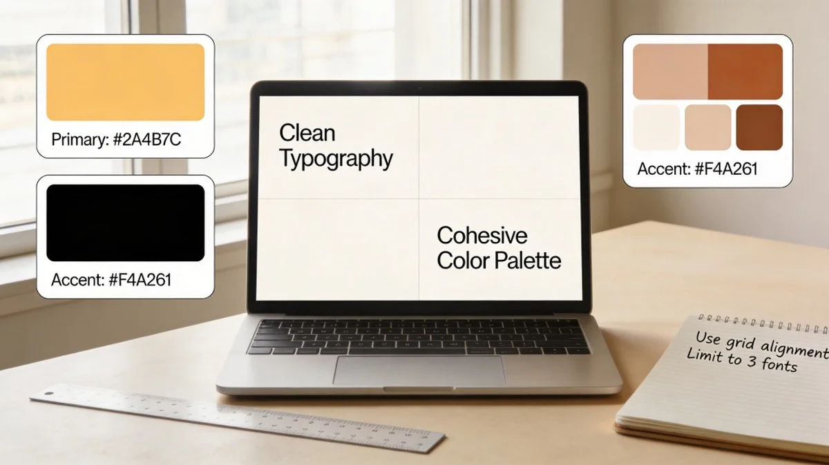
3. Use Color Strategically
Color is a powerful tool for evoking emotion and highlighting key information. However, too many colors can look chaotic. Stick to a palette of 3-4 colors: a primary color, a secondary color, and one or two accent colors. Use high contrast (e.g., dark text on a light background or vice versa) to ensure everyone can see your content clearly.
4. Ditch the Clip Art for High-Quality Visuals
Nothing screams "unprofessional" like outdated clip art or pixelated images. Use high-resolution photography that complements your message. Visuals should be used to enhance the story, not just fill space. If you are talking about "growth," show a powerful image of a seedling or a rising mountain path rather than a generic arrow chart.
5. Establish a Visual Hierarchy
Visual hierarchy tells your audience what to look at first. You can create hierarchy through size, color, and weight. Your main headline should be the largest element, followed by subheadings, and then body text. This "path" guides the viewer's eye through the slide in the order you intended.
6. Don't Be Afraid of White Space
White space (or negative space) is the area around your design elements. Non-designers often feel the need to fill every corner of a slide, but white space is actually your friend. It gives your content "room to breathe," making it look more elegant and professional. It also helps focus the audience's attention on what really matters.
7. Use Grids and Alignment
Randomly placed text boxes and images make a presentation look messy. Most presentation software has built-in gridlines or "smart guides." Use them! Aligning your elements to a common axis creates a sense of order and balance that the human eye finds pleasing and trustworthy.
8. Simplify Your Data Visualization
If you need to show a chart or graph, strip away the noise. Remove unnecessary gridlines, legends that can be labeled directly, and 3D effects. Focus on the data point that matters most. If the goal is to show that sales went up, highlight that specific bar in a bright color while keeping the others muted.
9. Maintain Consistency Throughout
Consistency is the hallmark of professional design. Use the same font styles, color palette, and image styles across all slides. If you use rounded corners for one image, use them for all. This creates a cohesive "brand" for your presentation, making it feel like a unified story rather than a collection of random slides.
10. Leverage AI and Templates
You don't have to reinvent the wheel. Professional templates provide a great foundation. Even better, modern AI tools can now generate entire presentation structures and designs based on your prompts. These tools handle the alignment, color coordination, and layout for you, allowing you to focus on the content and delivery.