
How to Make Slides Look Professional
Published on April 14, 2026

Creating a presentation is easy, but making it look professional is an art form that often eludes even the most experienced speakers. Whether you are pitching a multi-million dollar idea or presenting a quarterly report, the visual quality of your slides directly impacts your credibility. Professional slides don't just look "pretty"—they function as a visual aid that enhances your message rather than distracting from it.
In this guide, we will explore the fundamental principles of high-end presentation design. We will move beyond basic templates and dive into the nuances of typography, color theory, and layout that separate amateur decks from world-class presentations.
1. Establish Absolute Consistency
The hallmark of an amateur presentation is a lack of cohesion. If every slide looks like it belongs to a different deck, your audience will subconsciously feel a sense of chaos. To make slides look professional, you must establish a "Visual Language" and stick to it religiously.
- Standardize Fonts: Use no more than two font families. One for headings and one for body text. Consistent sizing (e.g., 36pt for titles, 18pt for body) is non-negotiable.
- Stick to a Color Palette: Choose 3-5 colors that complement each other. Use your primary brand color for emphasis and neutral tones for backgrounds.
- Uniform Alignment: Ensure that elements are aligned consistently across all slides. If your title is left-aligned on slide one, it should be in the exact same spot on slide twenty.
Pro Tip: Use the "Slide Master" view in your presentation software to set these rules globally. This ensures that every new slide you create automatically follows your professional formatting. Learn more about presentation structure here.
2. Embrace the Power of White Space
One of the biggest mistakes beginners make is trying to fill every square inch of the slide. Professional designers know that "white space" (or negative space) is your best friend. It gives the viewer's eyes a place to rest and directs their focus to the most important elements.
Avoid the "Wall of Text." If you have a paragraph on your slide, you have too much text. Aim for one core idea per slide. If you find yourself shrinking the font size to fit more information, that is a clear sign you need to split the content into multiple slides.

3. Create a Clear Visual Hierarchy
Visual hierarchy is the arrangement of elements in a way that implies importance. A professional slide tells the audience exactly where to look first. You can achieve this through size, color, and placement.
The most important element—usually your headline or a key graphic—should be the largest or most vibrant. Supporting text should be smaller and in a more muted color. By controlling the "path" the eye takes, you ensure that your message is communicated effectively and efficiently.
4. Use High-Quality, Purposeful Imagery
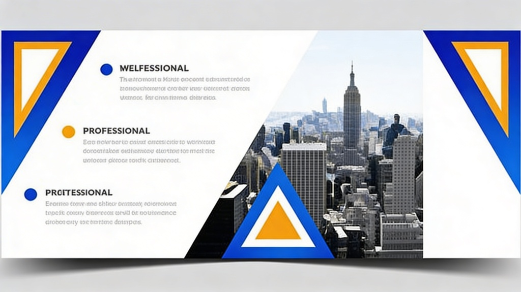
Clipart is the enemy of professional design. To elevate your slides, use high-resolution photography that feels authentic and relevant. Avoid generic stock photos of people shaking hands in a boardroom; instead, look for abstract textures or lifestyle shots that evoke the emotion of your topic.
- Full-Bleed Images: Sometimes, letting an image take up the entire slide background with a text overlay can create a powerful, cinematic effect.
- Iconography: Use consistent icons to represent data points. Ensure all icons share the same style (e.g., all "line icons" or all "solid icons").
5. Simplify Data Visualization
Data should tell a story, not confuse the audience. When presenting charts or graphs, remove the "chart junk." This includes unnecessary gridlines, legends that could be replaced by direct labels, and 3D effects. A professional chart is clean, flat, and highlights the specific trend you want the audience to notice.
If you are showing a bar chart, consider highlighting the specific bar you are discussing in a bright color while keeping the others in a neutral gray. This technique, known as "focal point highlighting," is a hallmark of professional data storytelling.
6. Use Subtle Transitions and Animations
In the world of professional presentations, less is almost always more when it comes to movement. Avoid "star" transitions or bouncy animations. Stick to simple "Fade" or "Push" transitions that feel smooth and purposeful. Animations should only be used to reveal information sequentially, helping the audience follow your narrative without getting overwhelmed.
Frequently Asked Questions
What is the best font for professional slides?
Sans-serif fonts like Helvetica, Montserrat, Open Sans, or Roboto are generally considered the best for presentations. They are clean, modern, and highly readable on screens from a distance.
How many bullet points should be on a slide?
A good rule of thumb is the 6x6 rule: no more than six bullet points per slide and no more than six words per bullet point. However, even fewer is often better for a truly professional look.
Should I use a dark or light background?
It depends on the venue. For well-lit rooms, a light background with dark text is usually safer. For dark auditoriums, a dark background with light text can look very sleek and reduce eye strain.
Create your presentation with one click now
Stop struggling with design. Let our AI-powered engine build professional, high-impact slides for you in seconds.
Get Started for Free